How to Avoid Brand Fatigue (Part 1)
I've changed my perspective on this

After finishing a rebrand project, I used to caution clients against using their new logo on everything, warning them about the dangers of "brand fatigue."
I've changed my perspective on this now.
It feels counterintuitive, but your brand should be 99% repetition and 1% novelty.
As a ministry leader, you'll get tired of hearing your core values long before your audience even remembers one of them. You'll be dreaming in only your brand colors before anyone even notices that there's an intentional palette.
In fact, there was a study done to see how well regular people could recall major brand logos from memory. The results were pretty shocking.
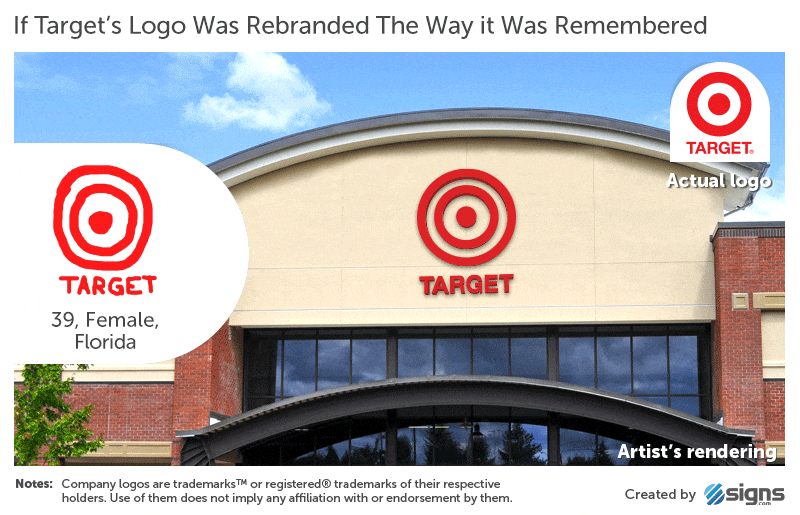
If regular people struggled to remember the TARGET logo, then your church probably doesn't have to worry about "over-branding."
That said, there's a simple principle that can help you give your church more brand "touchpoints" without going overboard and getting on anyone's nerves. I’ll talk about that in the next one.
See you there!
I've created a free assessment that allows you to get personalized recommendations for if, when, and how to rebrand your church.
Get results within minutes!