How to Design Your Church Way-Finding Signs
...and help visitors find the bathroom!
I recently helped a church in Kansas City rebrand, and this project took much longer than we anticipated! This church needed collateral designed in preparation for their official launch of the new identity. Collateral like wayfinding signs, and A LOT OF THEM.
85 signs, to be exact.
If you have a church building, chances are you have these!
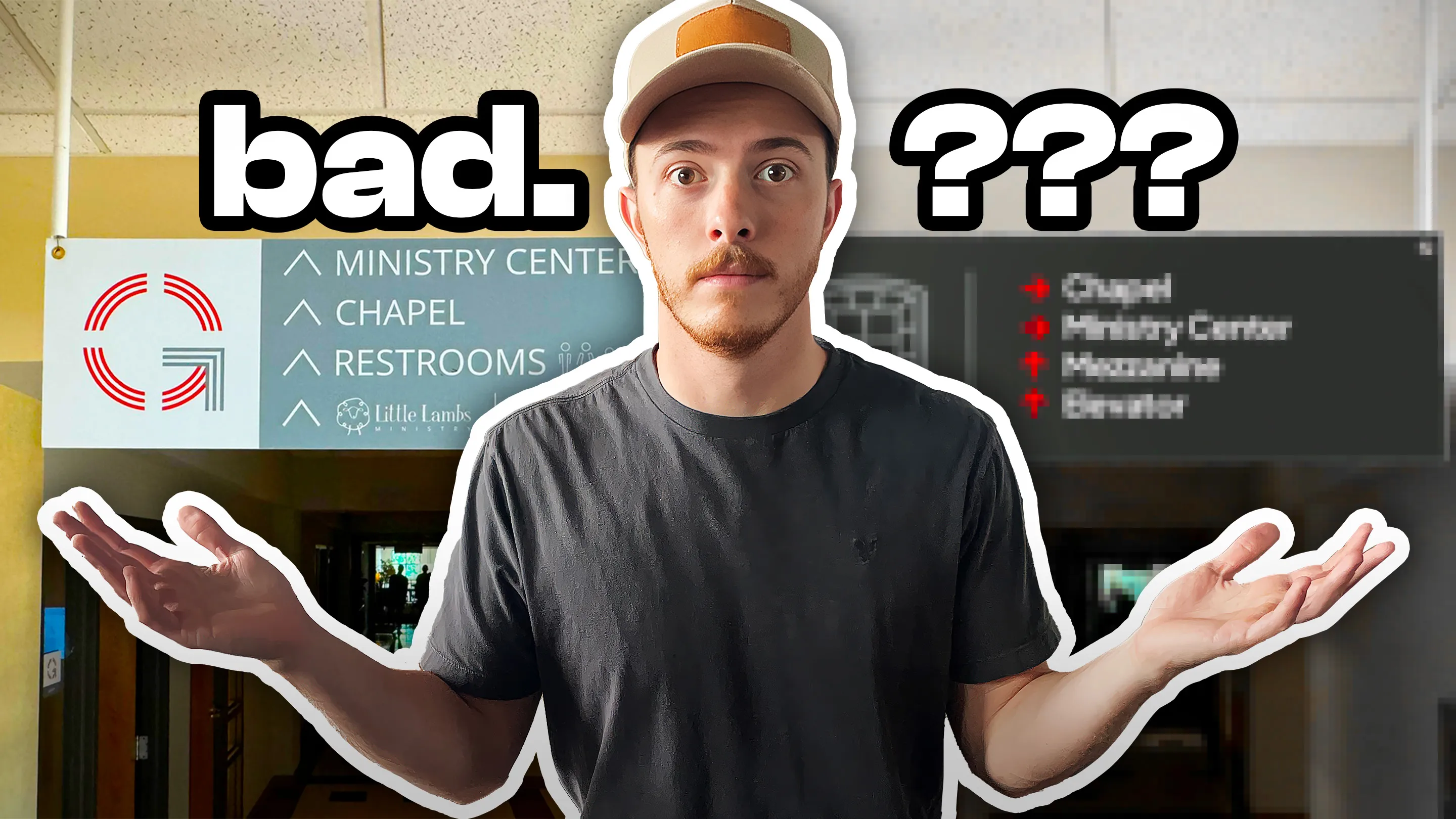
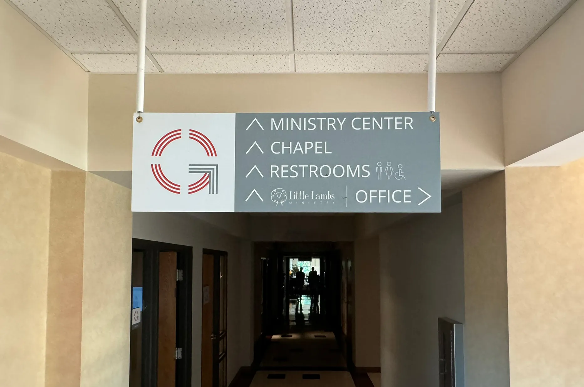 Sample from OLD wayfinding and branding
Way-finding signs are the built-in guide to your building, both for first-time visitors and those forgetful members who could probably get lost in their own house (you know who I’m talking about).
BUT... Beware!
There are some HUGE blunders that are easy to make with this type of signage.
So, to save you from those, I thought I would show the design process I went through with this Kansas City church and their way-finding signs. Check it out!
In design, way-finding falls under the category of what we call “environmental design.” Most of these signs were going to be a part of the building, so we had to treat them more like a piece of furniture than a poster.
The brand’s hero color was a bright red, so the signs should be red, right?
Not so fast! Would you put a bright red couch in your living room? What about multiple bright red paintings throughout your home? Again, probably not. For environmental signage and way-finding, we have to think more like interior designers and accessibility experts than graphic designers.
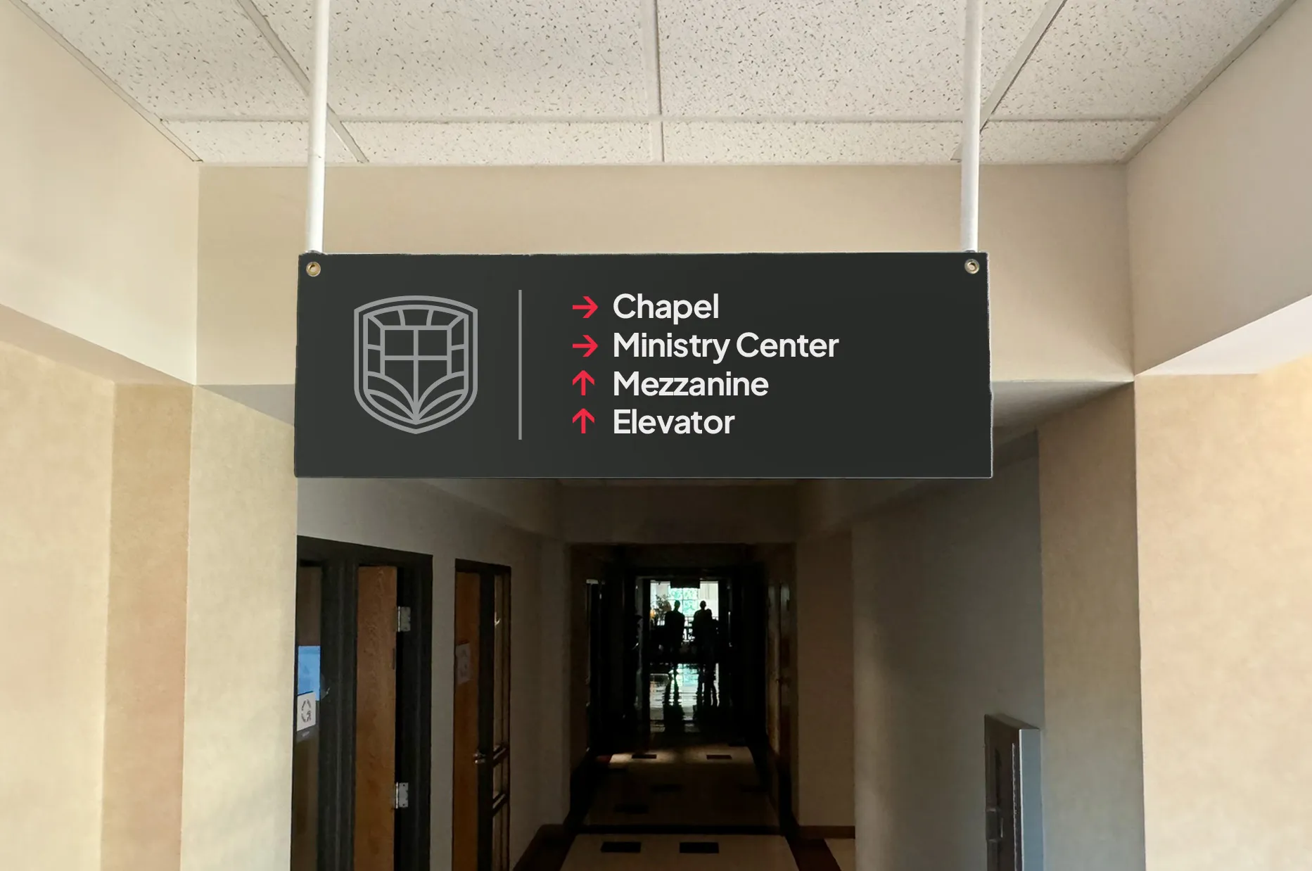 Directional way-finding signage for Gashland EPC
Earlier in the rebrand process, we had developed a brand color palette for this particular church with a dark charcoal color we called “Forge Black.” Using this darker, more neutral color as the main background was a good choice for three reasons:
As you can see, we did bring in the red hero color, but only in a very intentional, minimalist way. Even the logo on the signs was intentionally subdued and understated to make room for more important information, like “¿donde esta el baño?”
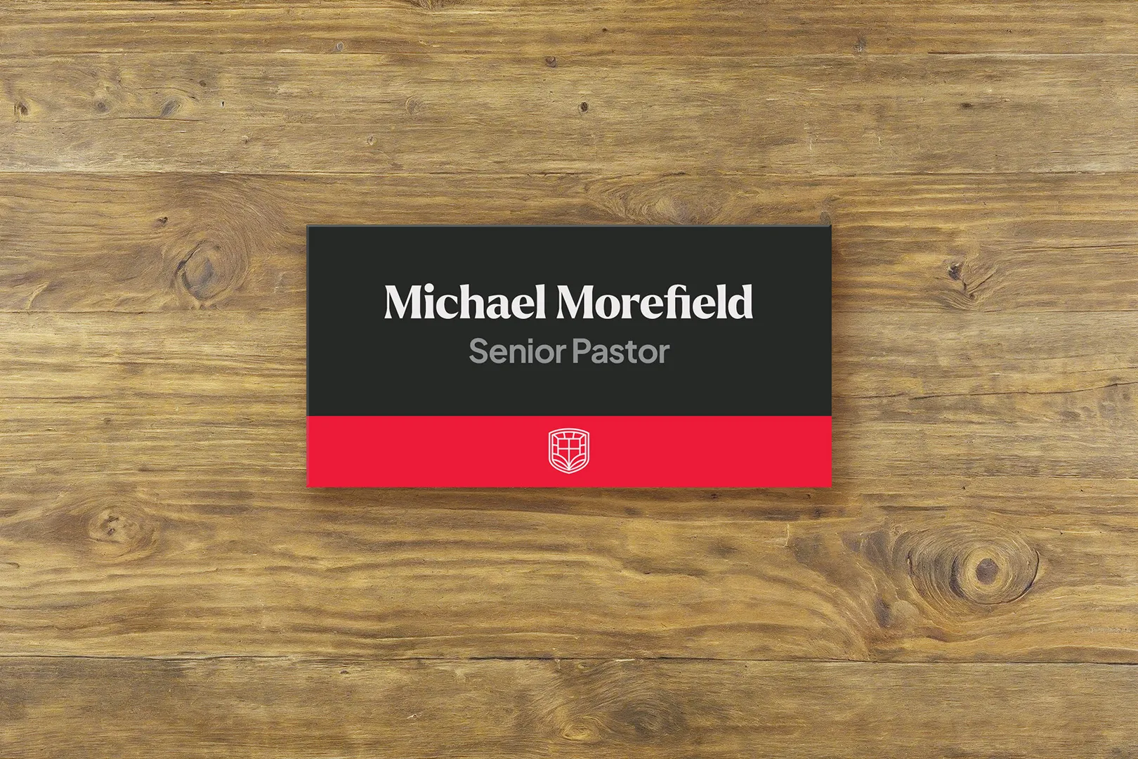 Staff nameplate and door signage for Gashland EPC
For way-finding signage, there are three critical things to get right with typography: Size, Style, and Grouping.
To figure out how big the font size should be on your signs, think about the furthest possible viewing distance for that sign. Will visitors be seeing it up close every time, or is it at the end of a hallway?
A general rule of thumb is that the main headings on the sign should be legible from 40ft away for someone with good eyesight.
This applies mostly to directional signage, and isn’t necessary for things like room labels.
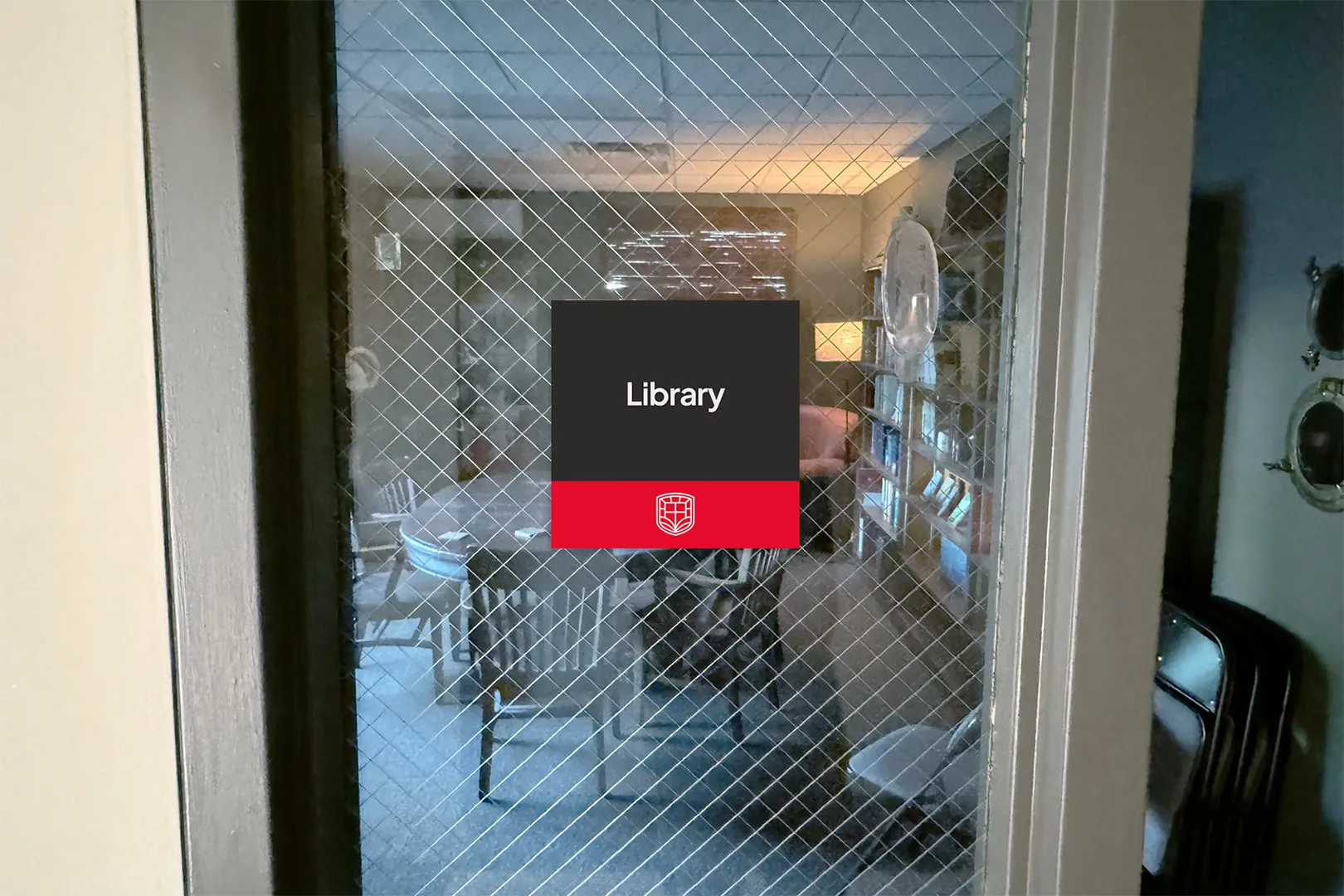 Room label way-finding signage for Gashland EPC
Now on to font style. Legibility is absolutely critical for way-finding, so you want to choose a brand-aligned font that is easy to read. For the thickness or weight of the text, lean bolder rather than lighter.
In this example, we’re using Larken, the main brand typeface, for the headings. The secondary typeface, Plus Jakarta Sans, was better suited for the other information and is more legible at small sizes.
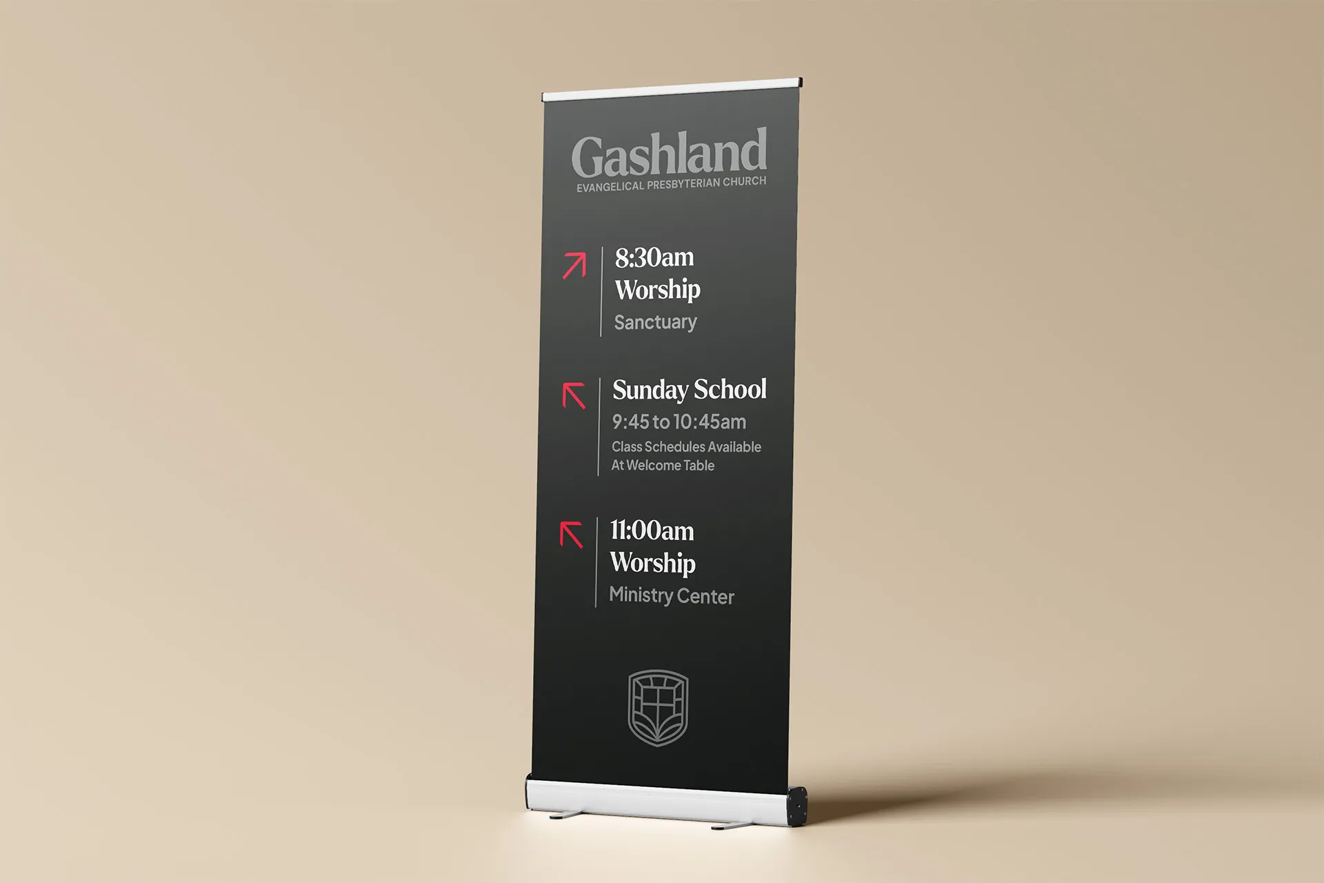 Directional way-finding pop-up banners for Gashland EPC
Finally, consider the grouping of information and arrows in your layout. You want to make sure that you have grouped relevant information together in a way that will quickly make sense to someone who is late for Sunday School!
 Wayfinding signage for Walnut Street Baptist Church
If you’re looking at getting new signs or updating your building, don’t miss this opportunity to update your branding as well!
It’s one thing for a sign to look nice and be functional, but branding and design has the power to do much more than just help people find the nursery.
Every bulletin, banner, and coffee cup is an opportunity to shape the culture of your church through intentional, vision-aligned branding that stands the test of time. If that’s your ultimate goal, then updating your signs without rebranding first would be a massive waste of time and money!
Schedule a time to talk and I’ll walk you through what a brand refresh could look like, so you don’t have to re-do your signs AGAIN in a couple of years.
Answer a few quick questions about your church, and I'll reach out with some personalized information for you.
It only takes 90 seconds!