My Complete Guide to Color Selection for Churches
5 Critical Tips to Choose Colors without Causing a Church Split

If you’ve ever thought about the “why” behind your church color palette, you probably realize that brand colors aren’t always black and white (wink).

Those questions all have the same answer: timeless color selection principles. This post is my full guide to brand color selection for churches, which I’ve gathered the hard way from years of church rebrands.
I’m giving it to you here in the form of five basic principles (with some bonus tips at the end).
Without further ado, here are my hard-won church color selection principles.
In a vacuum, it’s easy for one person to pick colors that “look good.” But when the stakes are high and the colors have look good to more people in more contexts, suddenly things get trickier.
Sampling colors from the real world can be a great starting point for palettes that feel cohesive and familiar. Palettes taken from nature, architecture, and even human features translate surprisingly well to both digital and print.
Scottish tweed makers will go out into the countryside, capture a swatch of colors from their environment, and use those colors in their designs.

What’s stopping us from doing the same thing?
Find or take a photo of your church building, its surroundings, or something in your environment that fits the aesthetic you’re going for. Pull the image into a tool like Coolors.co and start sampling.
You’ll notice that the palettes you can create will have light colors in the highlights of the image, dark colors in the shadows, and mid tones which are more vibrant or less vibrant. You’ll want at least one of each.
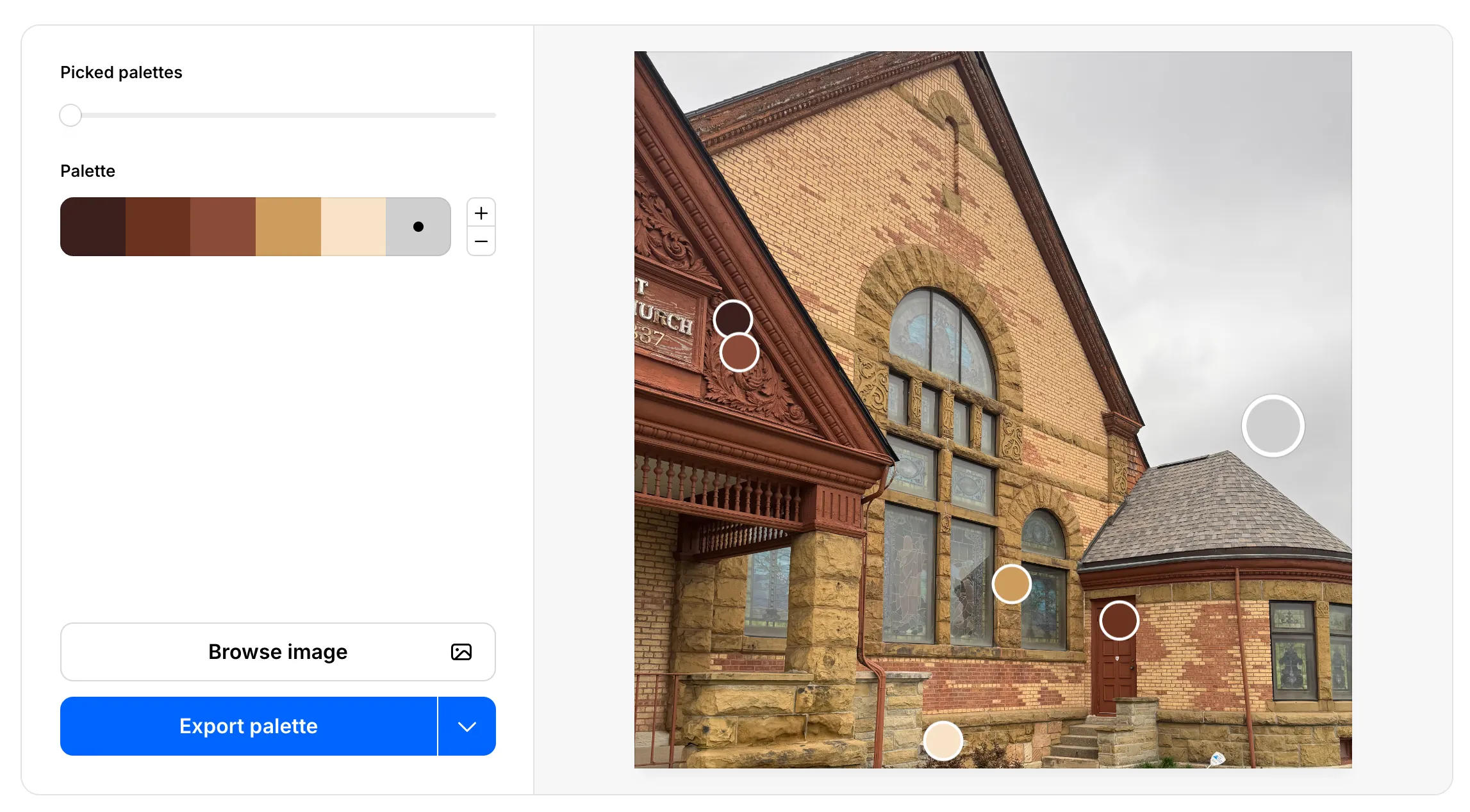
Then, when you’re feeling good about a particular palette, you can go beyond the screen to a Home Depot or Sherwin Williams paint store. Gather swatches close to the colors in your palette, and compare them in different real-life environments.
If you follow these steps for sampling, it’s hard to go wrong.
Just like with your church logo, you’ll want layers of meaning and depth behind your church color choices.
One way to accomplish this is through symbolism. Colors are symbolic because they can bring to mind a mix of material things and abstract ideas.
Here are a few examples… but before I share them with you, keep in mind that these colors are broad and have many different meanings associated with them.
The symbolism I’m focusing on here is related specifically to churches, and how a church might use these for their brand colors. Don’t start using them without doing your own research as well.
Okay, with that out of the way, here are some color symbolism examples:
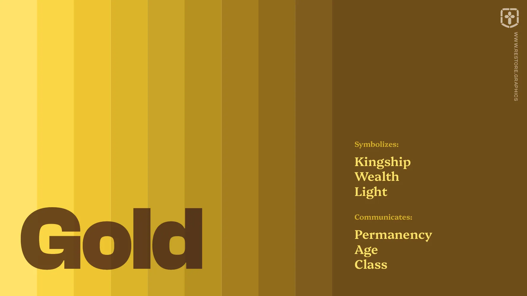
Gold can communicate permanency, age, and class. It symbolizes kingship, wealth, and light.
Orange can communicate energy, friendliness, and youthfulness. It symbolizes flowers, fire, and sunsets.

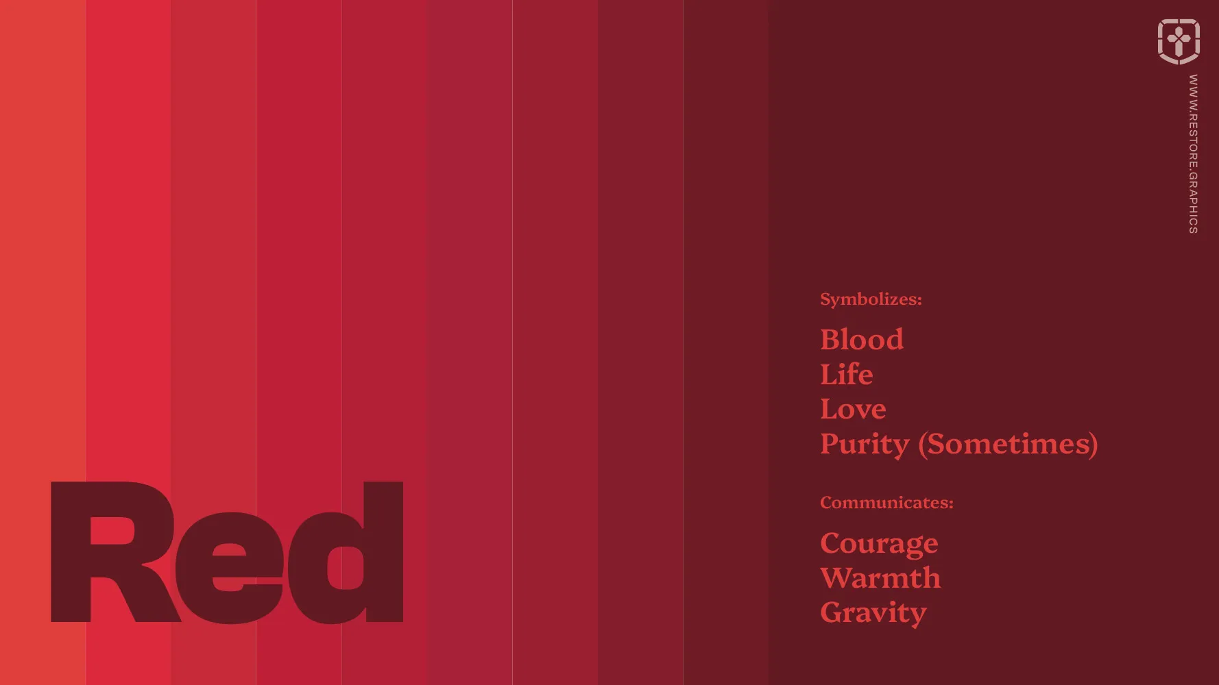
Red can communicate courage, warmth, and gravity. It symbolizes blood, life, love, and sometimes purity.
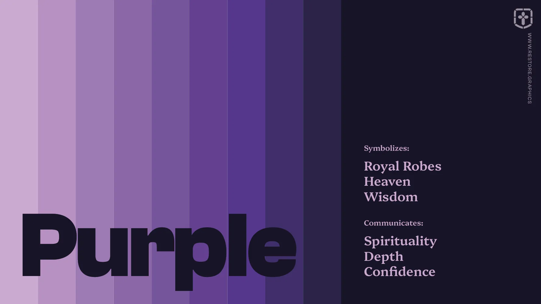
Purple can communicate spirituality, depth, and confidence. It symbolizes royal robes, heaven, and wisdom.
Teal can communicate balance, peace, and renewal. It symbolizes healing, water, and growth.

If you want to go deeper, here’s where you can read more on color symbolism and usage (from a secular source).
Carefully crafting color categories can catalyze cohesion.

Alliteration aside, the categories or buckets you sort your colors into will determine the overall look and feel of your church’s brand. If you try to use too many colors spread out across different channels, your visual identity can start to feel incoherent and disjointed.
Keeping the visual identity unified is why we normally pick 2 to 4 “core colors,” which are the duo, trio, or quartet that glue your whole brand together. Core colors can help focus the look of the brand and make it recognizable by a particular combination of colors alone.
This also means core colors must be used and guarded more carefully than other colors.
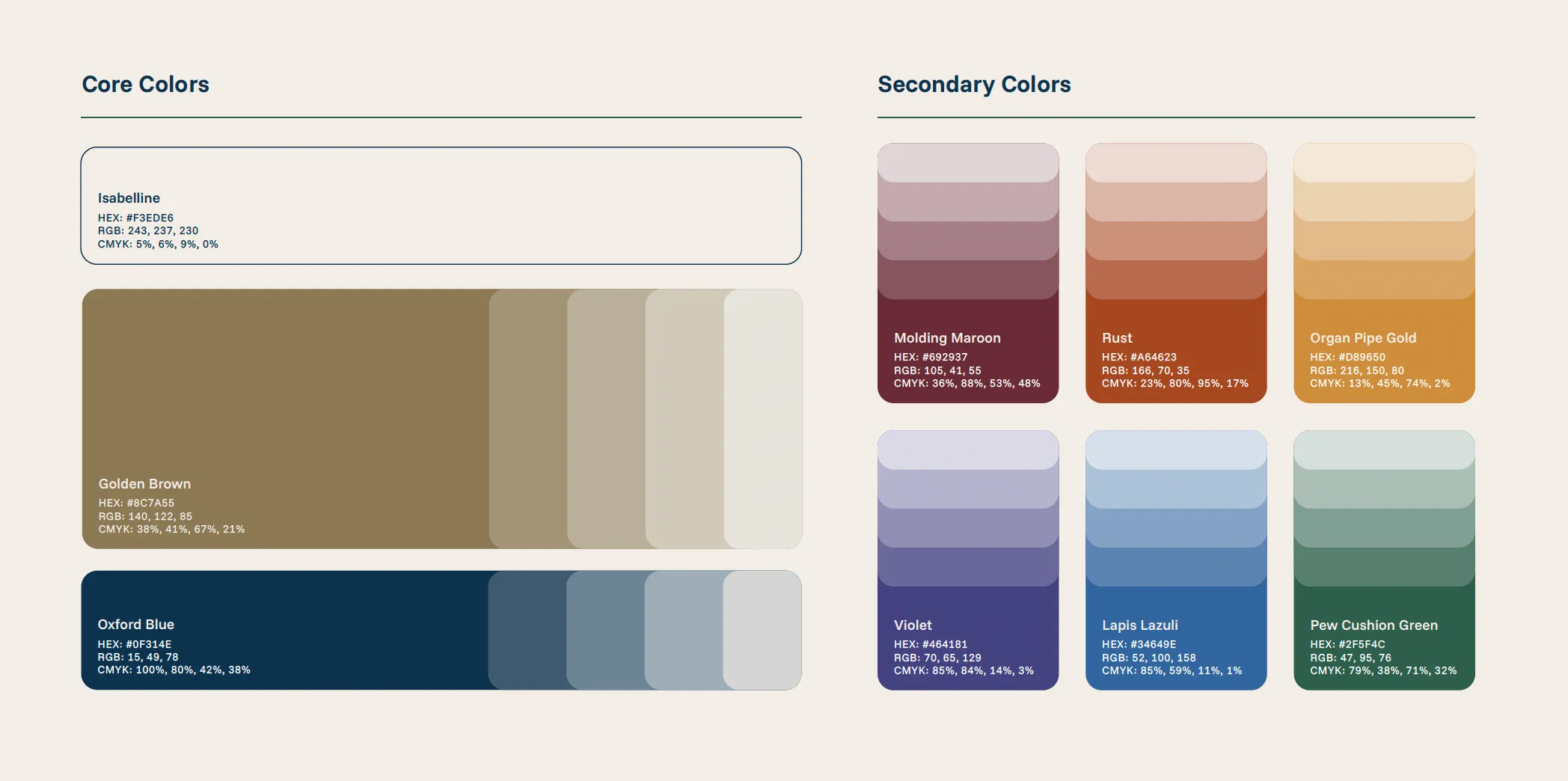
Supporting colors are generally taken from other parts of the color spectrum. We do this to add a certain level of variety and depth to the overall brand.
Having supporting colors sprinkled in throughout your brand helps prevent it from being strictly monochromatic, which can come across as flat or boring. Even if your core colors aren’t monochromatic, they can be easy to overuse, diluting their impact and handicapping their ability to grab attention.
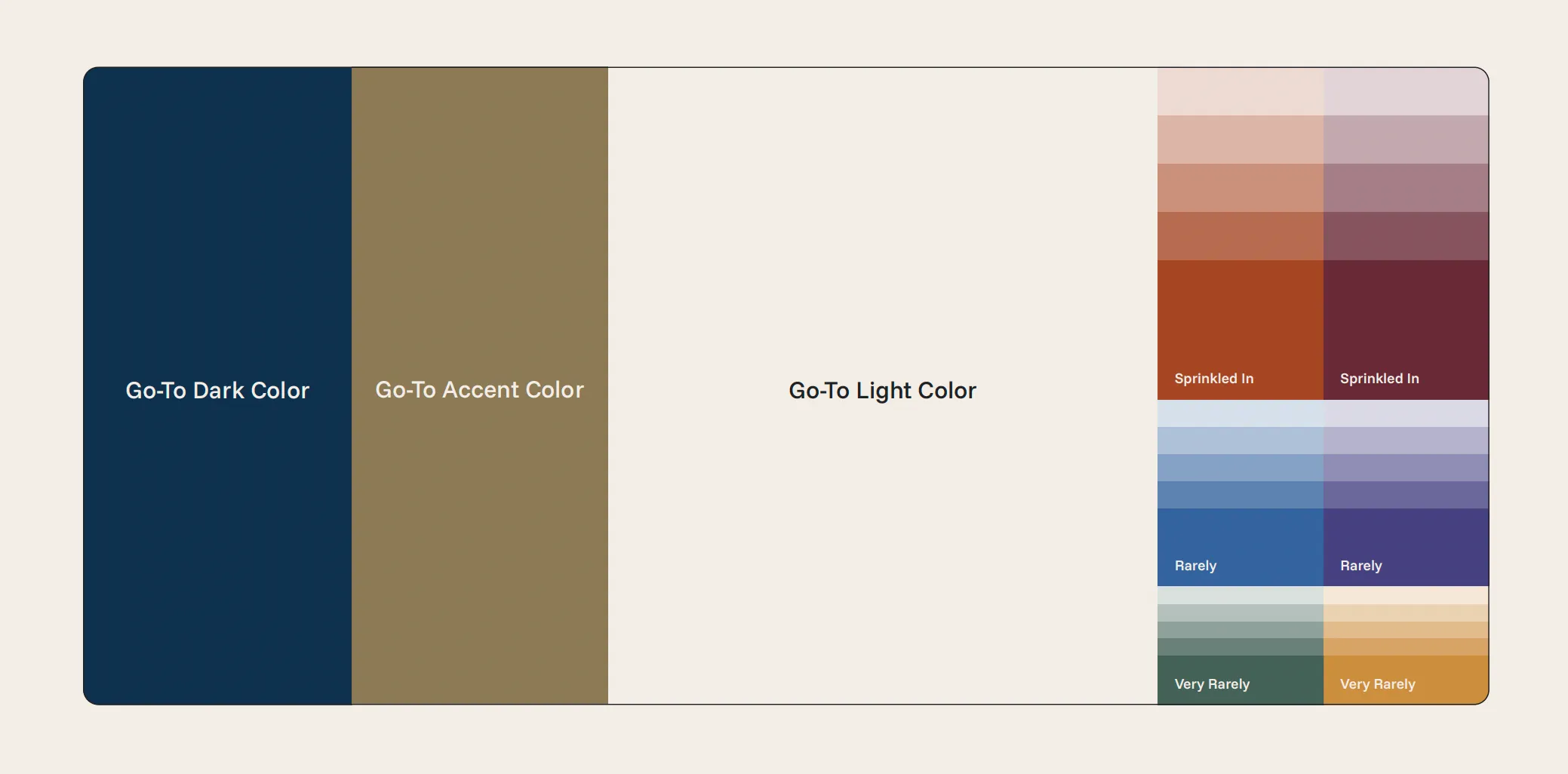
So, to sum up, distinguishing between core colors and supporting colors is all about proportions and ratios. Disproportionate use of even the perfect palette can send the wrong message, so prioritize which colors you want to stand out and maintain that balance.
Just use red? Can it really be that simple? Red is historically a color used by churches of all denominations, and it checks all the boxes I’ve mentioned so far.
✅ It makes a bold hero color and contrasts with both white and black.
✅ Among other biblical tie-ins, red symbolizes the blood of Christ that is offered in the gospel.
✅ Almost every church building or location has some form of red that can be sampled for a close match.
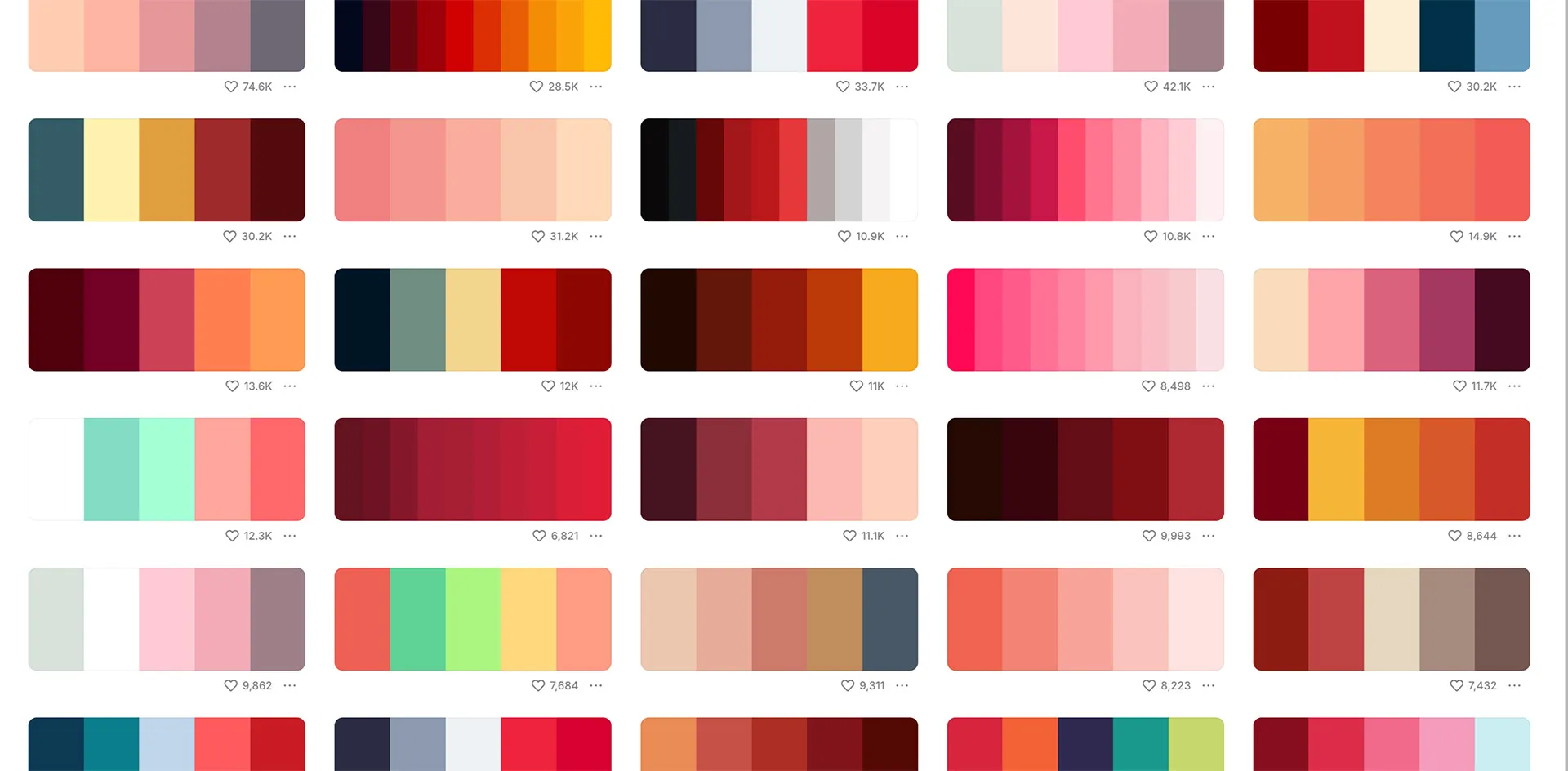
There are an infinite number of shades of red that can work for a church brand identity. Even if you’re not using red as one of your core colors, see if there’s a place for it in your supporting color palette.
Using tints and shades is a powerful way to expand your visual identity without adding new base colors. A tint is a lighter version of the same color. Shades are darker versions of the same color.
While you might not need them in everyday use (especially with a professionally designed color palette), there are situations where your standard set of base colors are going to clash or look too opinionated.
For example, a limited color palette might handicap an experienced web designer. Because websites are interactive and display lots of information in different formats, they often call for a suite of neutral colors, ranging from dark to light.
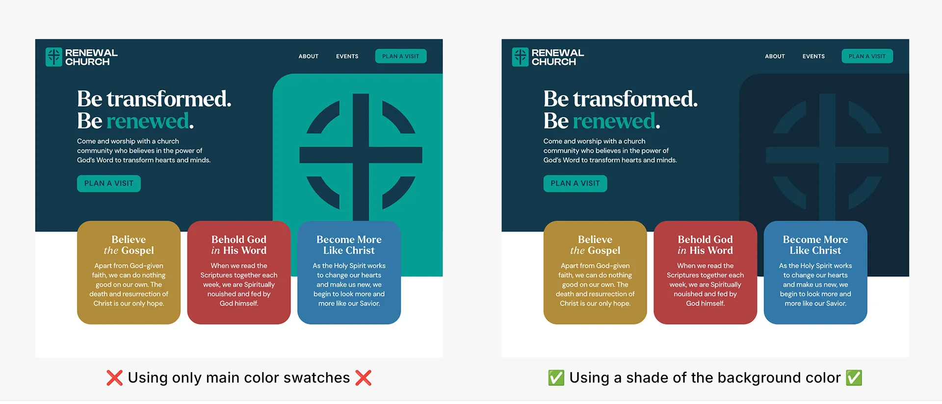
You might also find that a particular color works well online and in print, but is too strong and vibrant for apparel. A tint or shade of that color might make for a more wearable and fashion-friendly t-shirt than the original swatch.
If your palette feels incomplete or you’re looking for good supporting colors, consider using tints or shades of your core colors to round it out.
Creating, adjusting, saving and sharing color palettes isn’t actually all that easy. That’s where a color palette website can be invaluable.
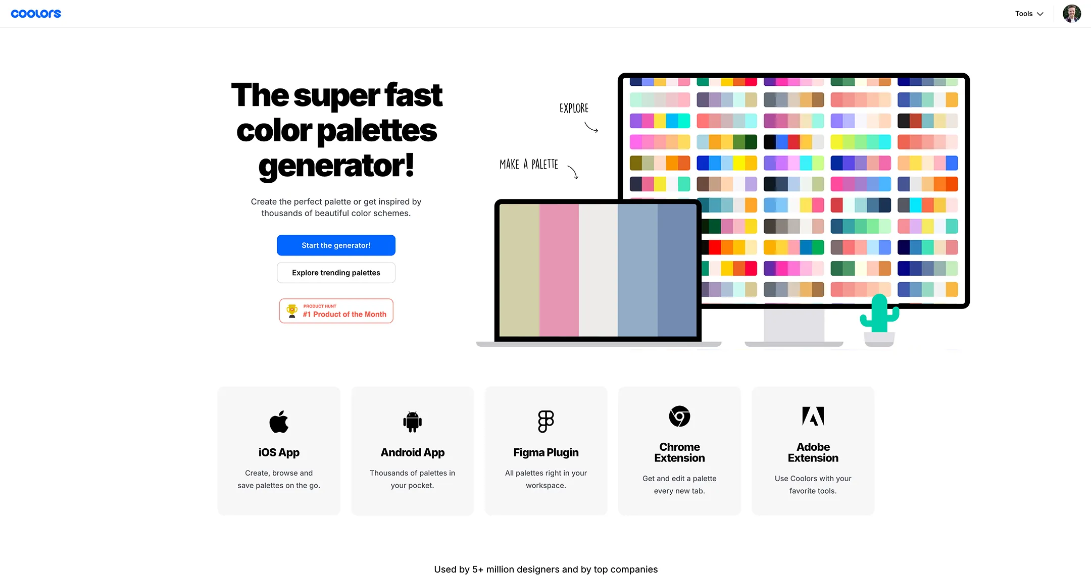
I mentioned this website up above called Coolors. When I first discovered it, I thought “where have you been all my life?!” Unlike most color websites out there, this one lets you do much more than browse and save color palettes. You can visualize your color palette in different contexts, do global adjustments to the whole palette at once, extract colors from an image, and even use a huge library of unique color names.
They didn’t sponsor me, but I really like using it. Maybe you will too.
…unless you’re working with a pro, that is. When I create a brand guide for a client, I include CMYK and Pantones as a nice addition, fully expecting that they will never be used.

Almost all print shops and vendors these days have automatic conversion between color spaces that is usually reliable, accurate, and consistent.
Even if you’re having screen printed t-shirts made or running off thousands of flyers, Pantone and CMYK values are only helpful in very specific situations.
Long story short, HEX codes are probably all you need.
You might be thinking, “It feels like I should be using these principles, but how do I actually put them into practice for my church?”
Even after reading my work specifically about church brand colors, it might not be clear how to actually apply this knowledge to your specific needs.
And on top of all that, color is just one piece of the puzzle.

That’s where having a personal guide can be a total game changer. With someone to make objective recommendations and help you avoid common mistakes, not only will you save time, you’ll save the headache of having to rethink your branding decisions in a few years.
Ideally you would want this person to be a proven expert who loves the capital “C” Church and has a strong track record of branding success stories.
If you’re looking for that kind of guidance, I’ve spent countless hours meeting with church leaders and translating their gut feelings into concrete messaging and visuals. I know the struggles and hurdles pastors face when nailing down exactly how their church should look, speak, and feel.
Book a call with me today and we'll talk one-on-one about how to represent the work God is doing in your ministry.
Answer a few quick questions about your church, and I'll reach out with some personalized information for you.
It only takes 90 seconds!