First Baptist Aurora
Once thriving, First Baptist Aurora had entered a season of sharp decline and was in desperate need of revitalization. Under the leadership of a new pastor, Robert, the church began to see signs of new life. Attendance was beginning to grow again, but their communication and visual identity hadn't kept pace with this renewal.
Pastor Robert had a compelling vision for the church: a congregation made up of everyone from high school dropouts and former addicts to homeschool moms and medical doctors - people who would work and worship together, unified in the gospel. He wanted the church to feel like something people could belong to.
The rebrand needed to speak to “salt of the earth” people while still feeling credible and inviting to professionals who value thoughtful preaching and theological depth.
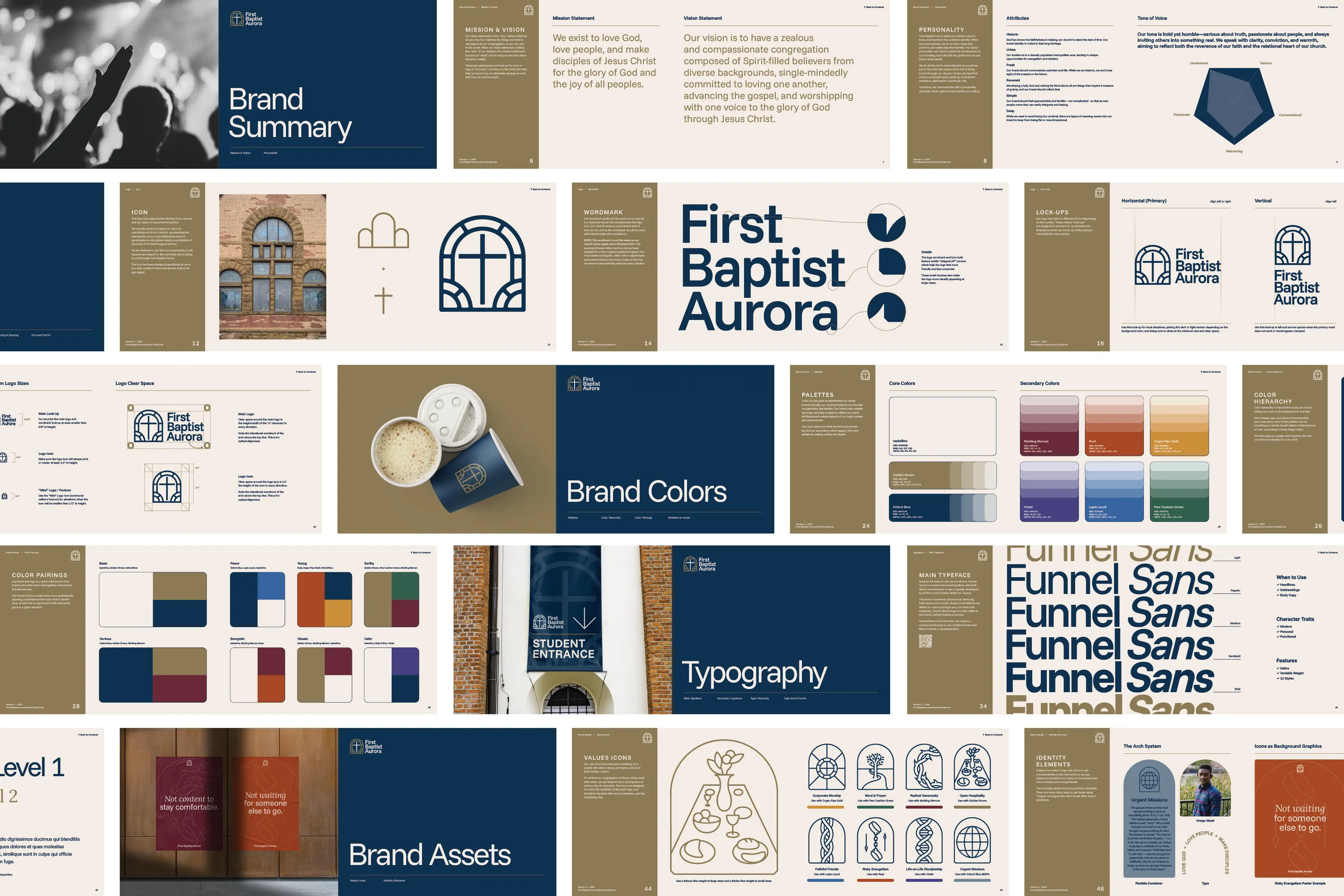
We started with a brand strategy phase to uncover the church’s unique identity and values. Two keywords quickly rose to the surface: historic and urban. These became anchors for the rest of the brand development.
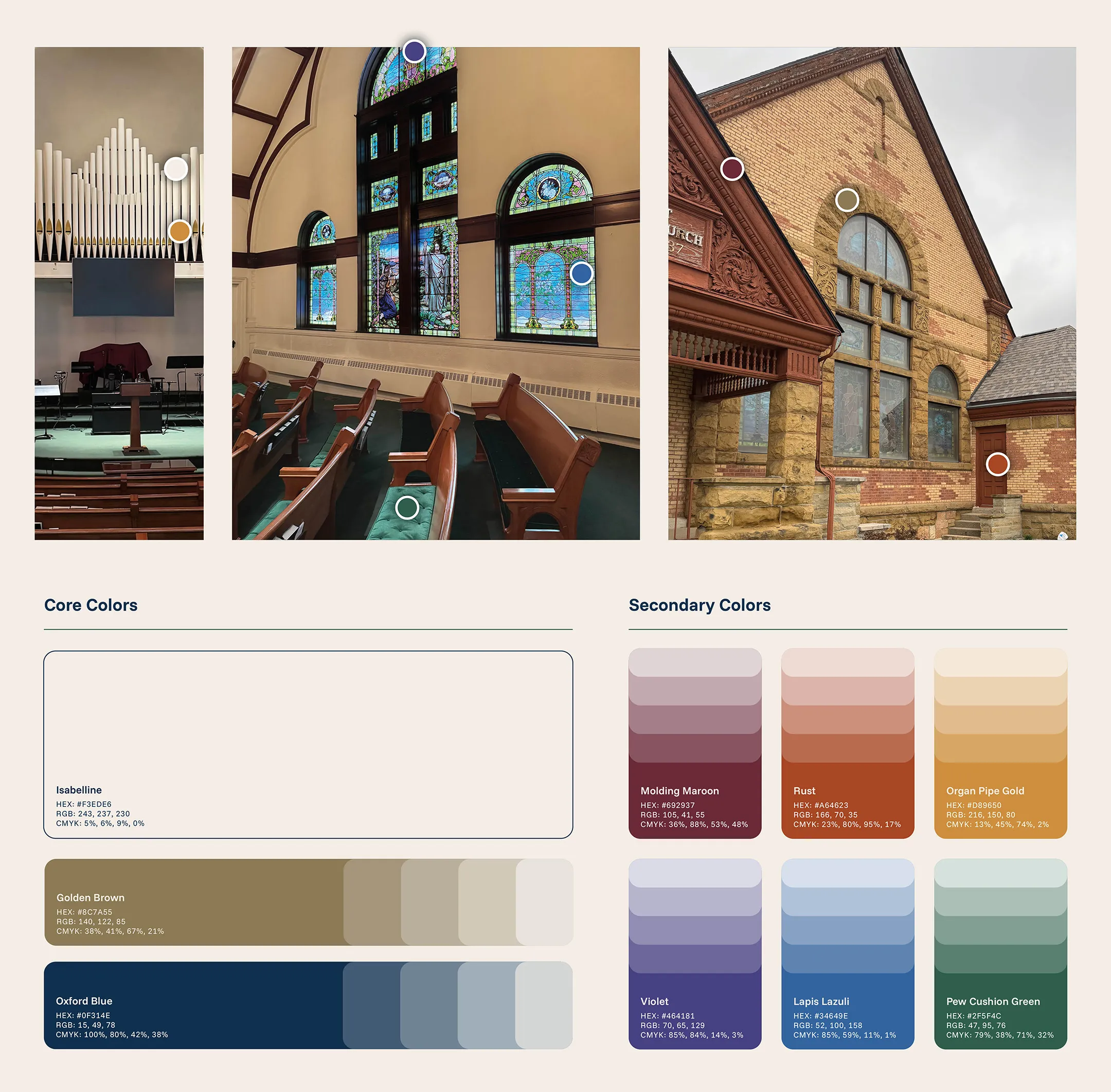
We grounded the color palette in the building itself — sampling tones directly from the brick, molding, and stained glass. This approach ensured the colors would remain relevant for years to come and provide a solid foundation for future renovation decisions.
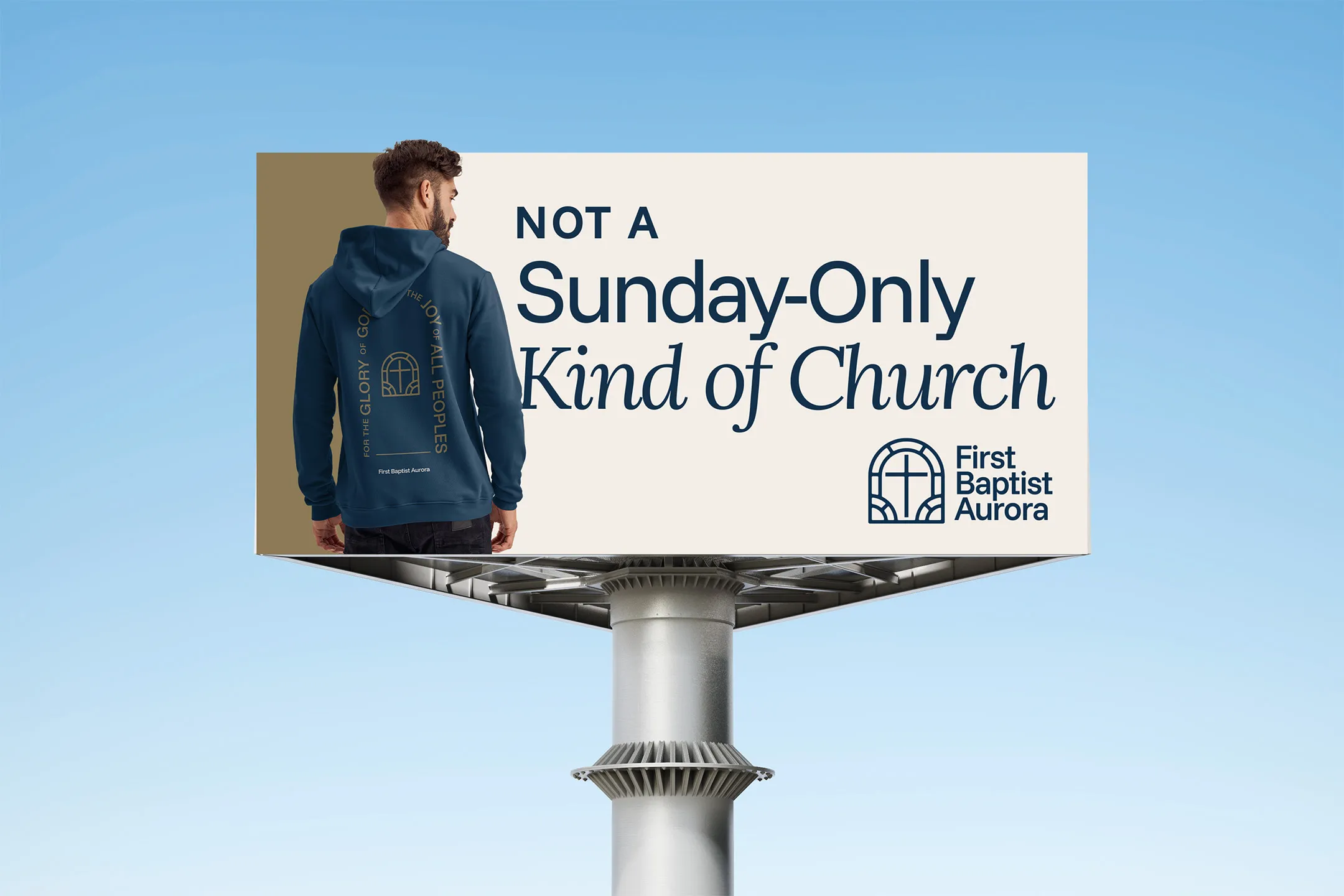
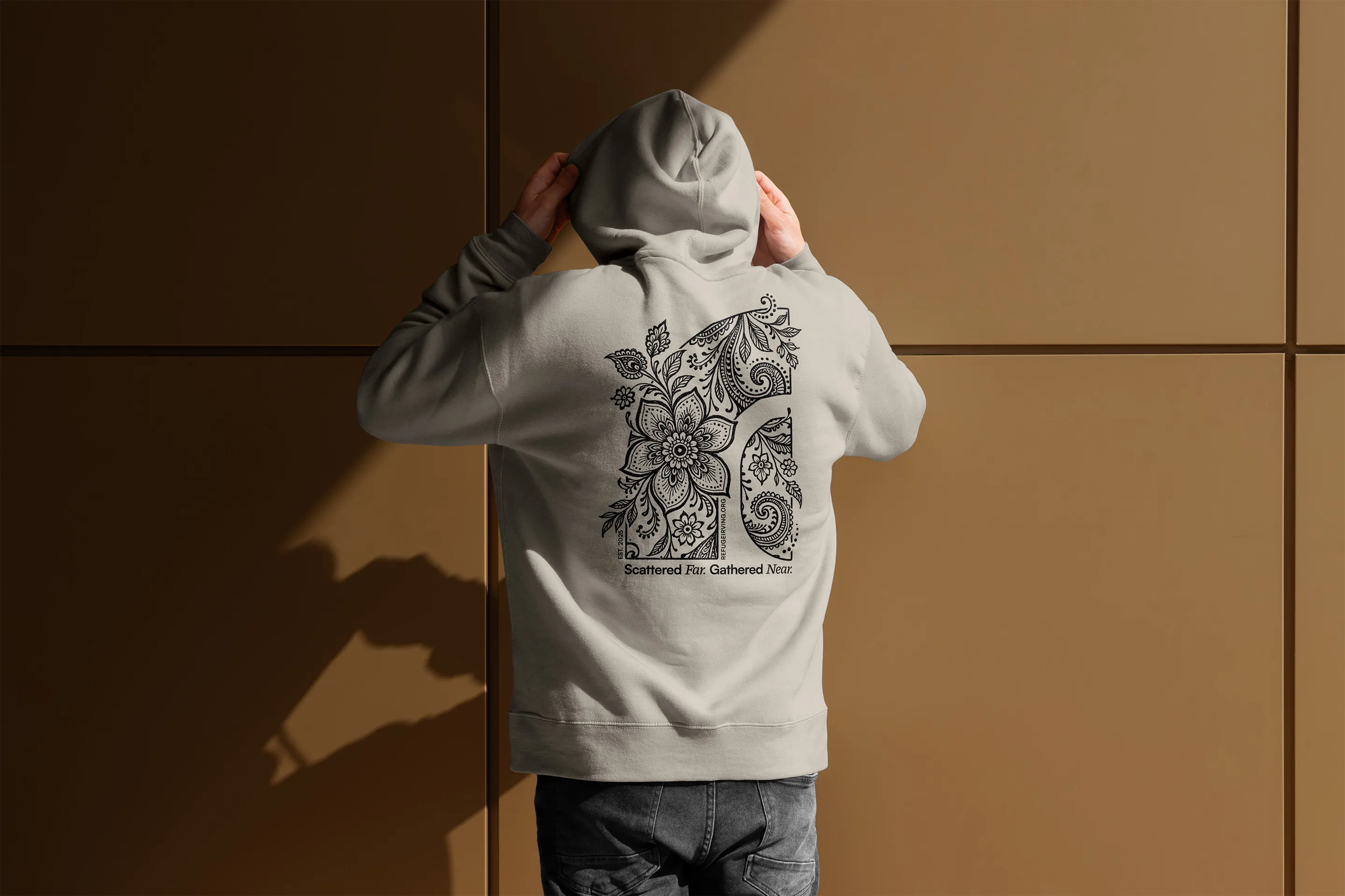
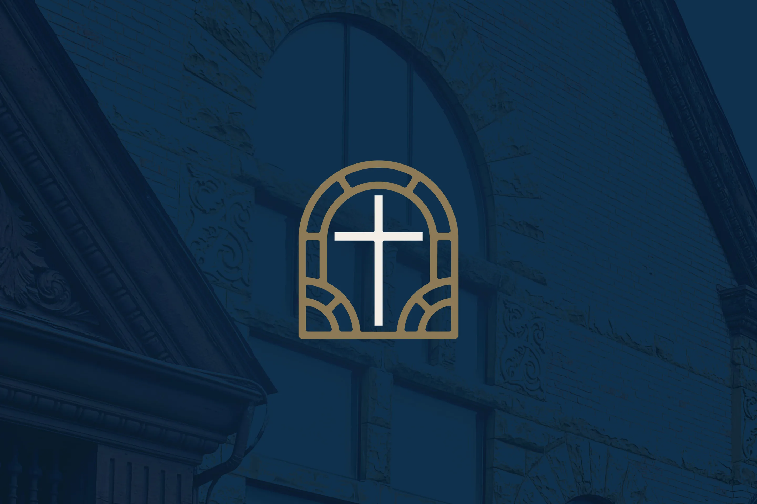
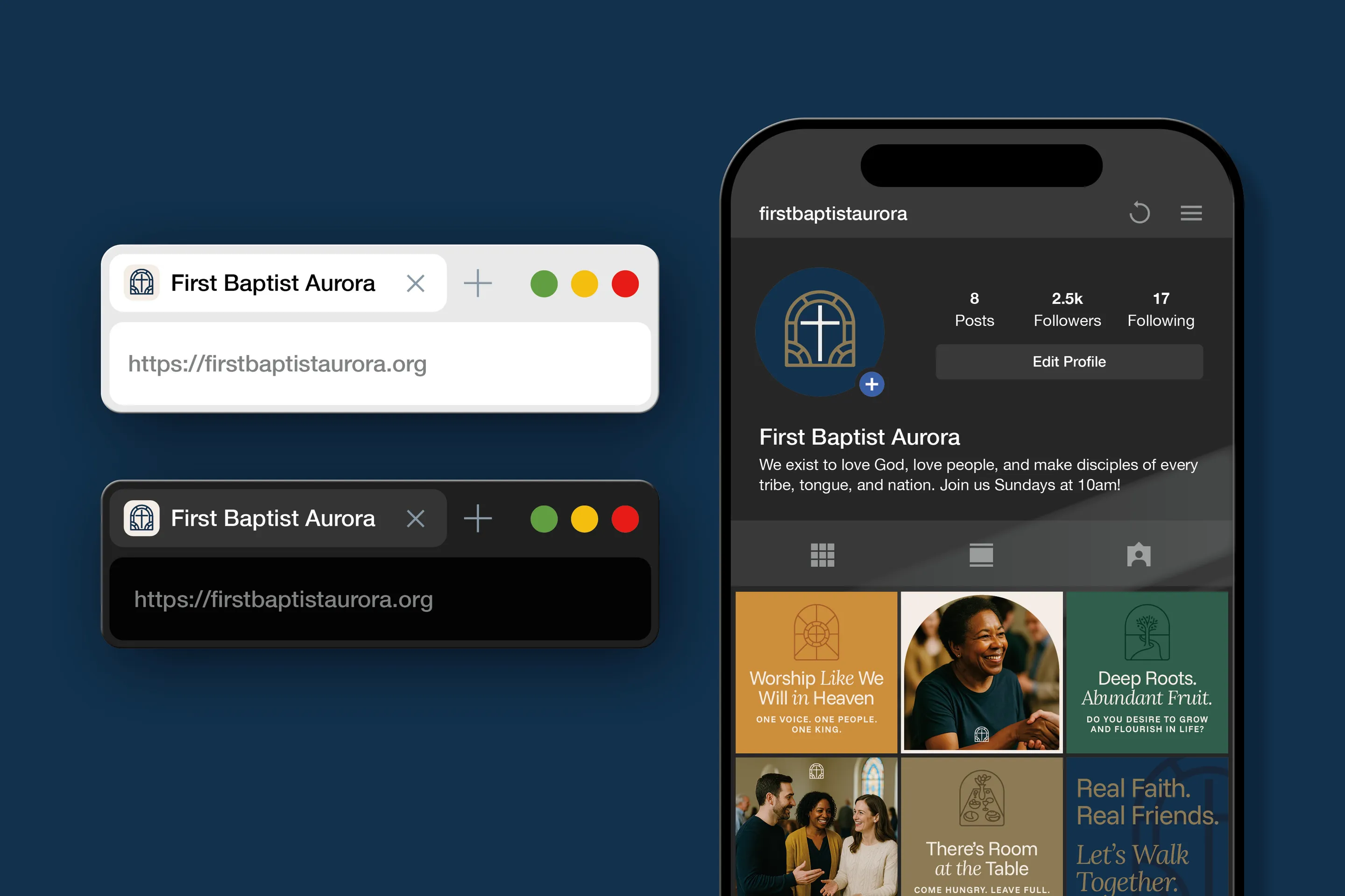
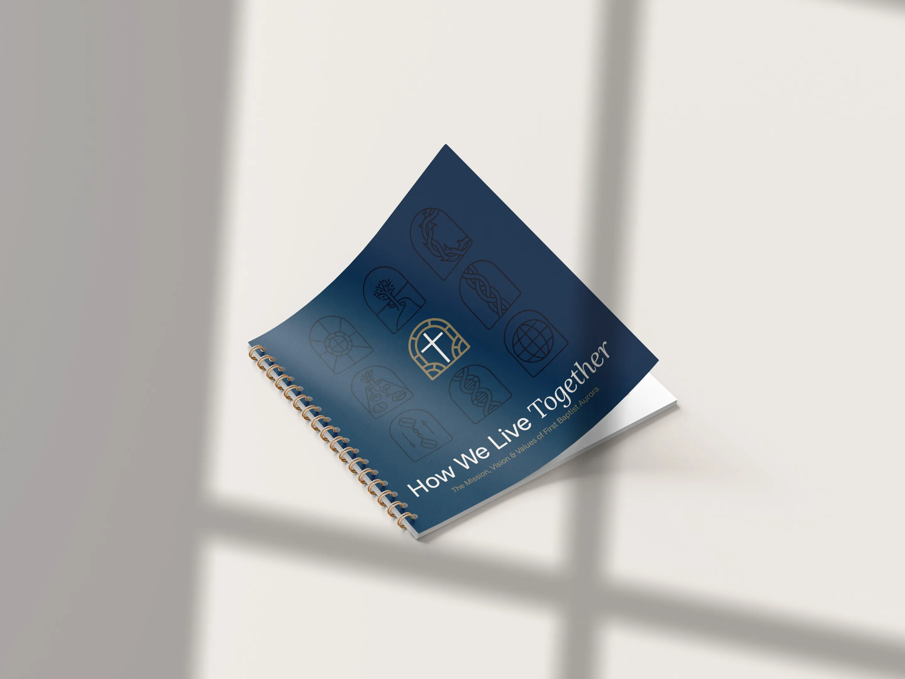
The most iconic visual element of the church was its historic stained glass windows. From the beginning, it was clear the new logo needed to honor this legacy. We designed a custom mark that captured the silhouette of the windows in a modern, simplified rendering.
![]()
![]()
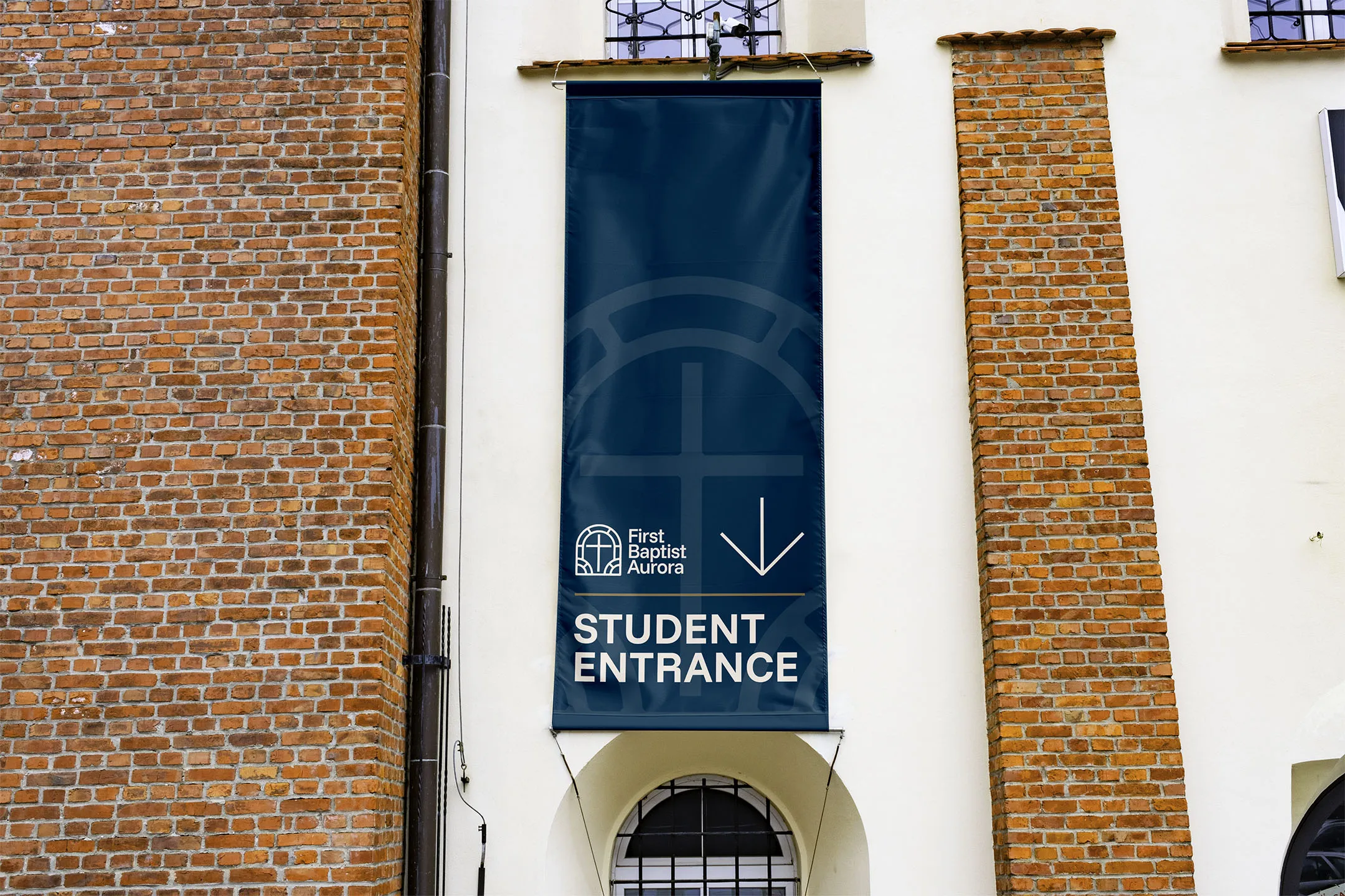
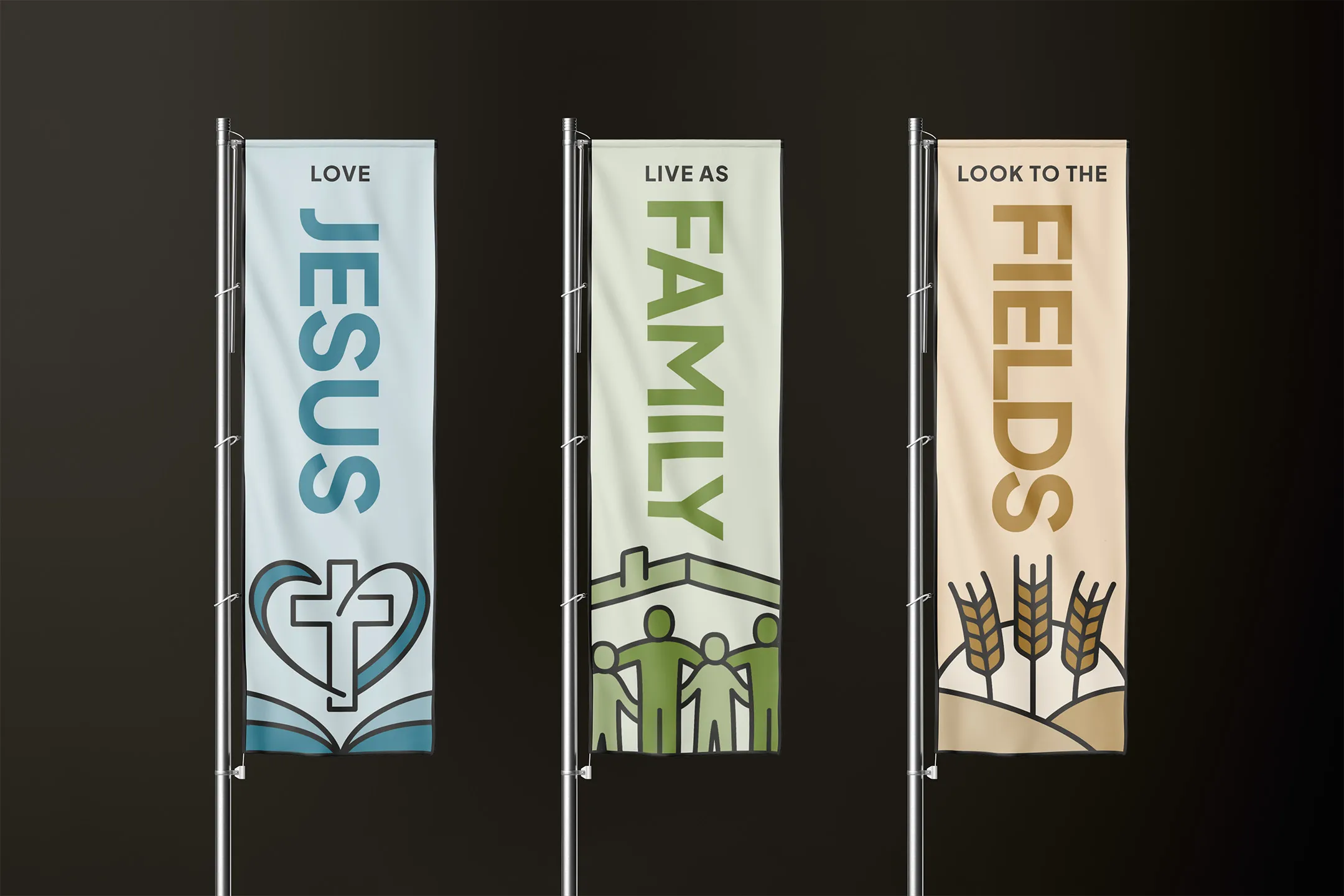
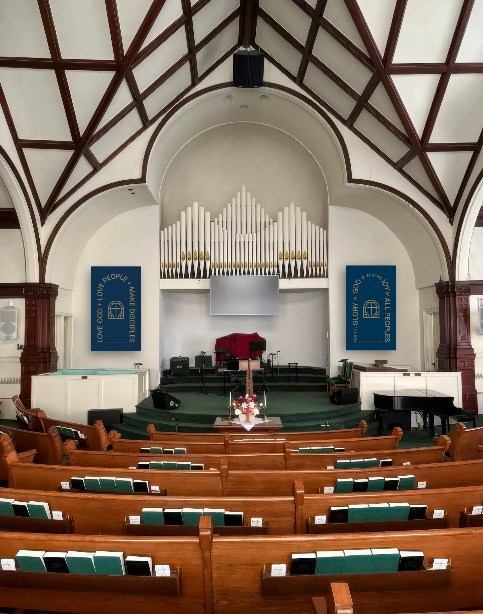
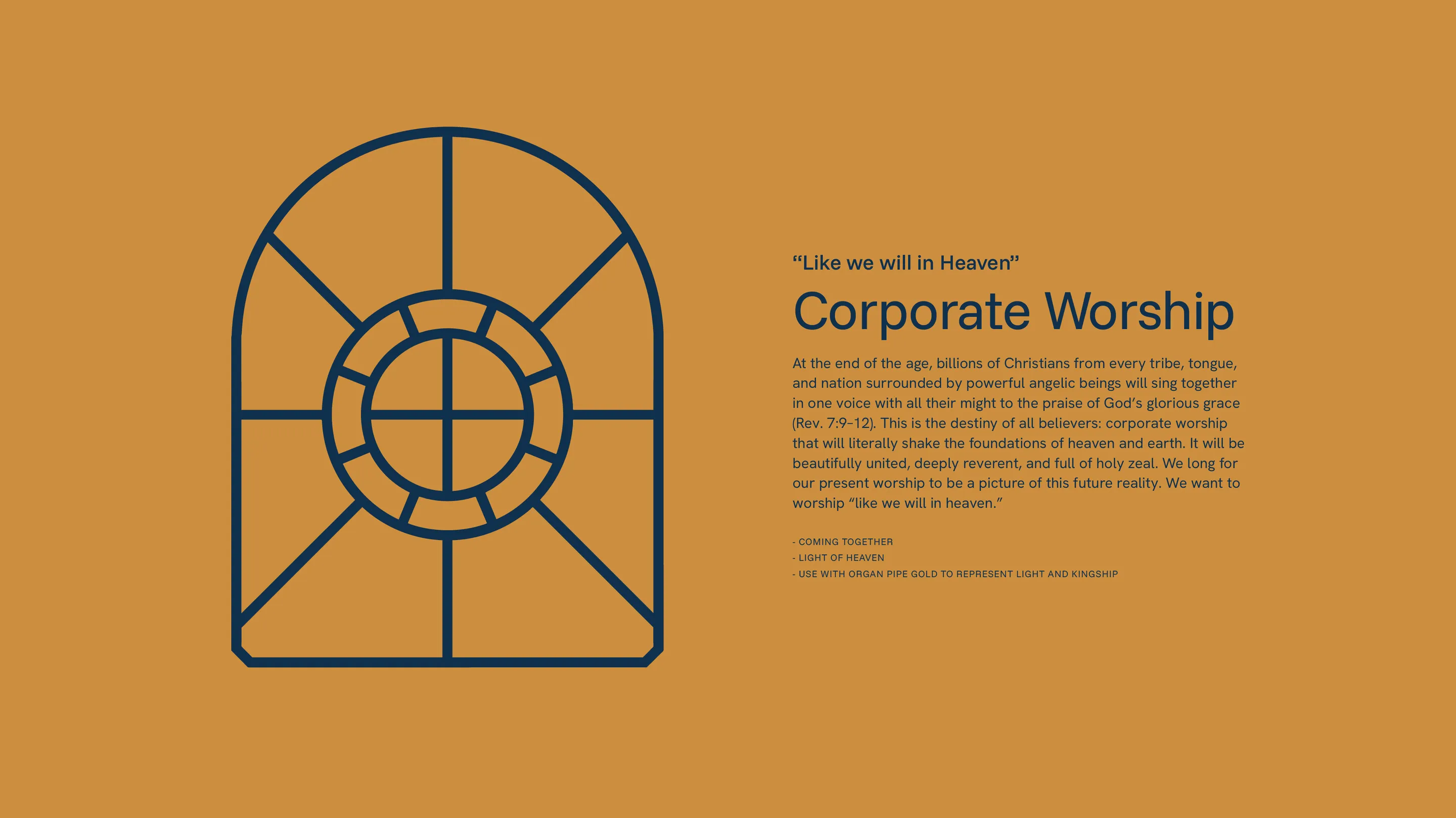
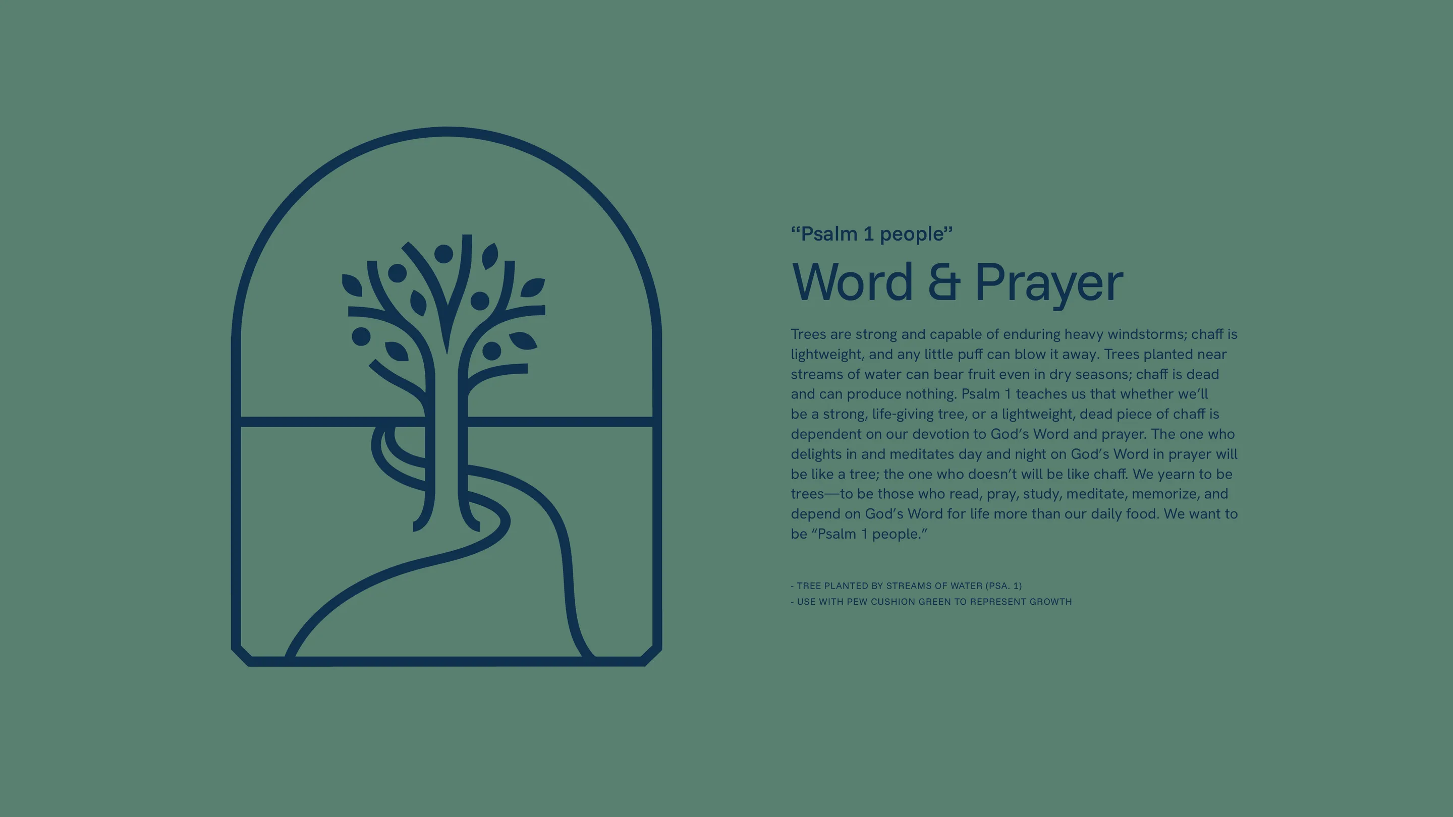
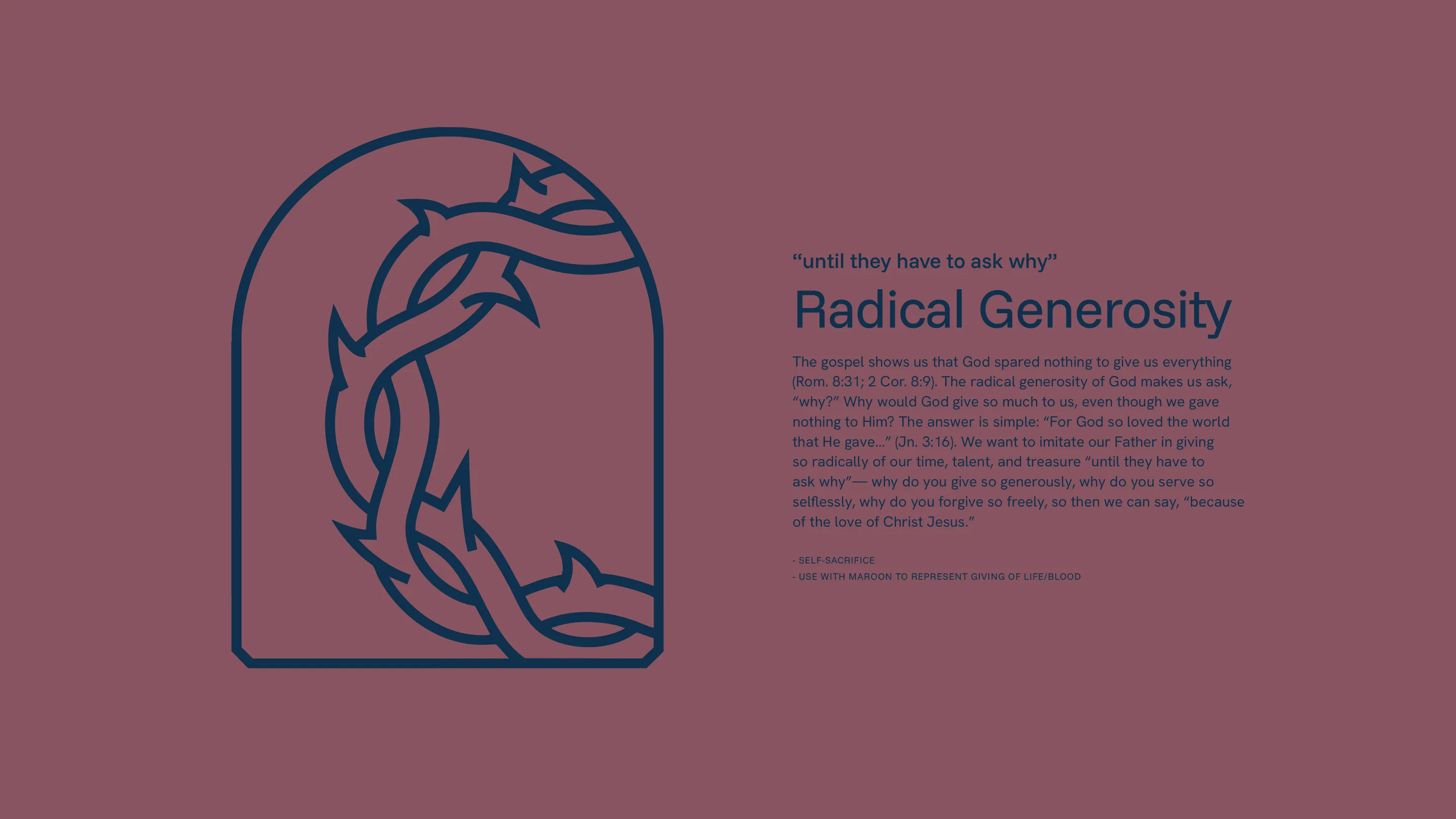
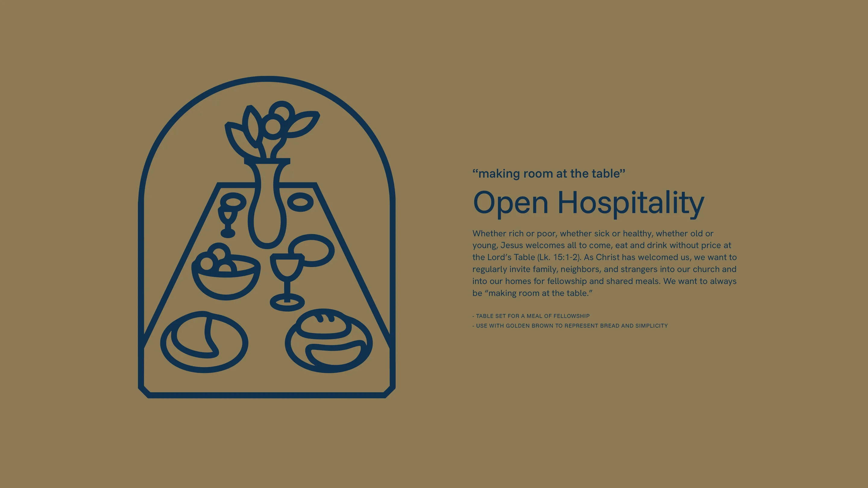
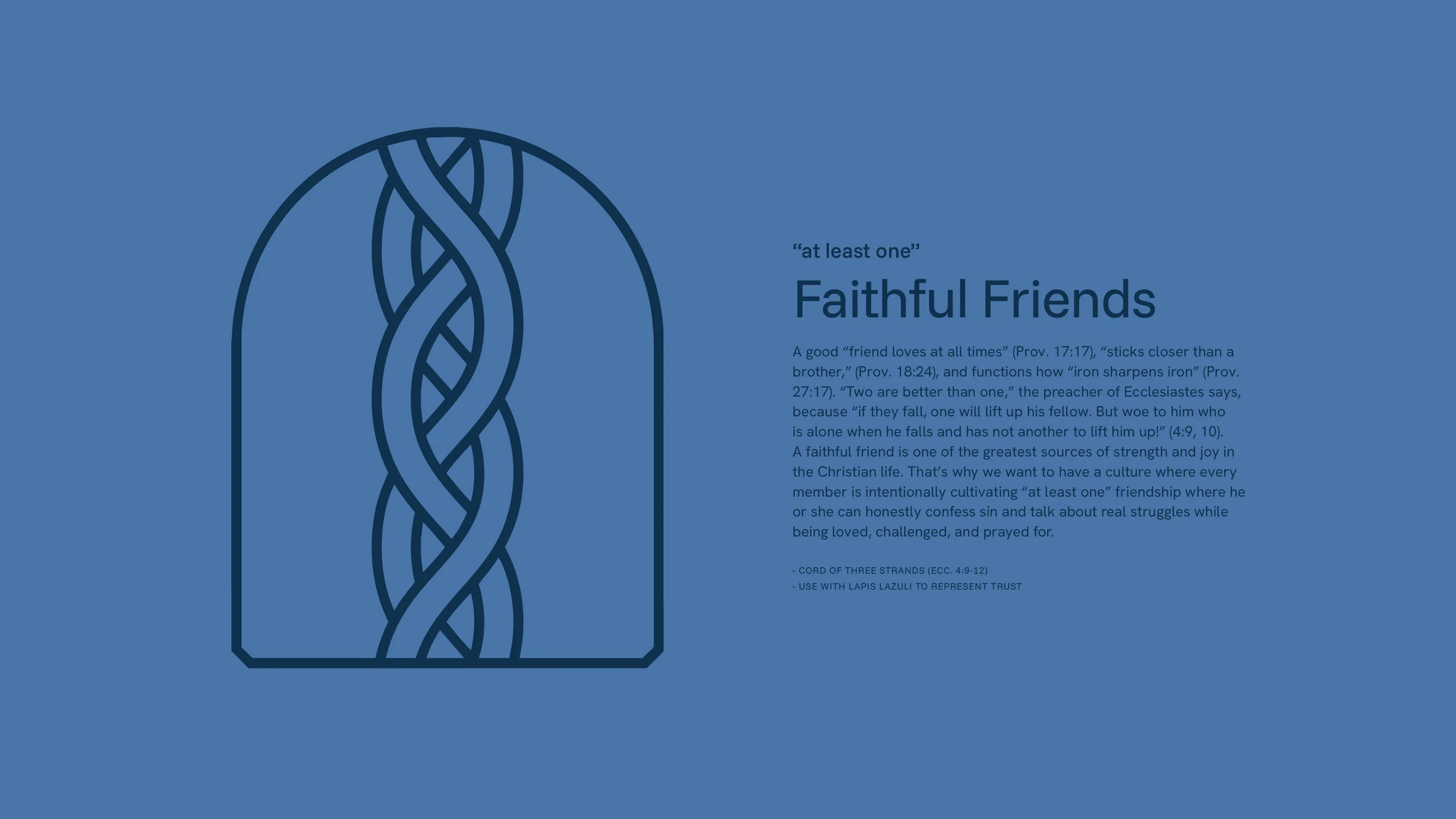
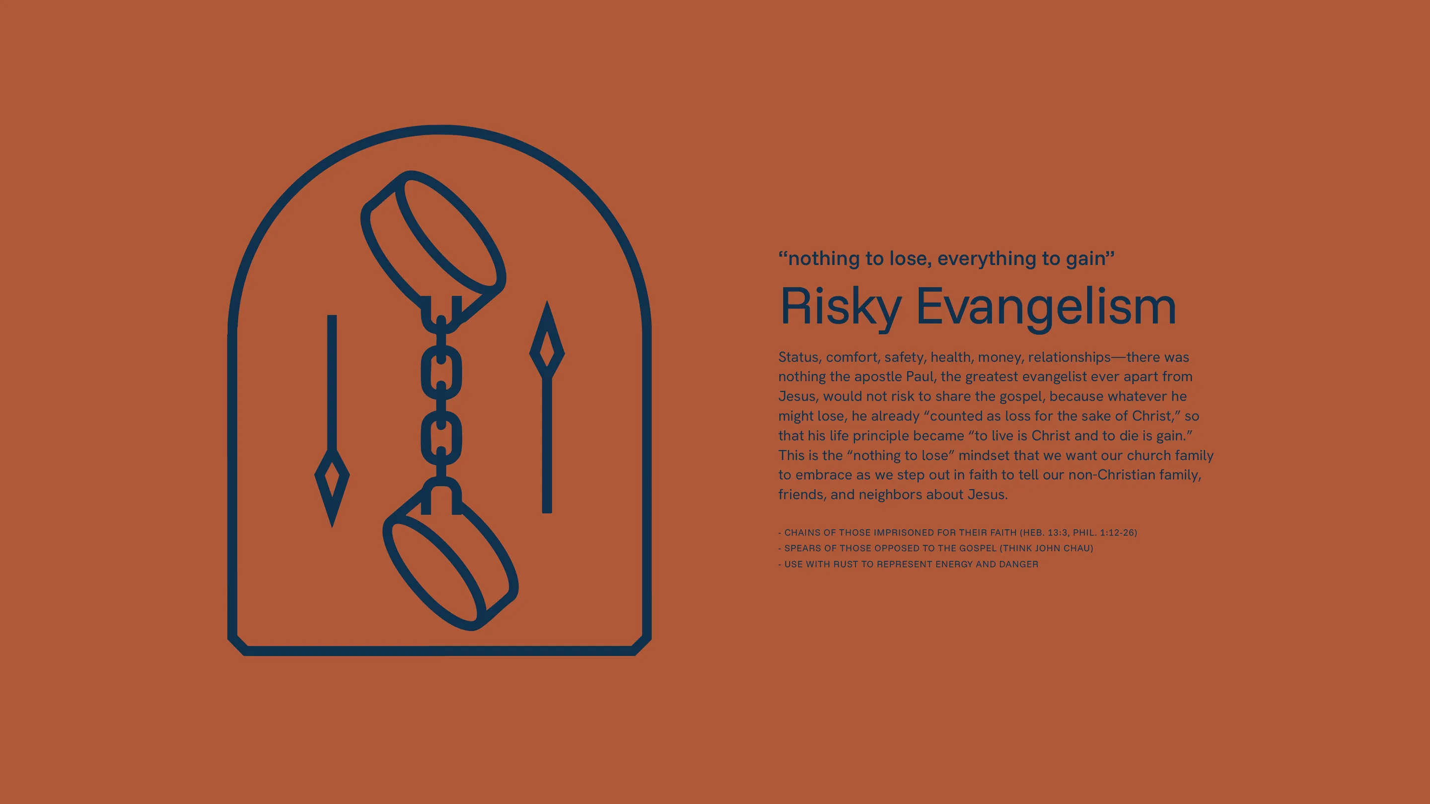
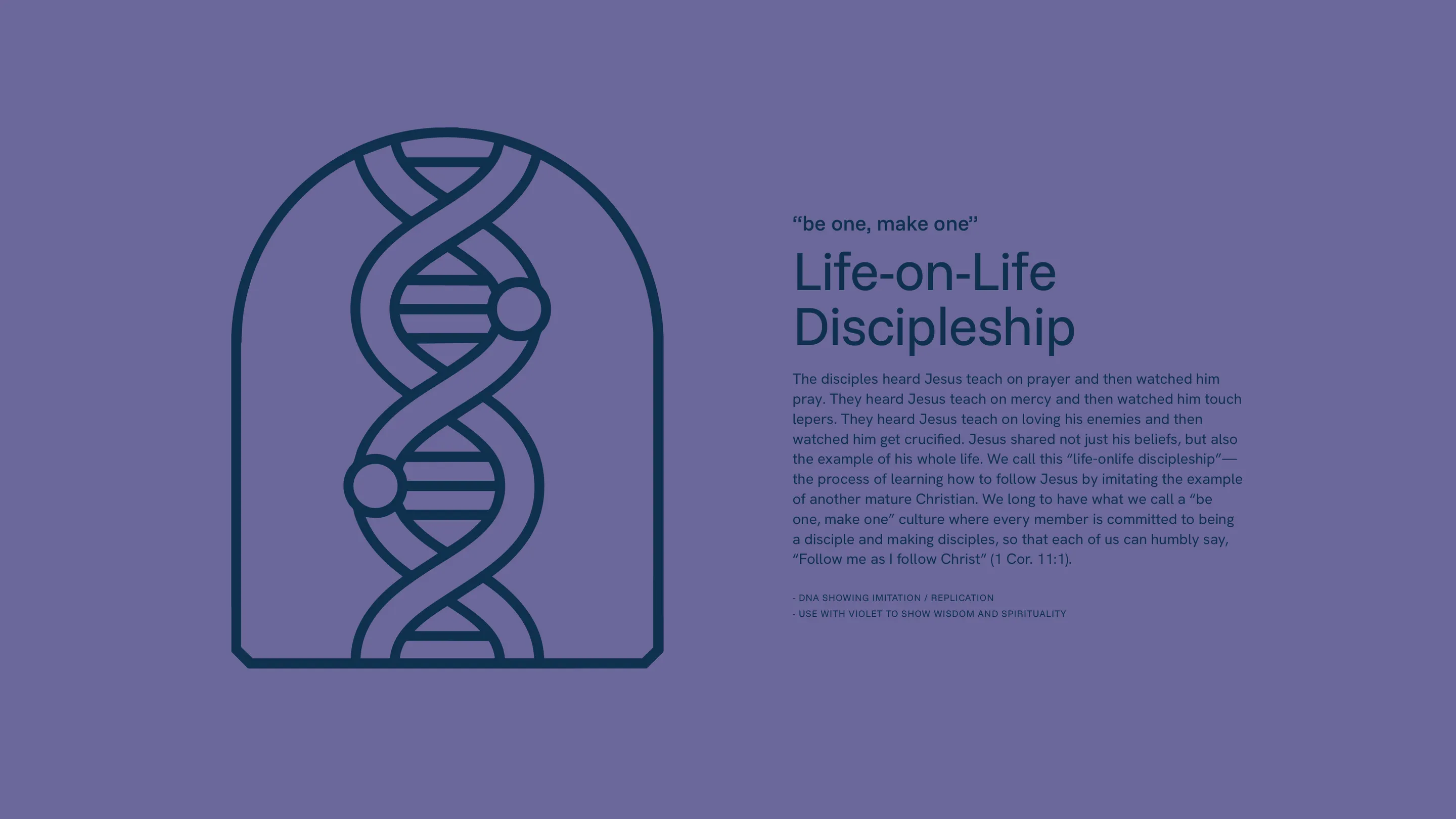
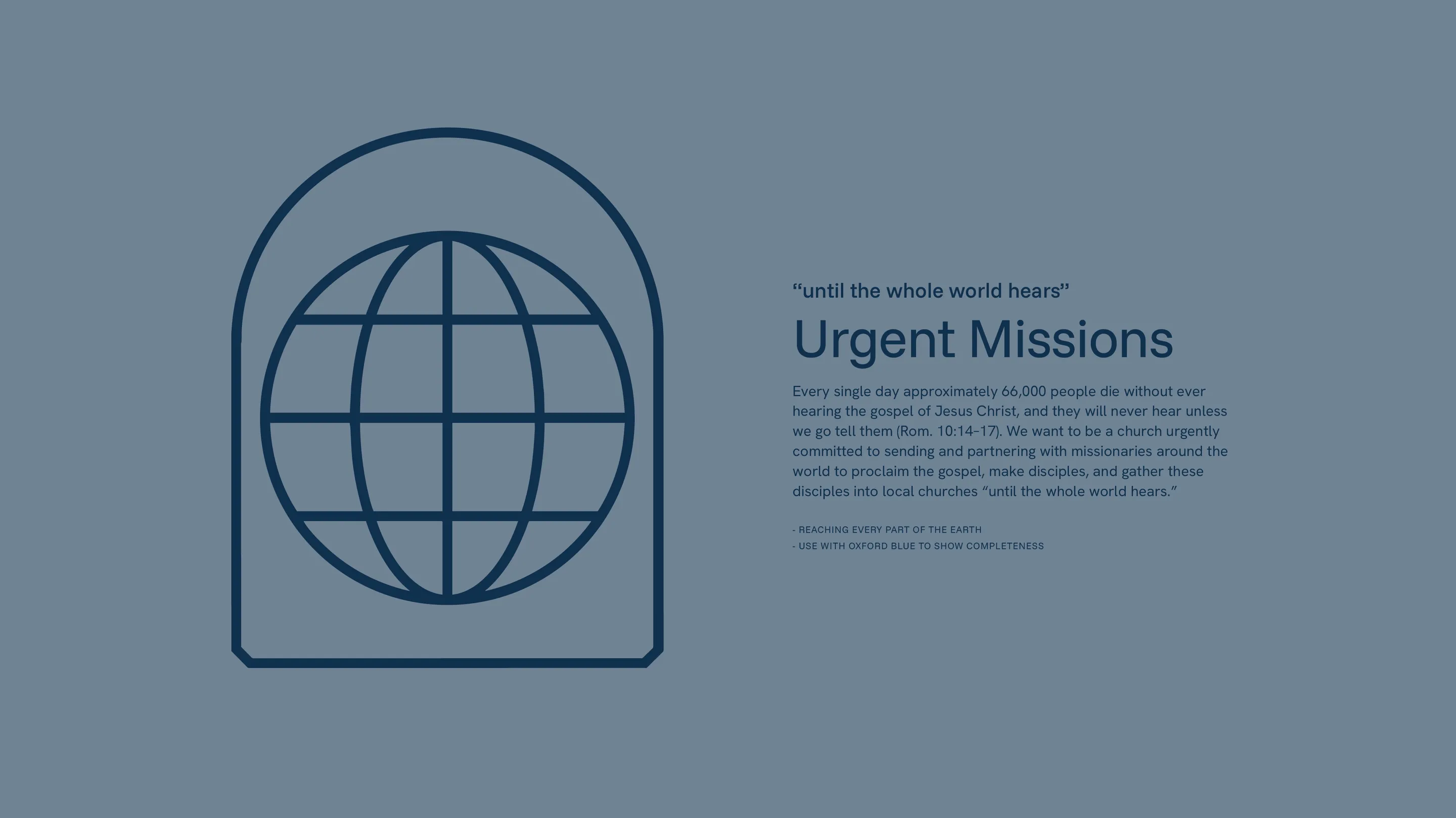
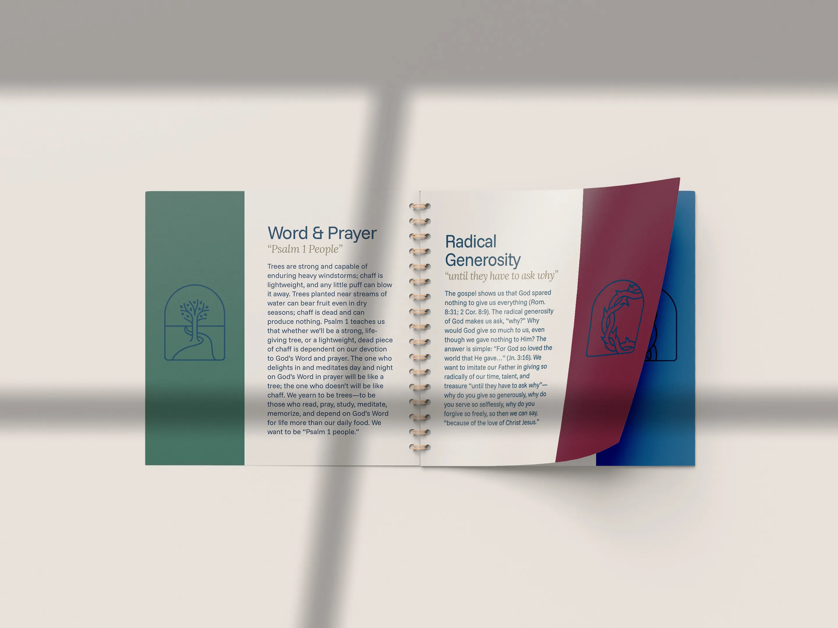
A key visual motif also emerged during our brand development process with First Baptist Aurora: the arch.
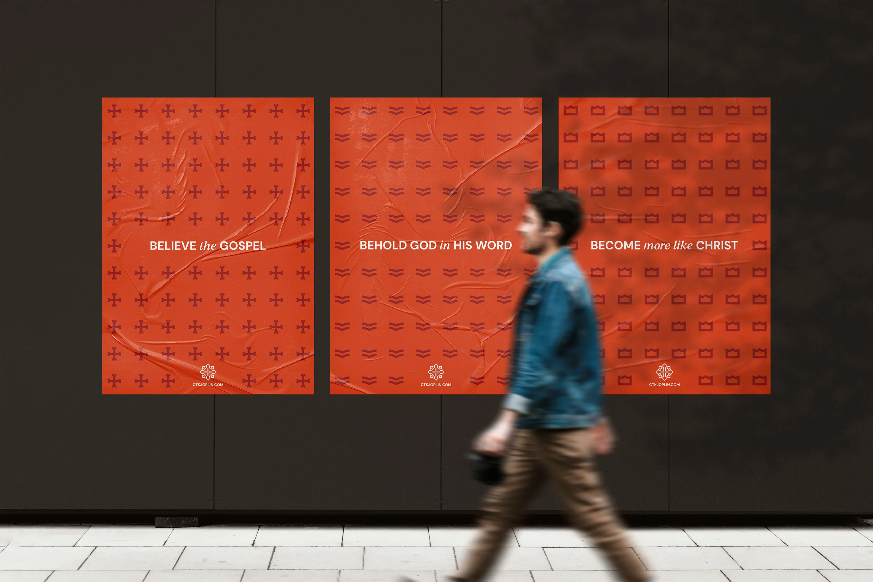
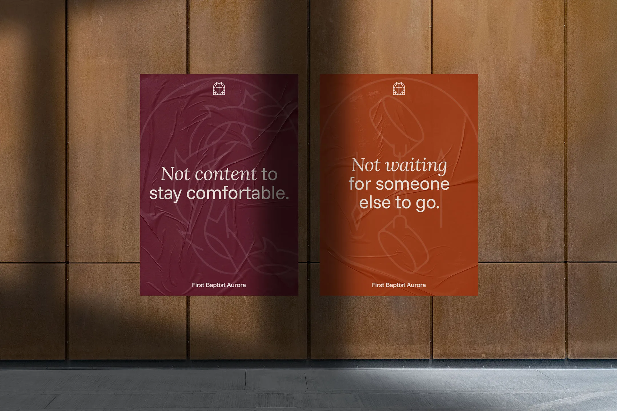
Inspired by the architecture of the stained glass windows and building interior, the arch became a unifying design element across the entire identity. It appears in the logo, image masks, text paths, and a custom set of icons for the church’s core values. This simple shape created visual cohesion and carried the historic-modern tension throughout the brand.
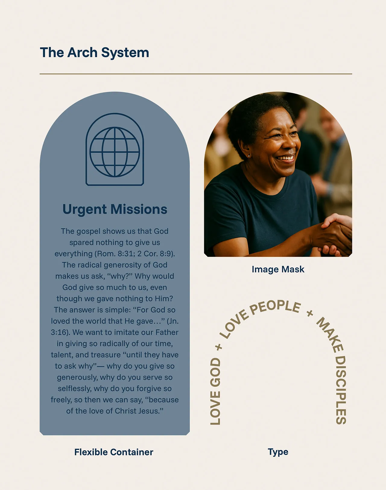
We then took the church’s eight core values and transformed them into meaningful, elegant pictograms that would play a key role in the overall brand. These pictograms could be used on anything, reminding the congregation of their identity week in and week out.
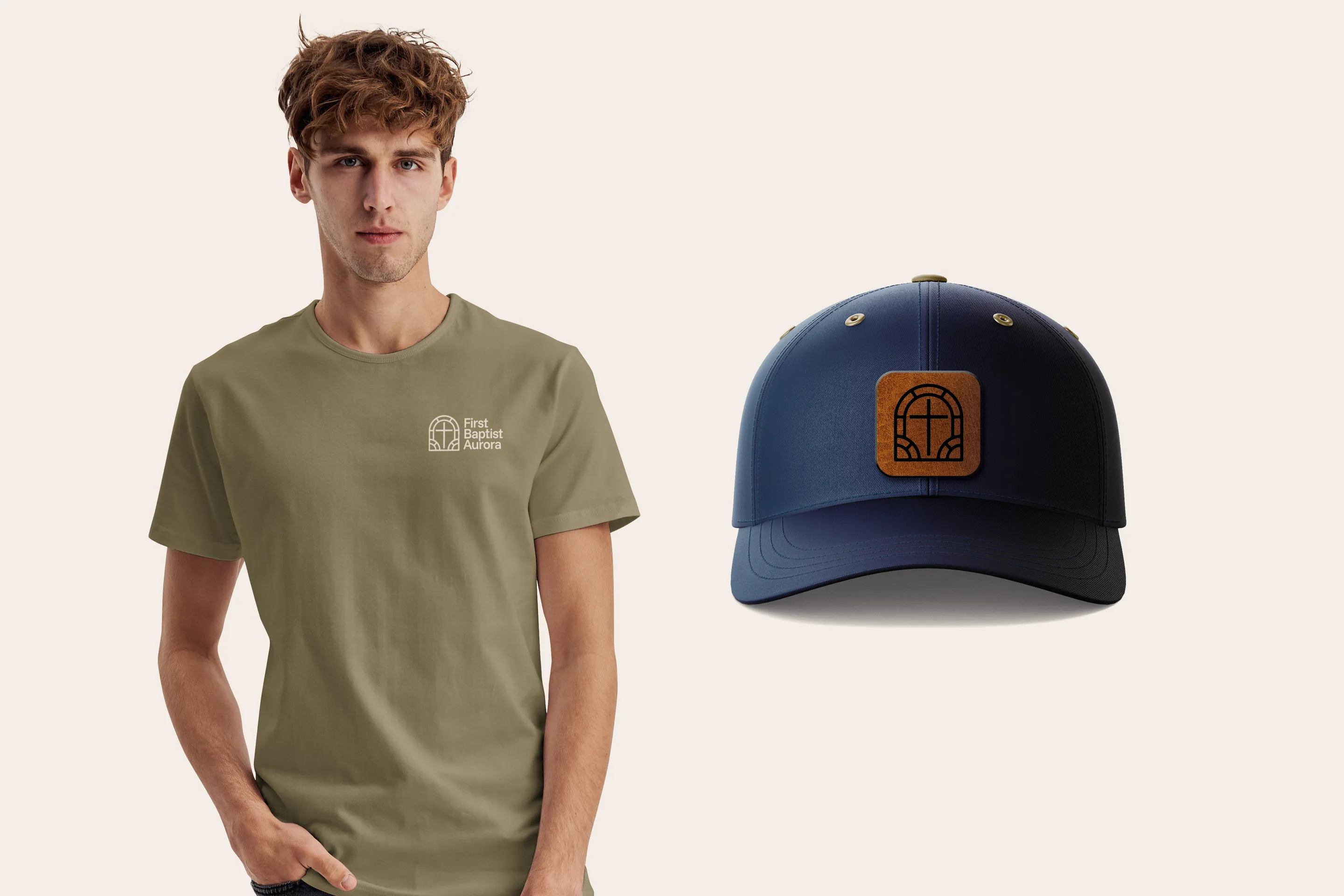
With the new identity in place, the church now has a cohesive and meaningful visual system that reflects both their legacy and their renewed mission. I delivered a full set of brand guidelines, logo animations, and social media assets so the team could implement the new brand immediately and confidently.
Today, First Baptist Aurora is not only growing in numbers but in clarity of purpose and identity. Visitors are able to connect more quickly, and the leadership now has the tools they need to integrate newcomers and build momentum for the future.
Braden did EVERYTHING for us — logo, color palette, fonts, core value graphics, brand guidelines, website, connect cards, bulletin, ministry team handbook, and more!
From conception to execution, through every revision, he faithfully labored until our church was ready to launch into its next chapter.
When you choose Restore Graphics, you’re not just hiring a gifted and competent designer — you’re partnering with someone who wholeheartedly loves Christ, Scripture, and the local church. Braden has our highest recommendation!

Take the first step and answer a few questions about your church.
It only takes 90 seconds.