Walnut Street Baptist Church

Walnut Street Baptist Church was the most historical and missional church in their city, but their logo was stuck in the early 2000's. Now they're able to honor their long heritage and reach key demographics in their city.
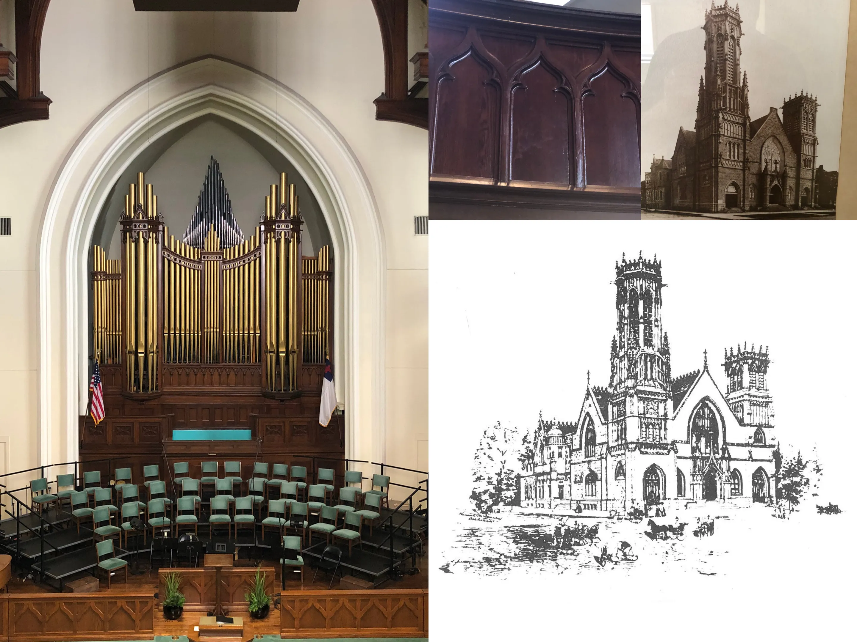
The aesthetics of the rebrand were important to the WSBC branding team, so I worked with them to match the historic, refined, and classy look of the church building.
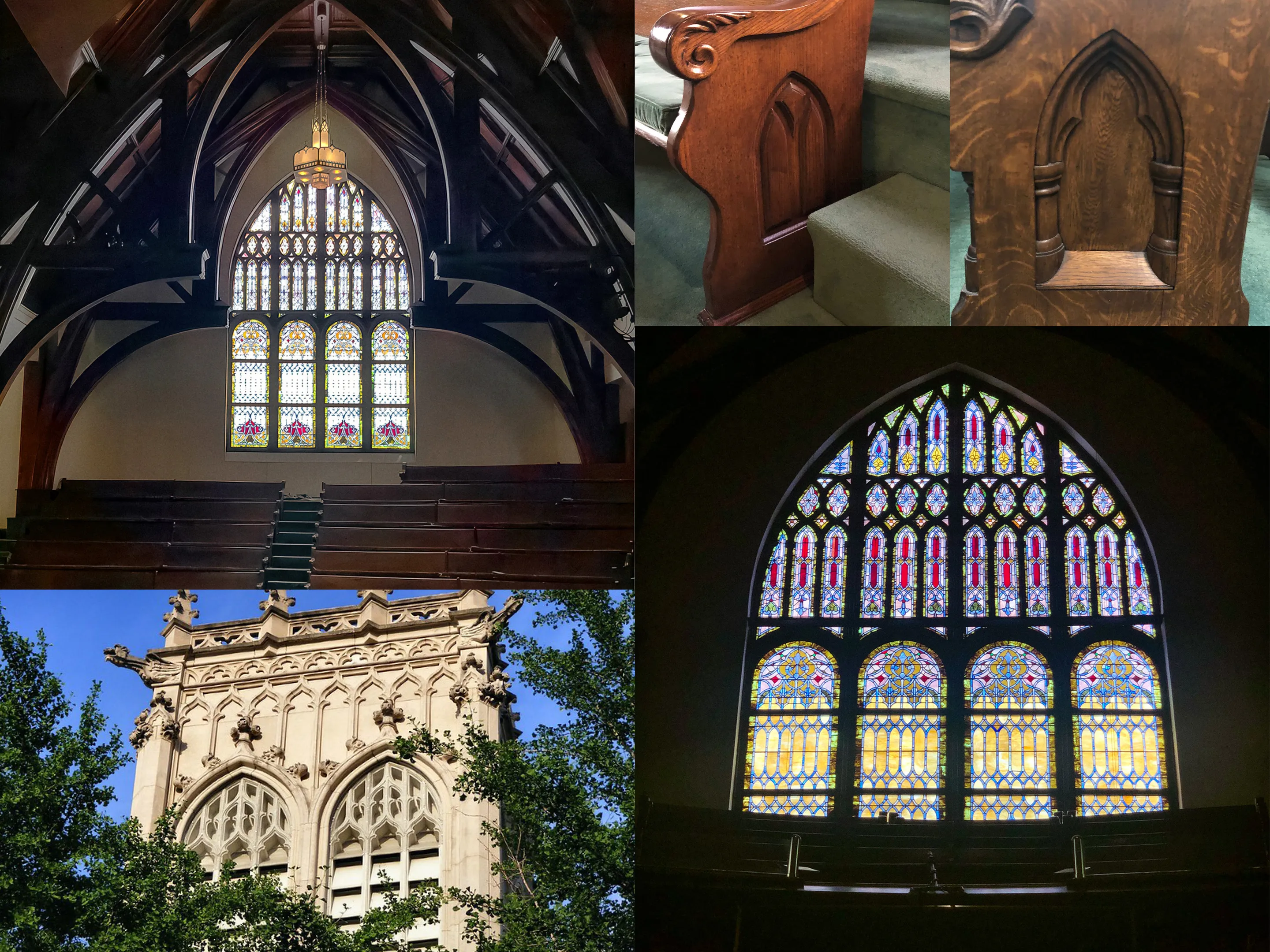
Together with the rebrand team, I looked at modern photos of the interior, exterior, and historic illustrations of the building. Two of those prominent features of the church were its arching stained glass window shapes and its iconic bell tower. These were shapes and ideas I played with in the initial logo concepts and sketches.
Louisville is home to The Southern Baptist Theological Seminary, which meant that seminary students were a key part of the target audience for this rebrand. That said, it was essential to resonate with longstanding members of the church as well.
In the final stages of logo development, there were still four options left. The rebrand team chose this logo from among the other options for a few reasons.
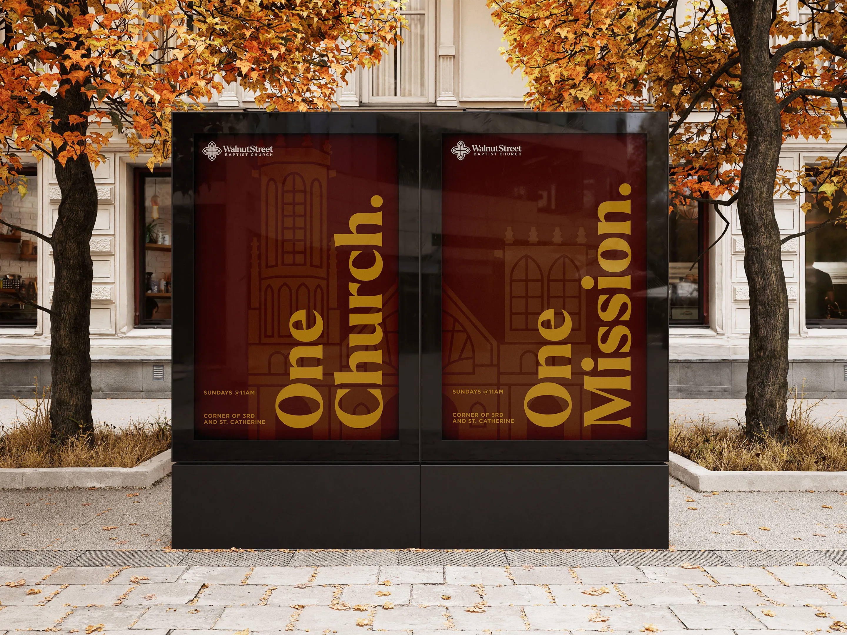
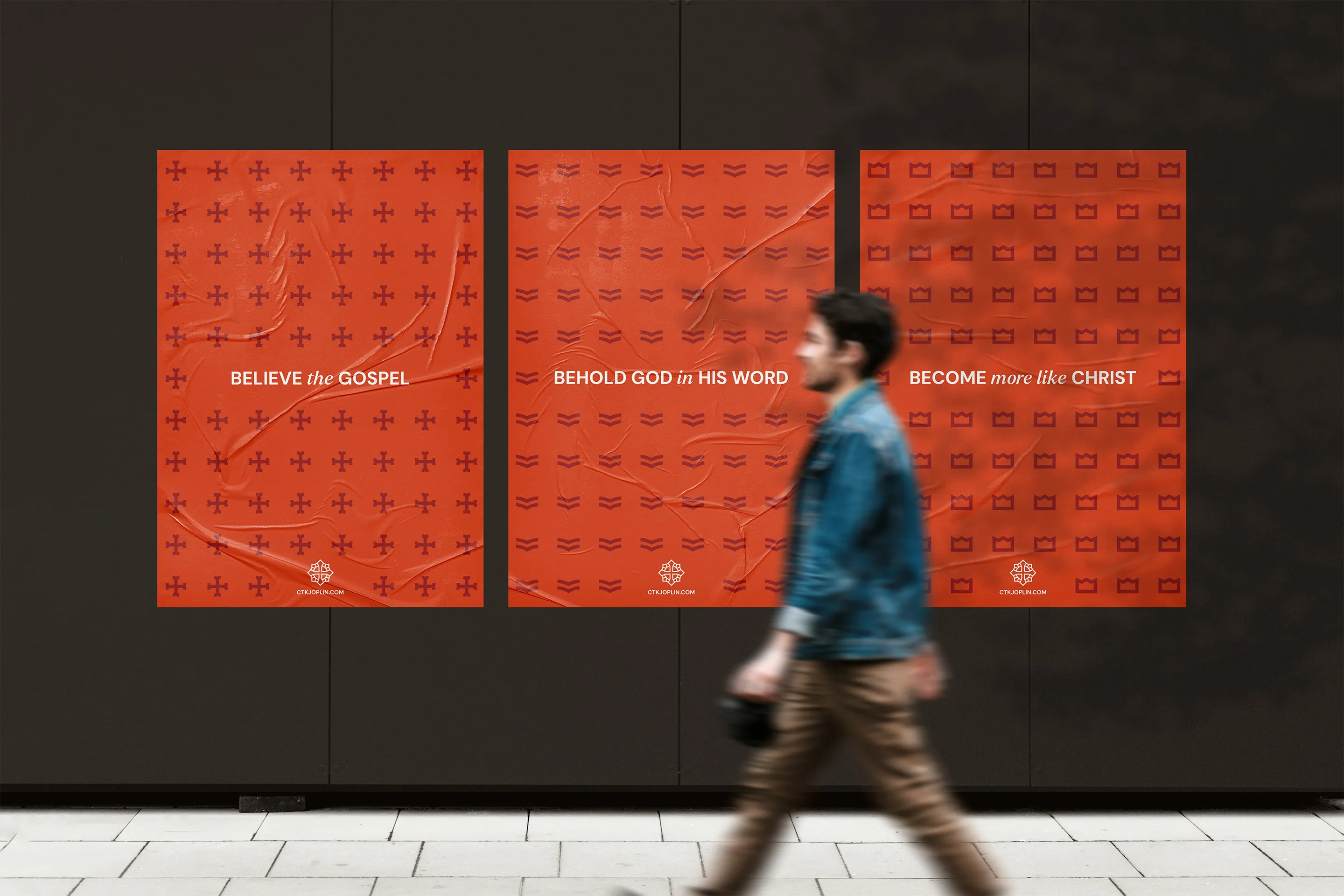
A goal of this rebrand project was for the the church logo to look comfortable and confident in both historic environments like the church building and in urban contexts like much of downtown Louisville.


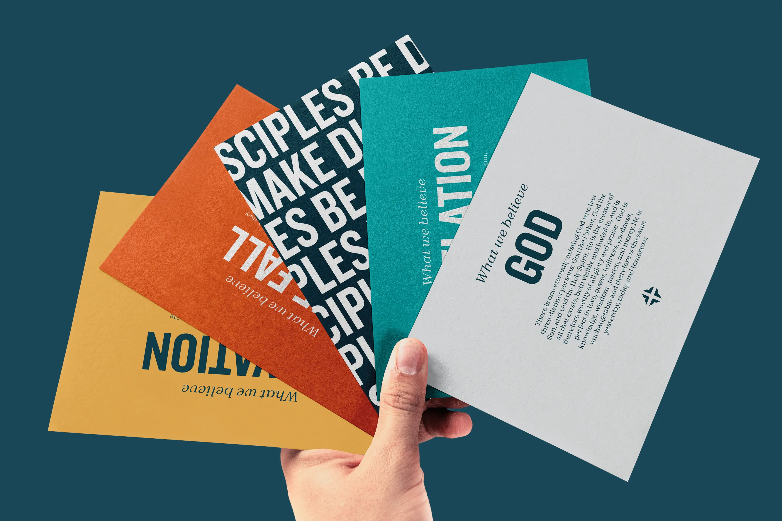
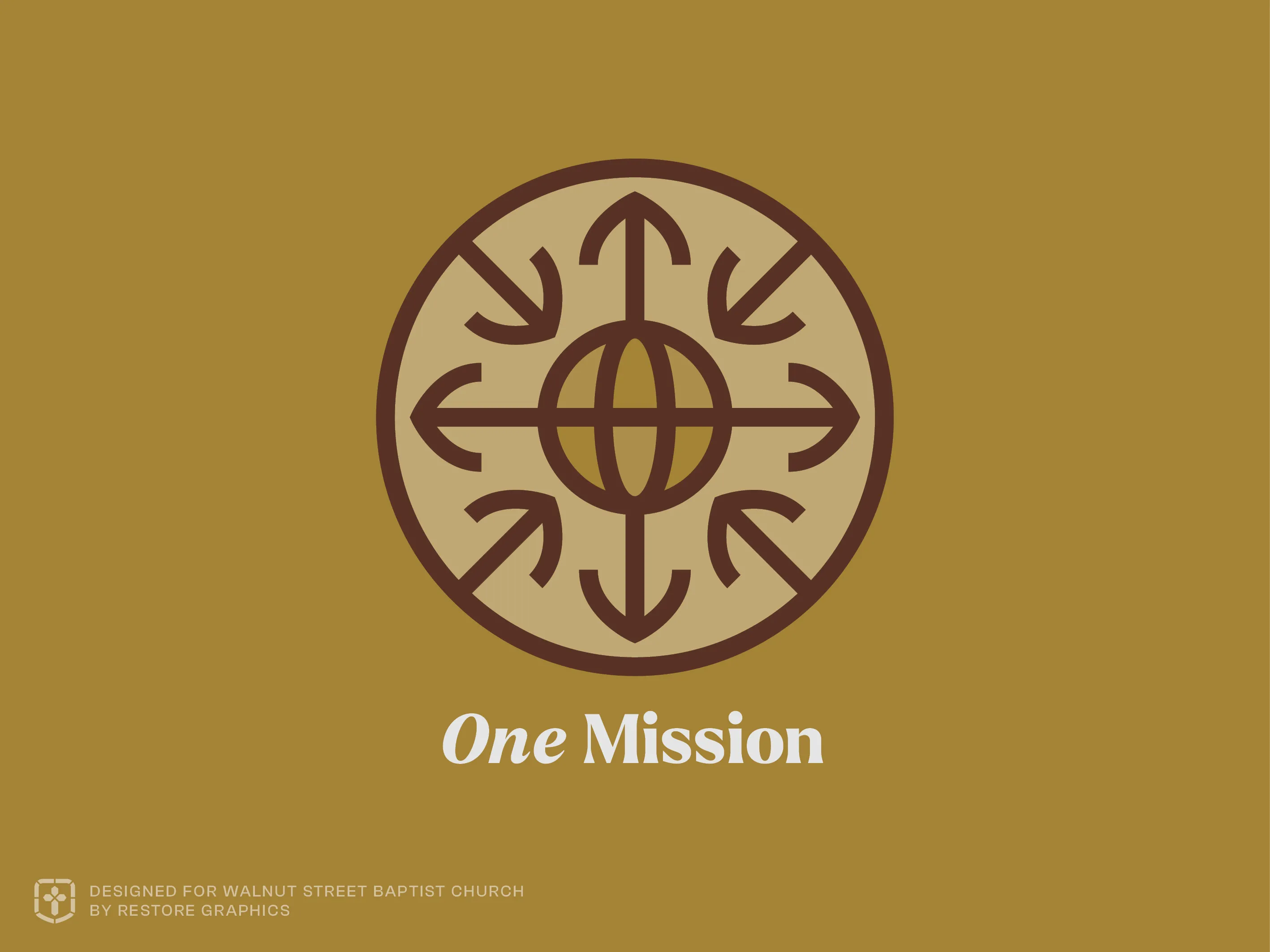
The two central pillars of WSBC were summed up in its vision statement: "One Church. One Mission." To visualize those ideas, I designed two pictograms as an extension of the church identity system.


Our leadership team really appreciated how Restore Graphics took the time to learn and understand our church's unique heritage, personality, and character.
Braden and his team created beautiful designs that not only look amazing, but also contain unique symbolic elements that help us communicate our church's heritage, culture, and vision. Our church quickly embraced our new logo because it was clear that it was created specifically for us.
Braden was prompt, helpful, kind, and easy to work with throughout the entire design process. I can't recommend Restore Graphics enough.

The church's branding team made an excellent choice to lean on the long-standing, well establised legacy of Walnut Street Baptist Church. With that as the foundation, the new logo and brand was positioned to serve the church well for decades.

Take the first step and answer a few questions about your church.
It only takes 90 seconds.