Gashland EPC

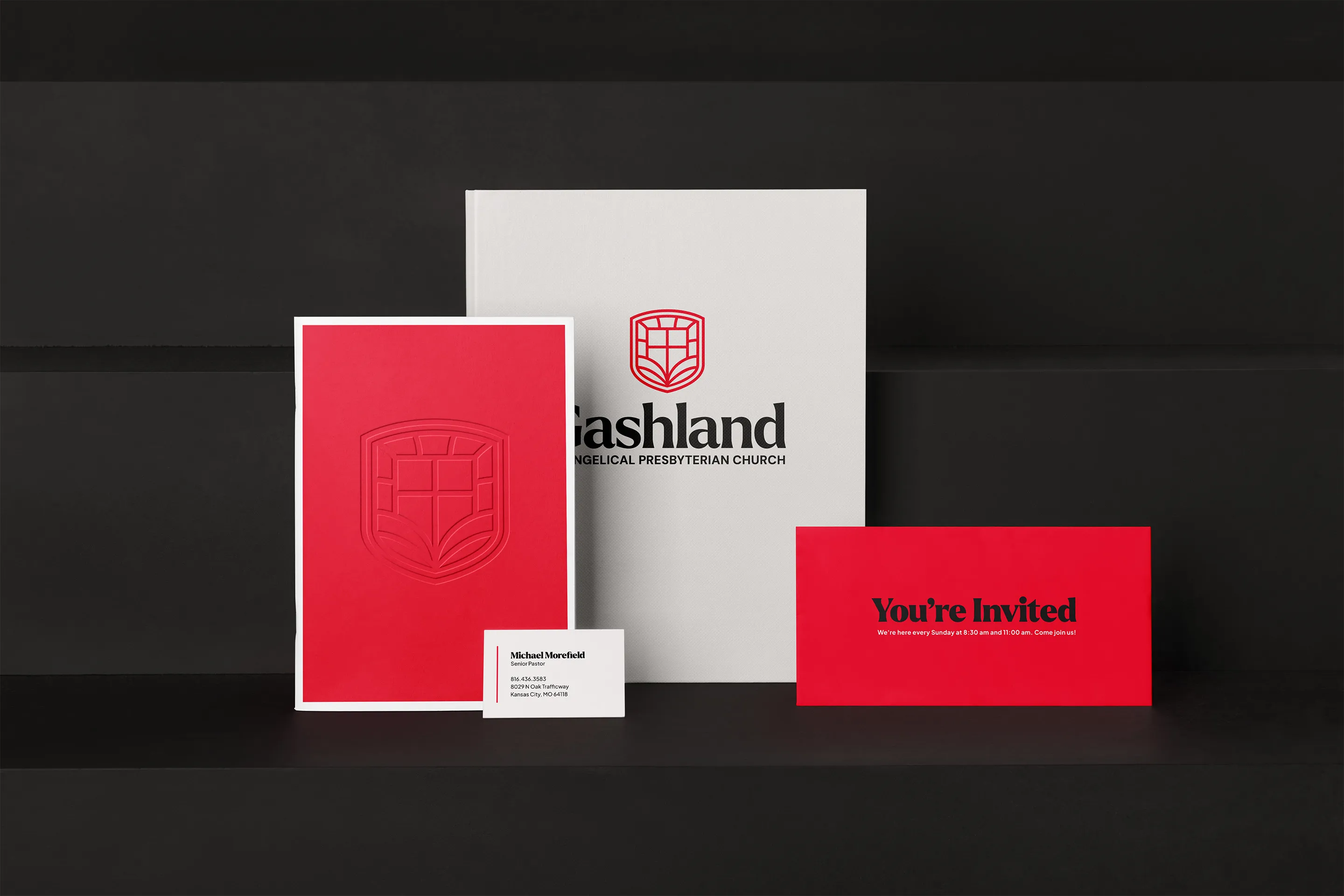
Gashland Evangelical Presbyterian Church had visuals and branding that didn't fit who they were. Using a context-based rebrand process, we created a new brand identity that points to their authentic, purposeful, and gospel-centered vision.
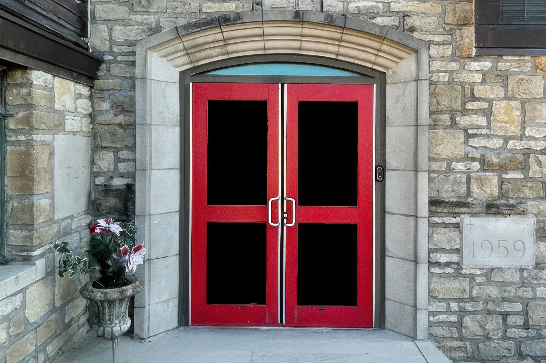
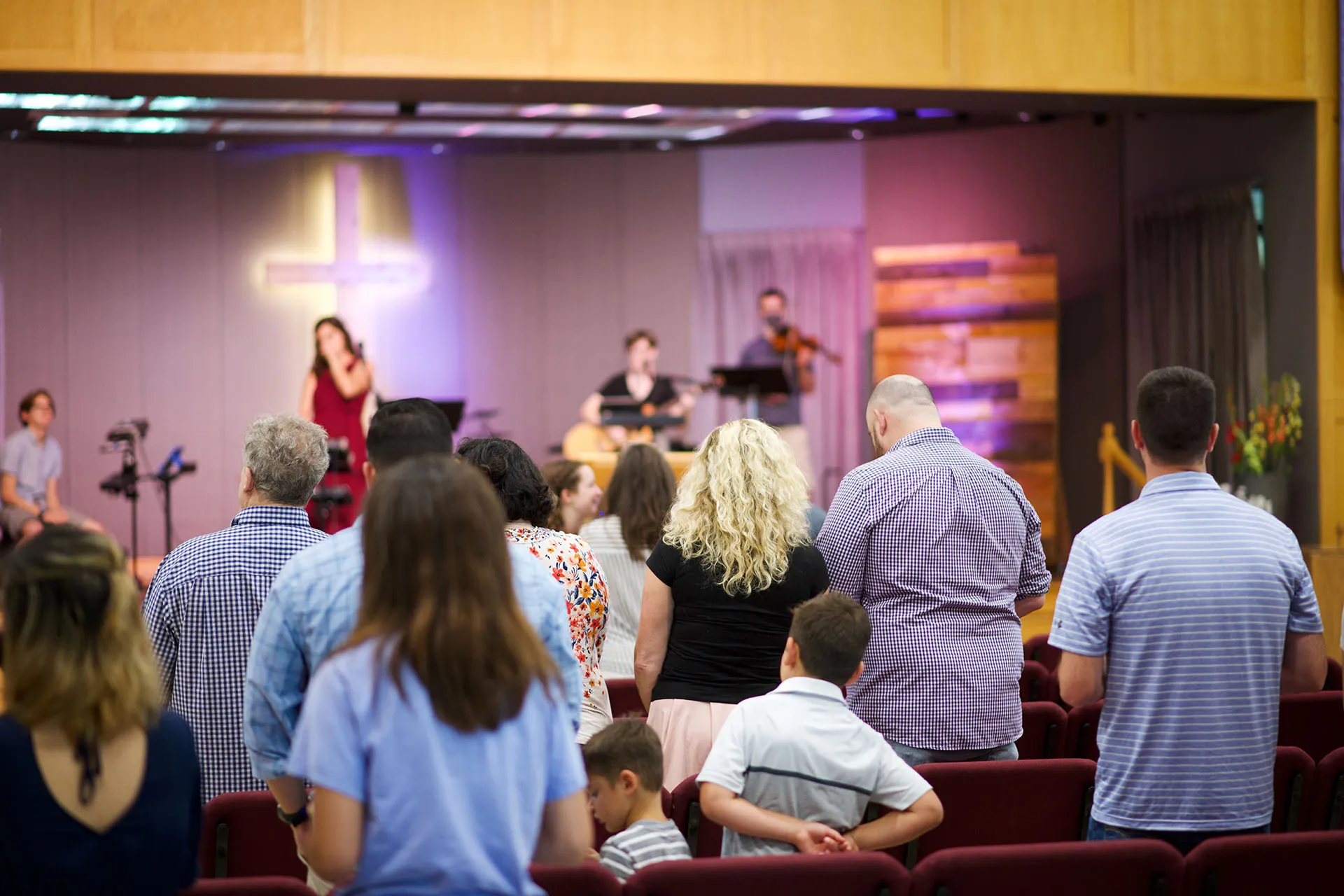
Gashland EPC had a few key elements that we identified as being core to their church identity:
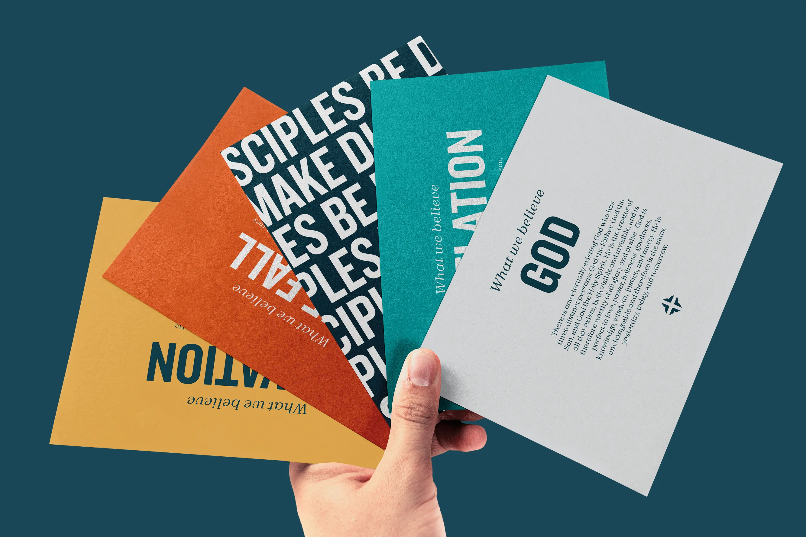
These things made Gashland a unique church in their community. We worked together over dozens of iterations to capture that core symbolism in a single mark that became the logo.
![]()
![]()
![]()
![]()
![]()
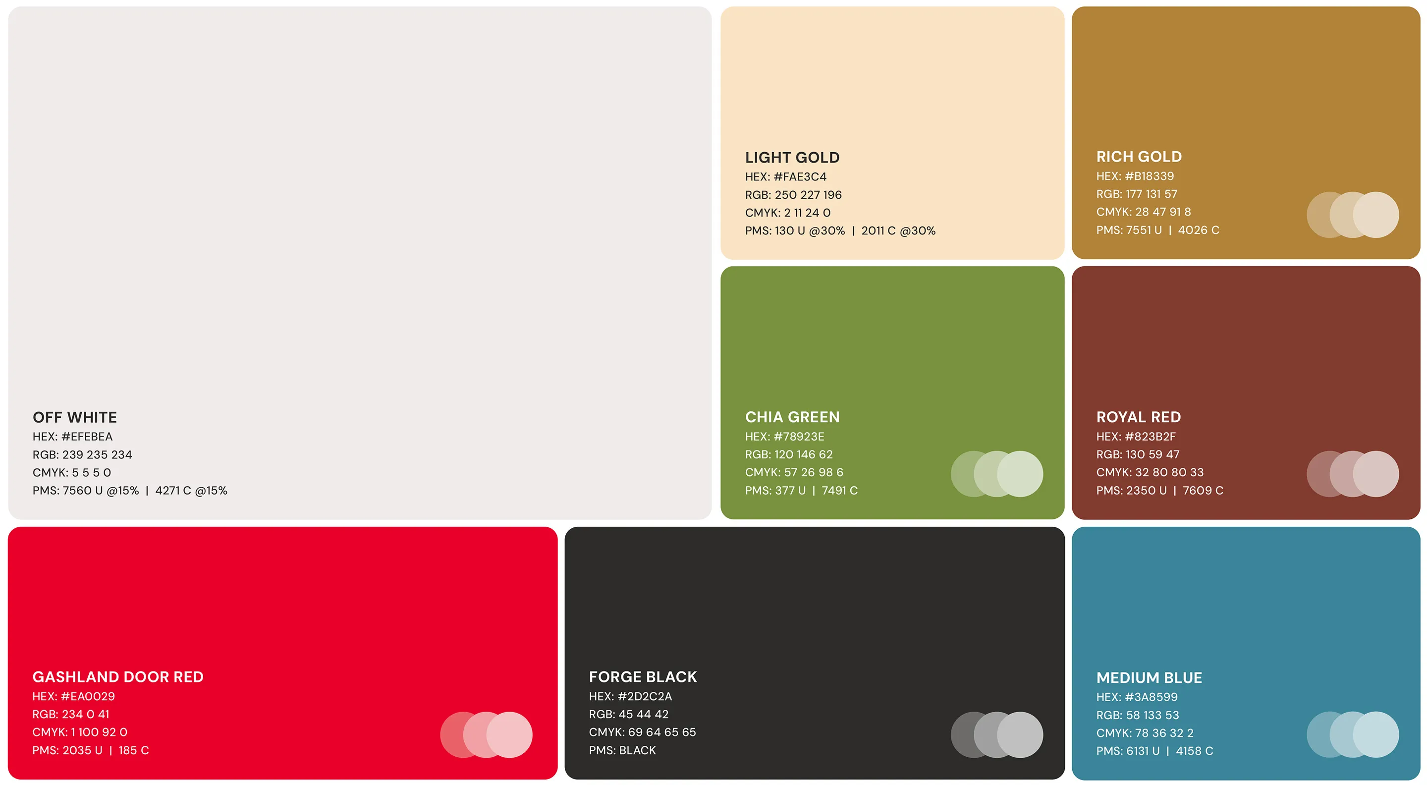
The Gashland color palette was a key element in expressing the warmth, modernity, and authenticity that defined their brand. Each color has been carefully selected to support these characteristics, creating a well-established, welcoming, and cohesive aesthetic.
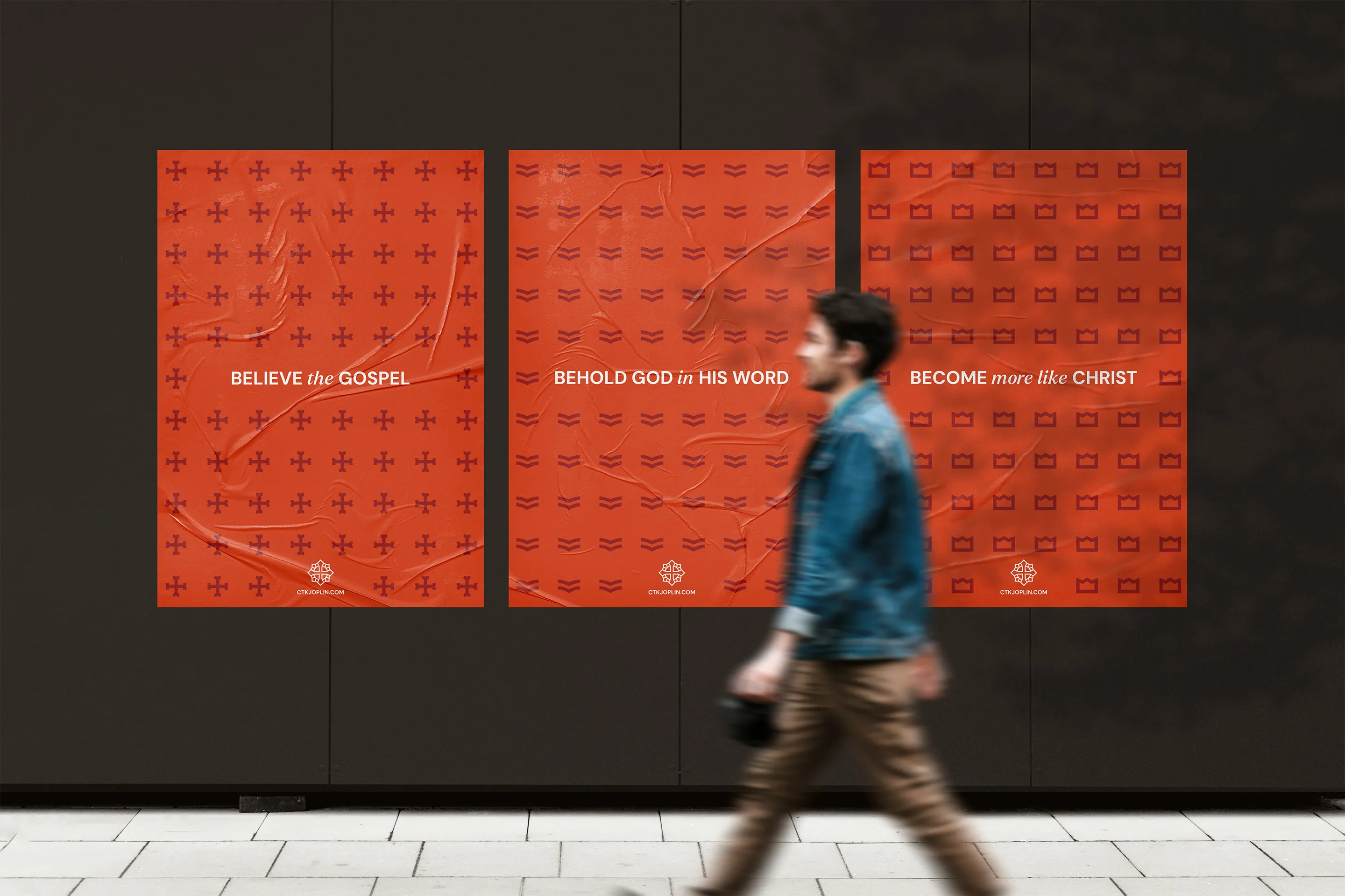
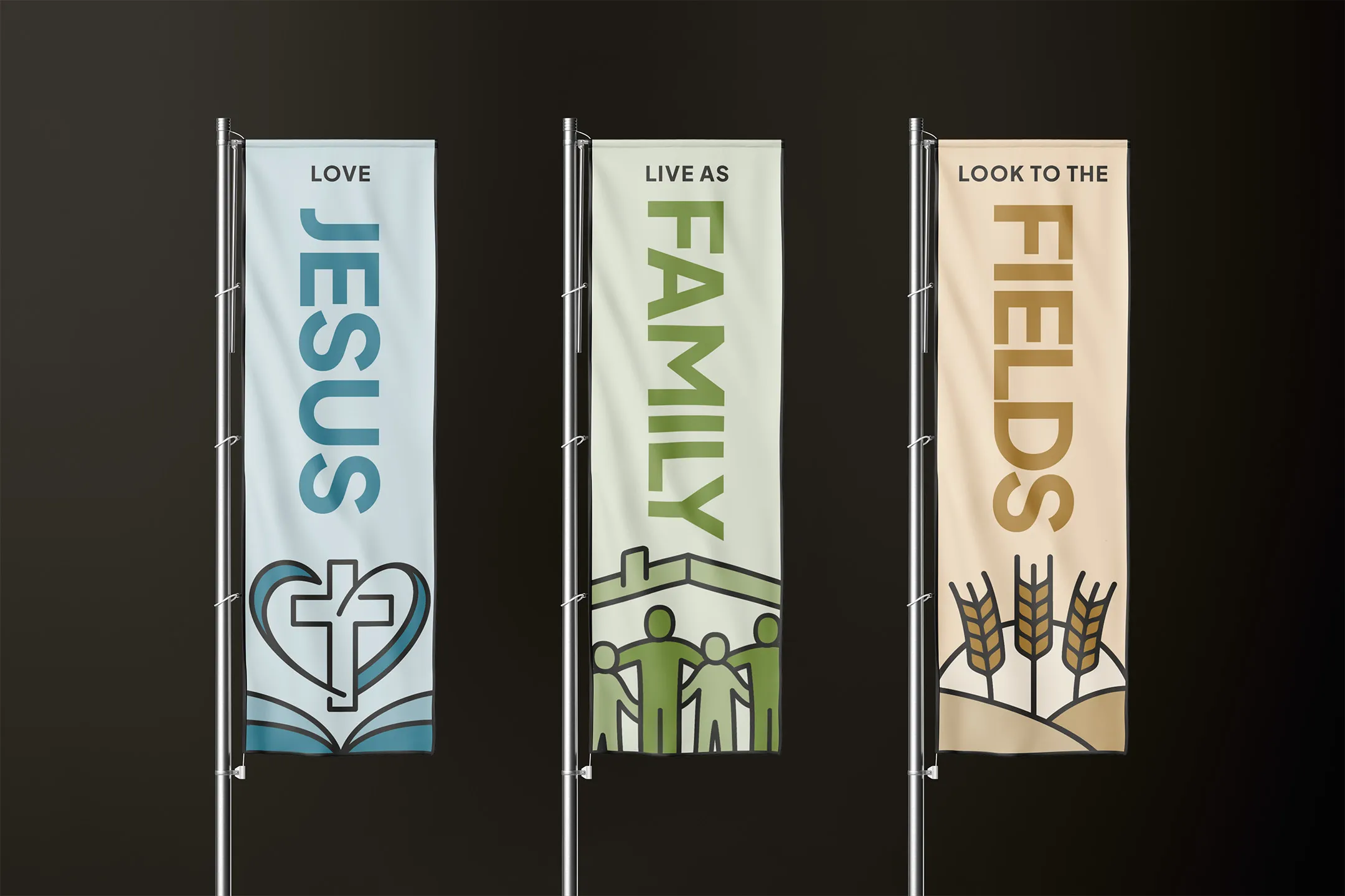
The Gashland vision statement is threefold: “Love Jesus. Live as Family. Look to the Fields.” We designed graphics around these three ideas to bring additional energy, color, and flexibility into the church brand.
Braden has been outstanding to work with. He takes the time to truly see and understand your church and the vision and then communicates them in a very powerful way. He is a very gifted designer, easy to communicate with, and provides an excellent finished product. We are super grateful for Braden and highly recommend him to anyone who is looking for a rebrand or graphic design help!

Take the first step and answer a few questions about your church.
It only takes 90 seconds.