Just last year, King's Cross Community Church was struggling with their identity. They tried to redesign their logo with Fiverr and it was a DISASTER.
A small Bible Church in Los Lunas, NM came to me in early 2024, looking to re-align their name and visual identity. The leadership of the church had a vision that involved kingdom perspecitve, warm community, and reverent worship. To help them plan out and acheive that vision, I took the KXCC's leadership through my time-tested church rebrand process.
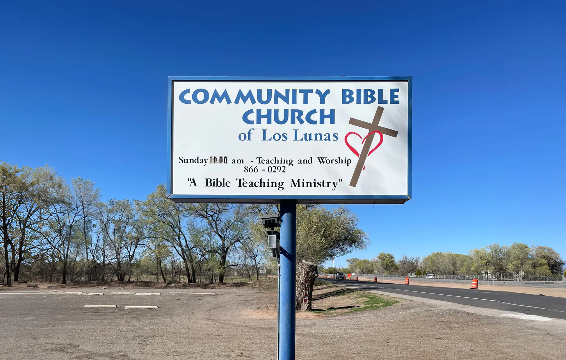
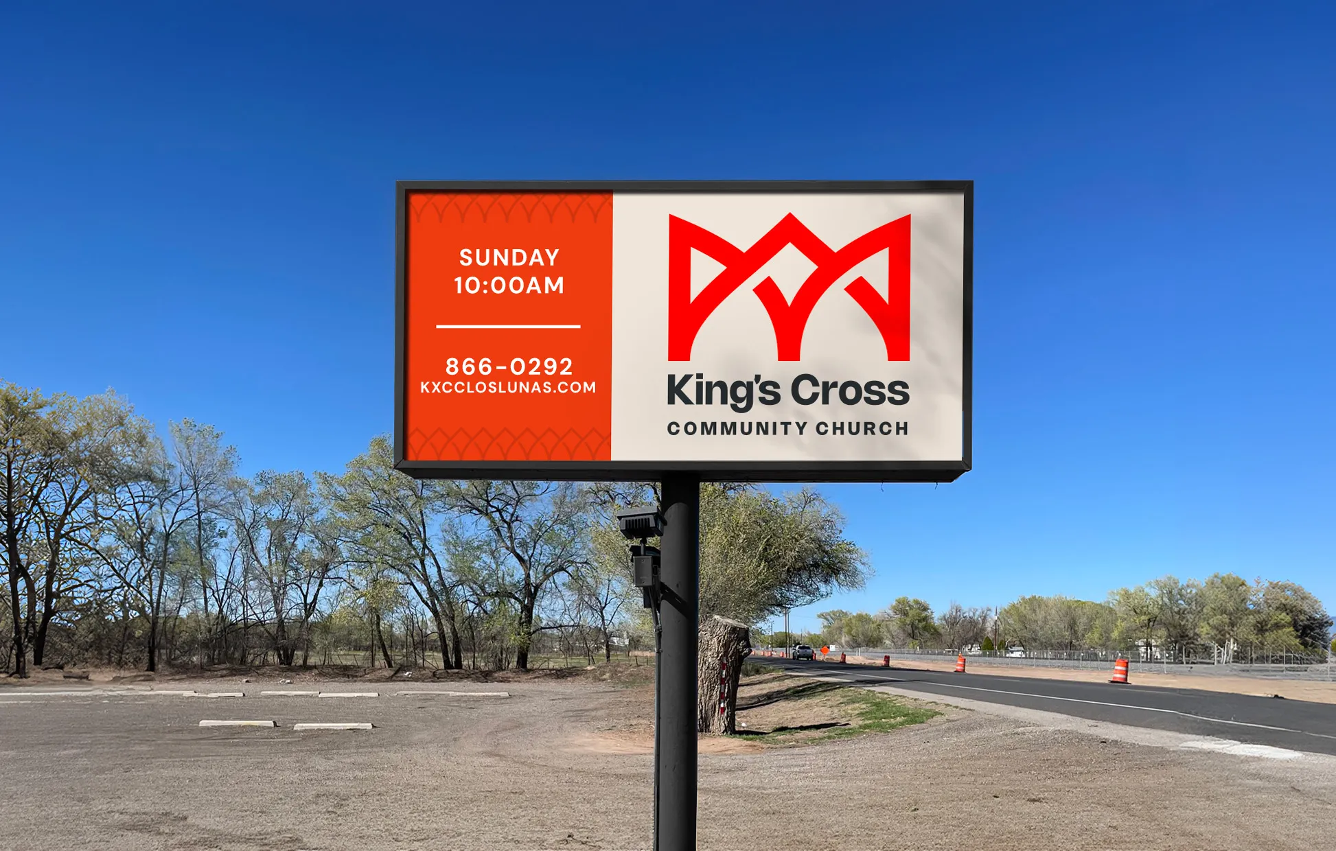
For the KXCC logo, I needed to represent its history, while emphasizing the vision that the pastor was casting for their congregation. This meant finding the fine balance between a mark that embodied their past identity and a mark that clarified their future.
The gentle curves and pointed intersections allow the logo to be used in a way that is elegant but approachable.
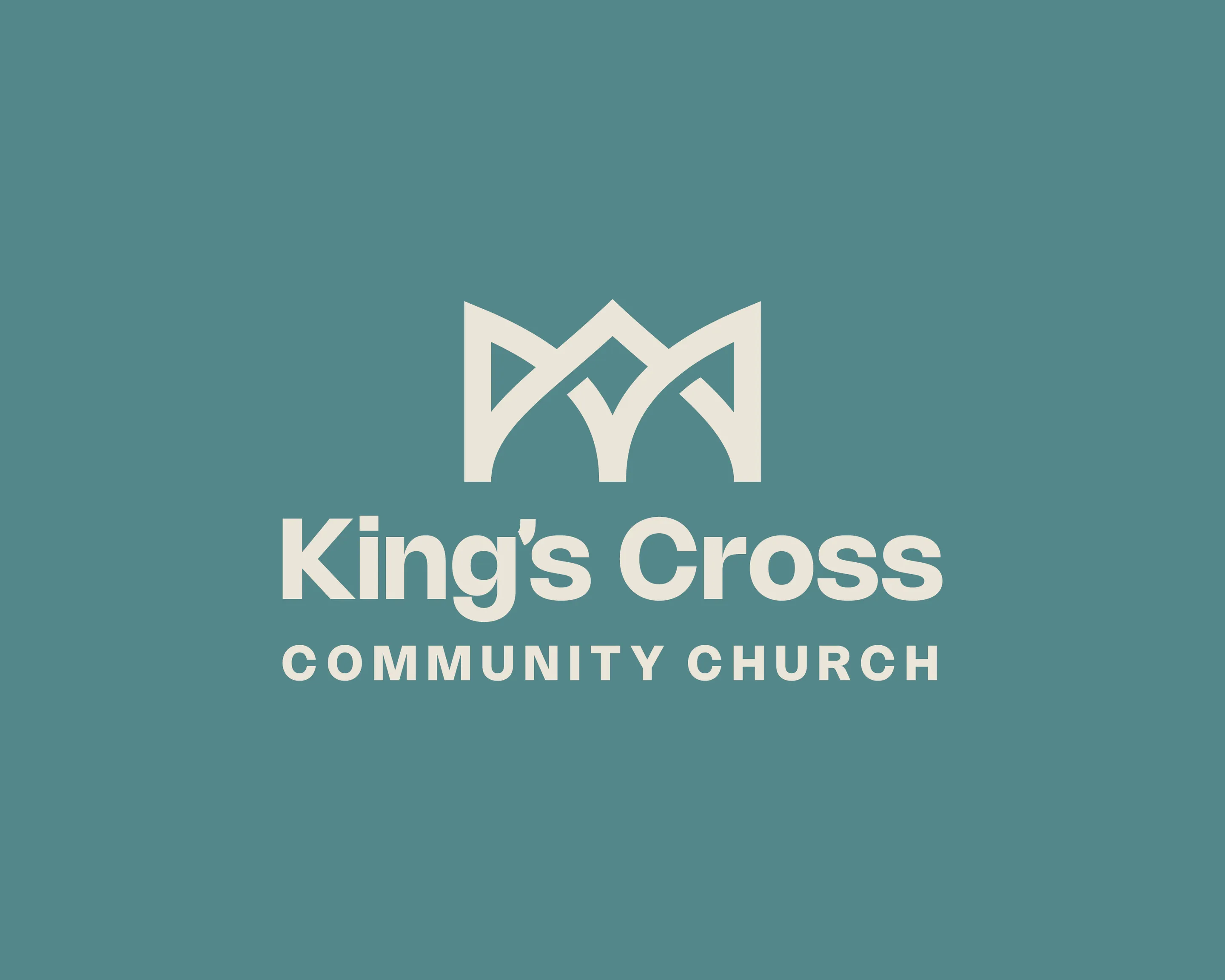
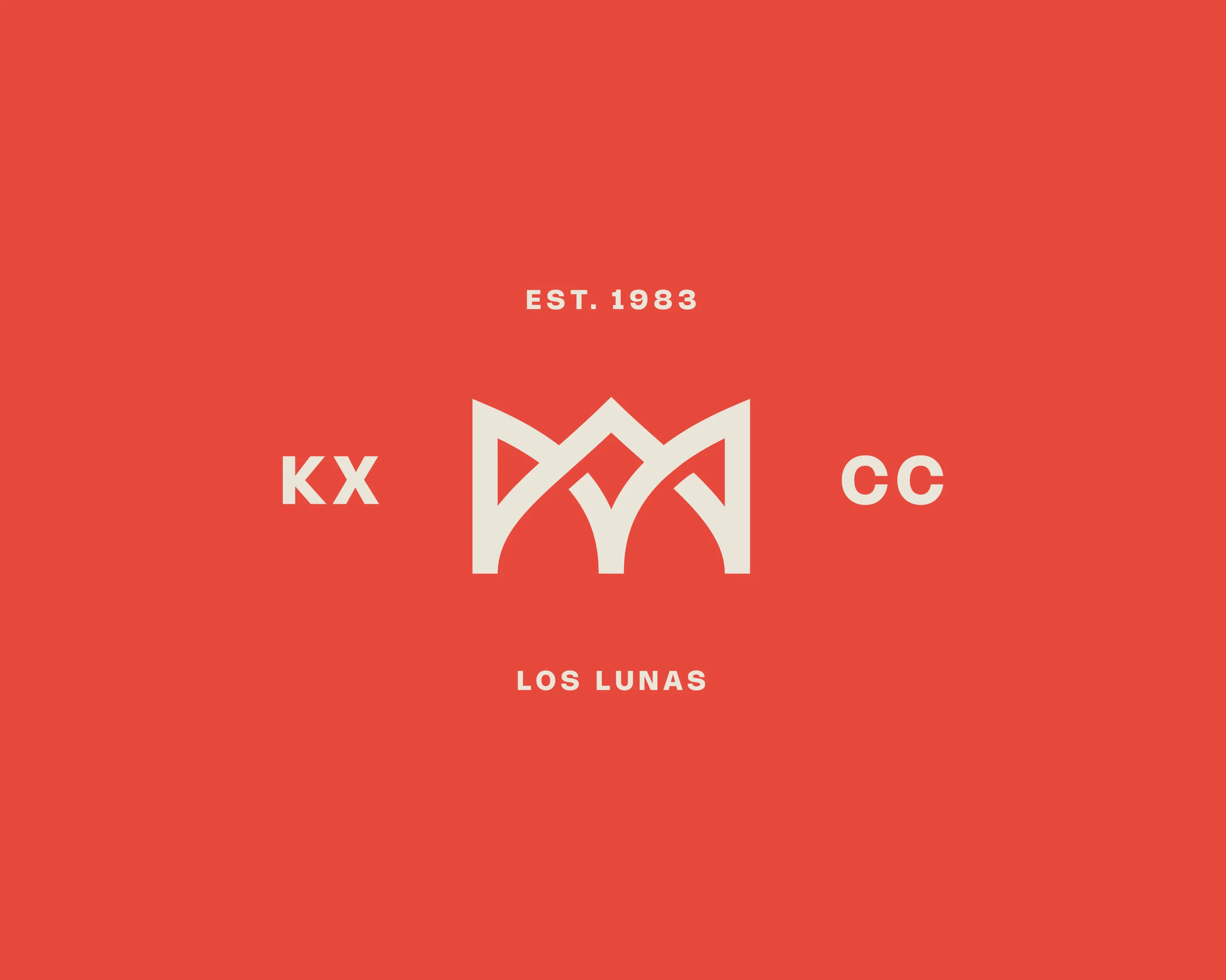
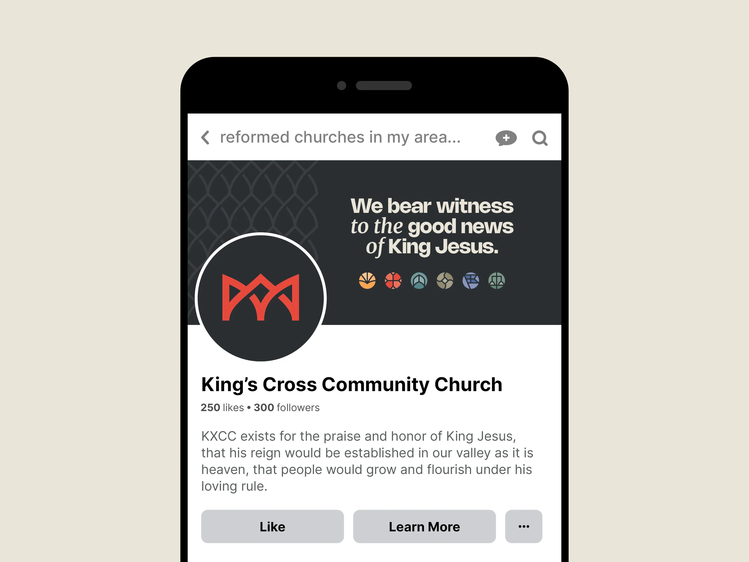
Church leaders wanted to emphasize the royal, timeless nature of Christian worship in both the primary and extended color palettes. I picked the main color that became King's Cross Red for its vibrance and historic Christian gravitas.
The secondary color palette was selected based on each of the six core pillars of the church, shown below.

![]()

Take the first step and answer a few questions about your church.
It only takes 90 seconds.