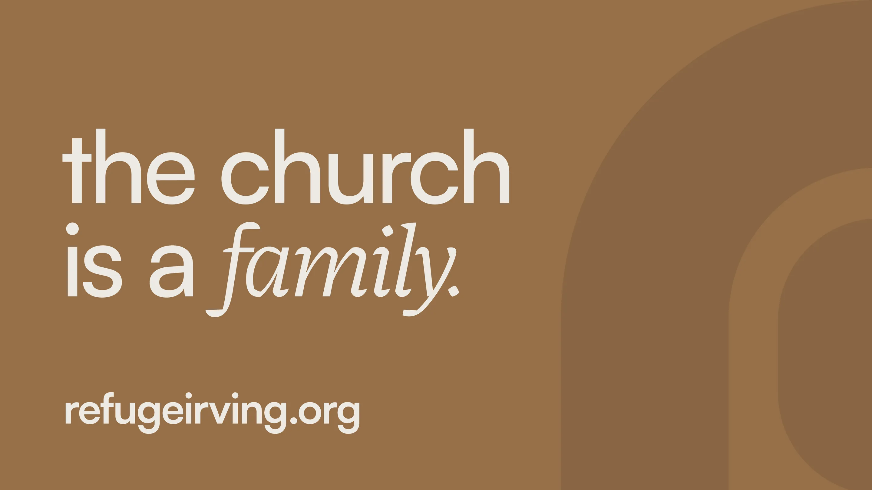
Refuge Church

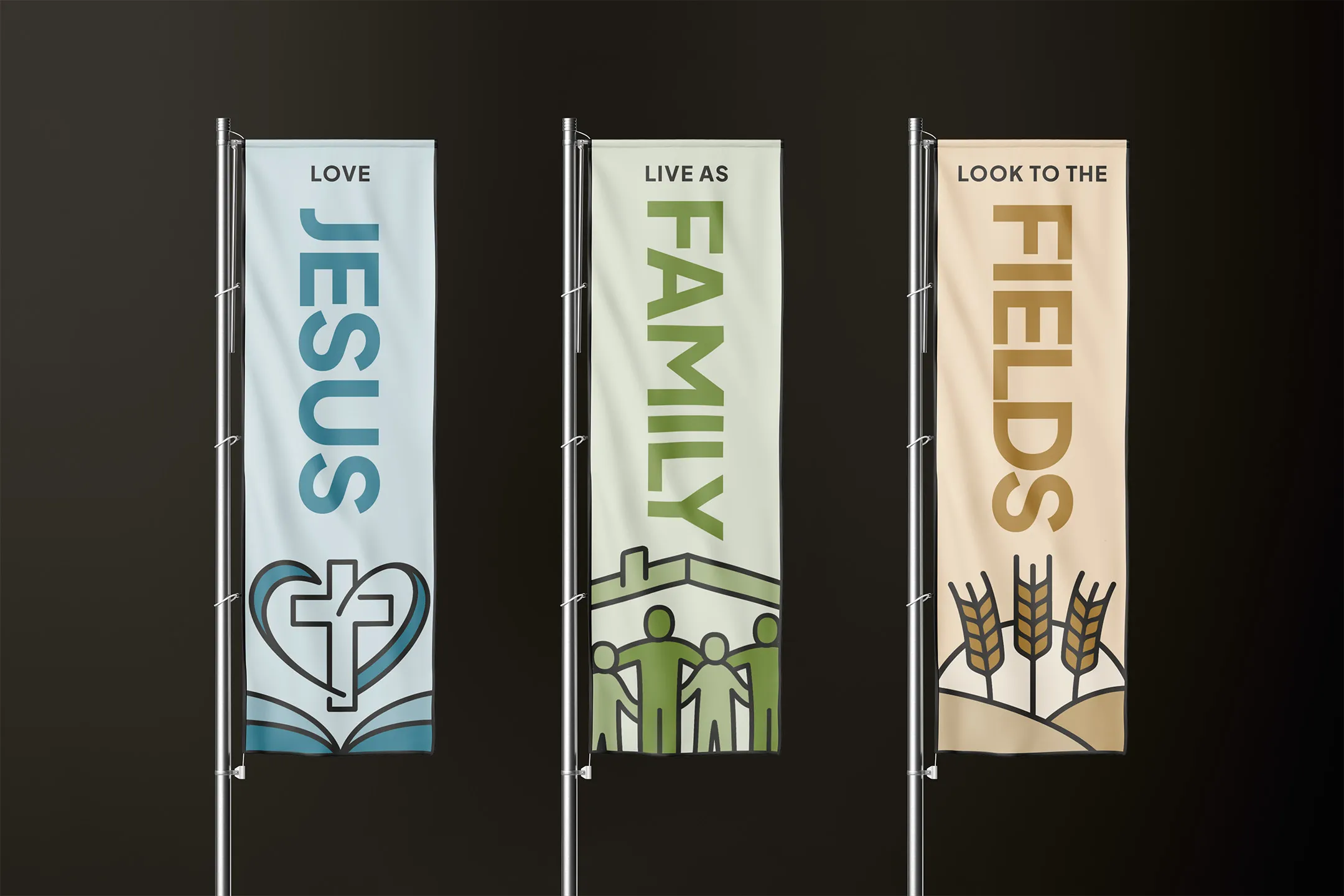
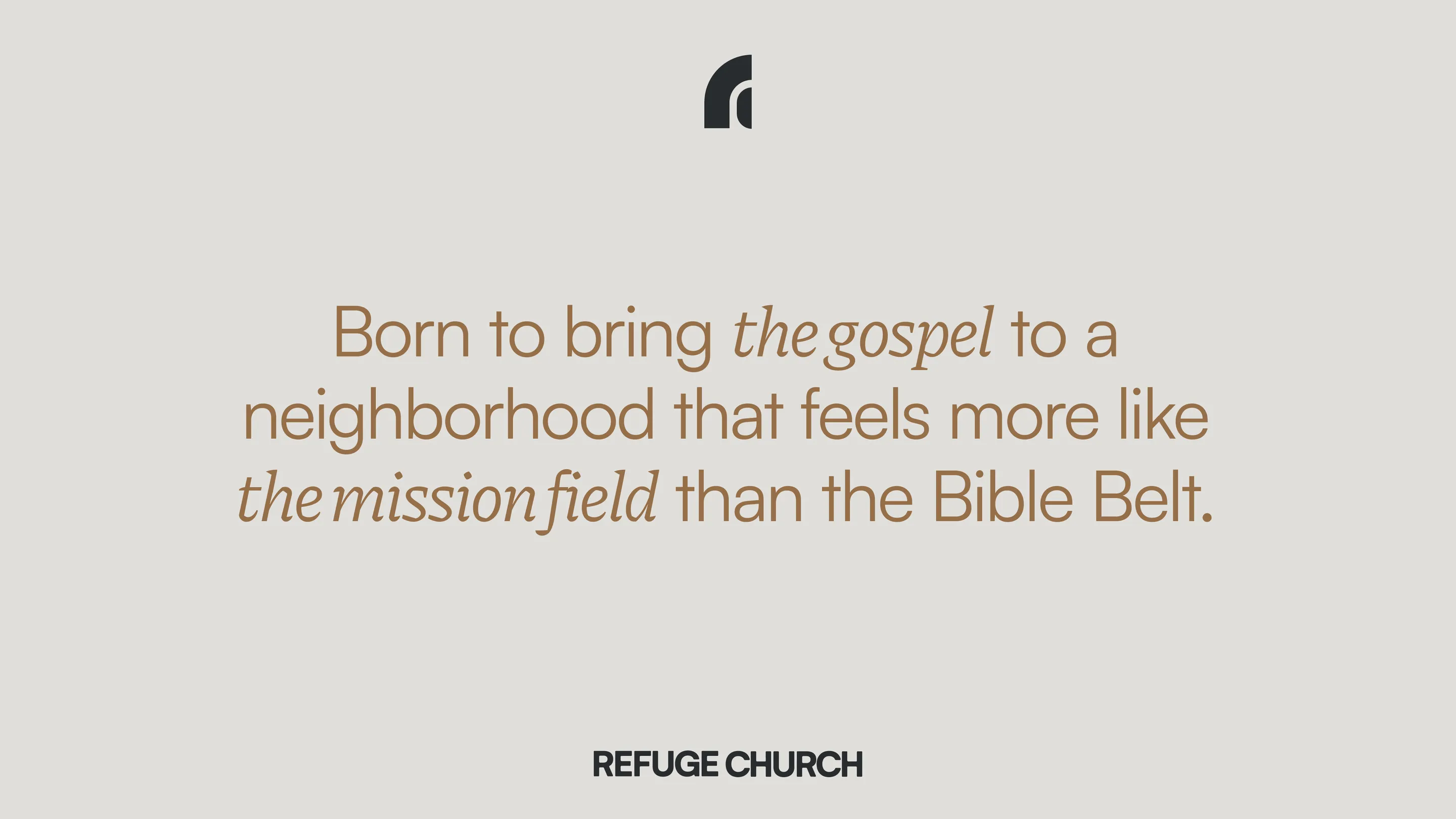
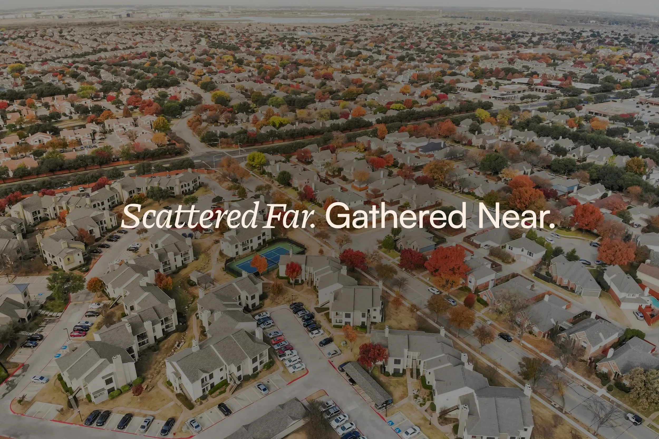
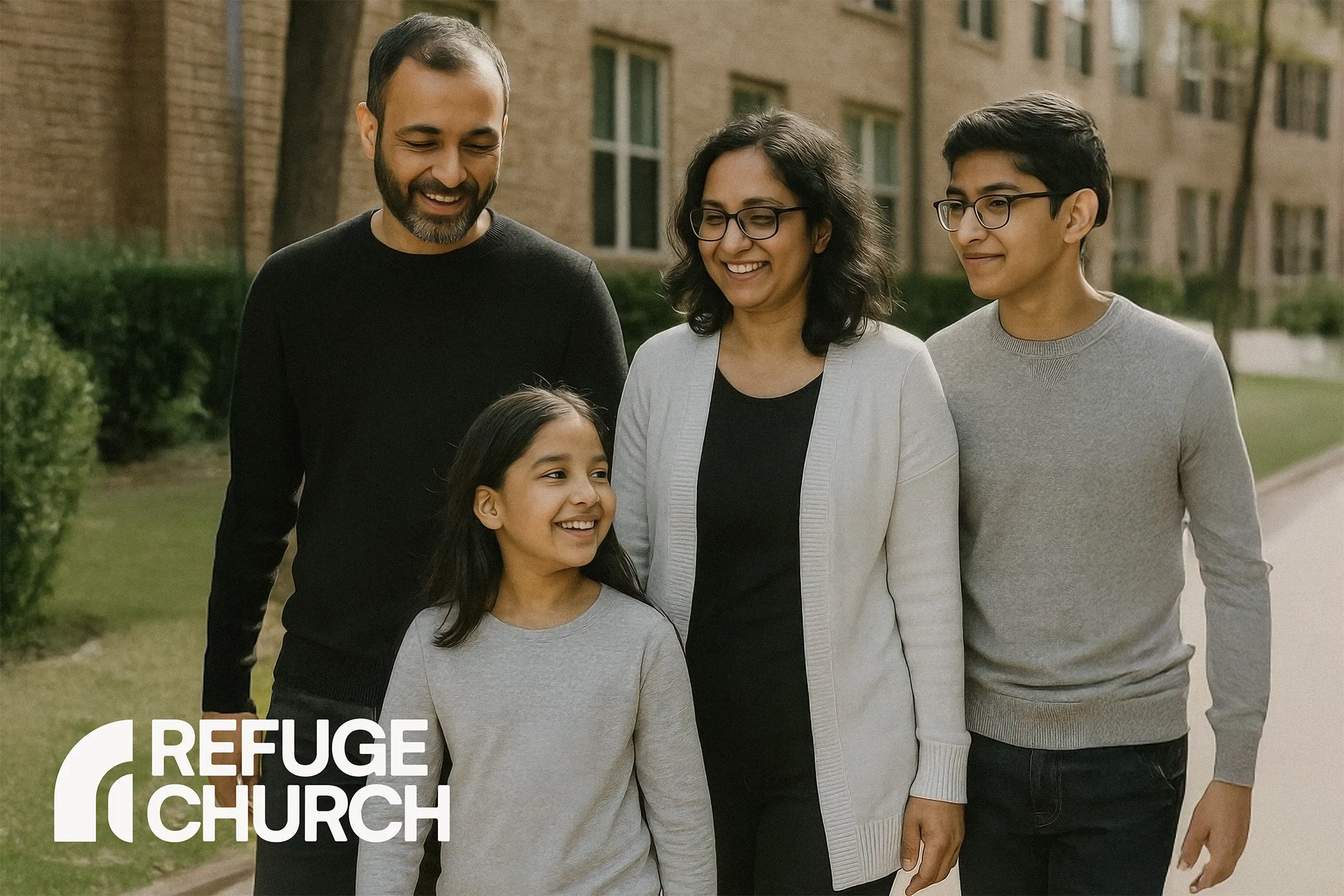
Two divinely appointed families had been planning and building toward their vision for a church plant in Irving, Texas. But their neighborhood felt more like the mission field than the Bible belt. We built a brand around this idea, that scattered peoples could be gathered together around the cross of Christ.
Throwback to early 2025...
When Andrew initially approached a local apartment complex manager to discuss serving the residents, the conversation was... awkward. He had a clear vision and zeal for bringing the gospel their multi-national neighborhood where mosques and Hindu temples outnumbered Protestant churches.
But when he talked to the apartment manager, her first question was, "Do you have a business card or flyer I can hang on to?" Without professional materials and a visual identity, she was skeptical, and he had to leave her empty-handed.
The lack of brand created a barrier to trust.
![]()
![]()
![]()
Later, Andrew and Brett threw a block party expecting 250 people, but 1,000 showed up! It was a massive success but they didn't have cards, a website, or a way to say, "This is who we are, and here's how to find us."
They considered going the cheap route, but they hesitated. They didn't just need a logo; they needed a partner who understood that a church isn't a business, even if it needs to function with professional excellence.
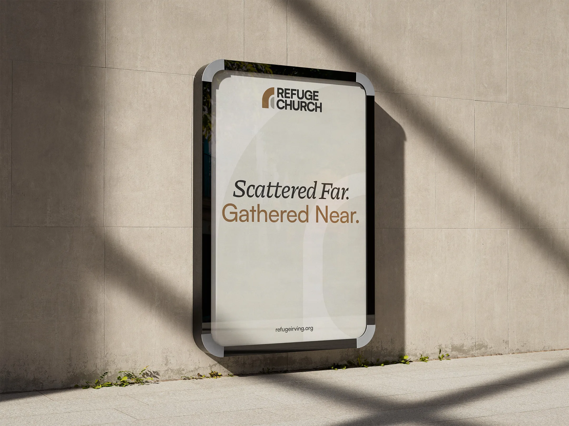
We were hesitant at first about the investment, but looking back, the value is undeniable. Having a professional, cohesive identity gave us credibility with the city and our neighbors instantly. It removed the friction of explaining who we were and allowed us to get straight to the Gospel. It gave our launch team confidence and put us on the map. It’s an investment that pays off in opened doors.

The team was initially hesitant about "branding." Like many pastors, they worried it would feel too corporate or manufactured.
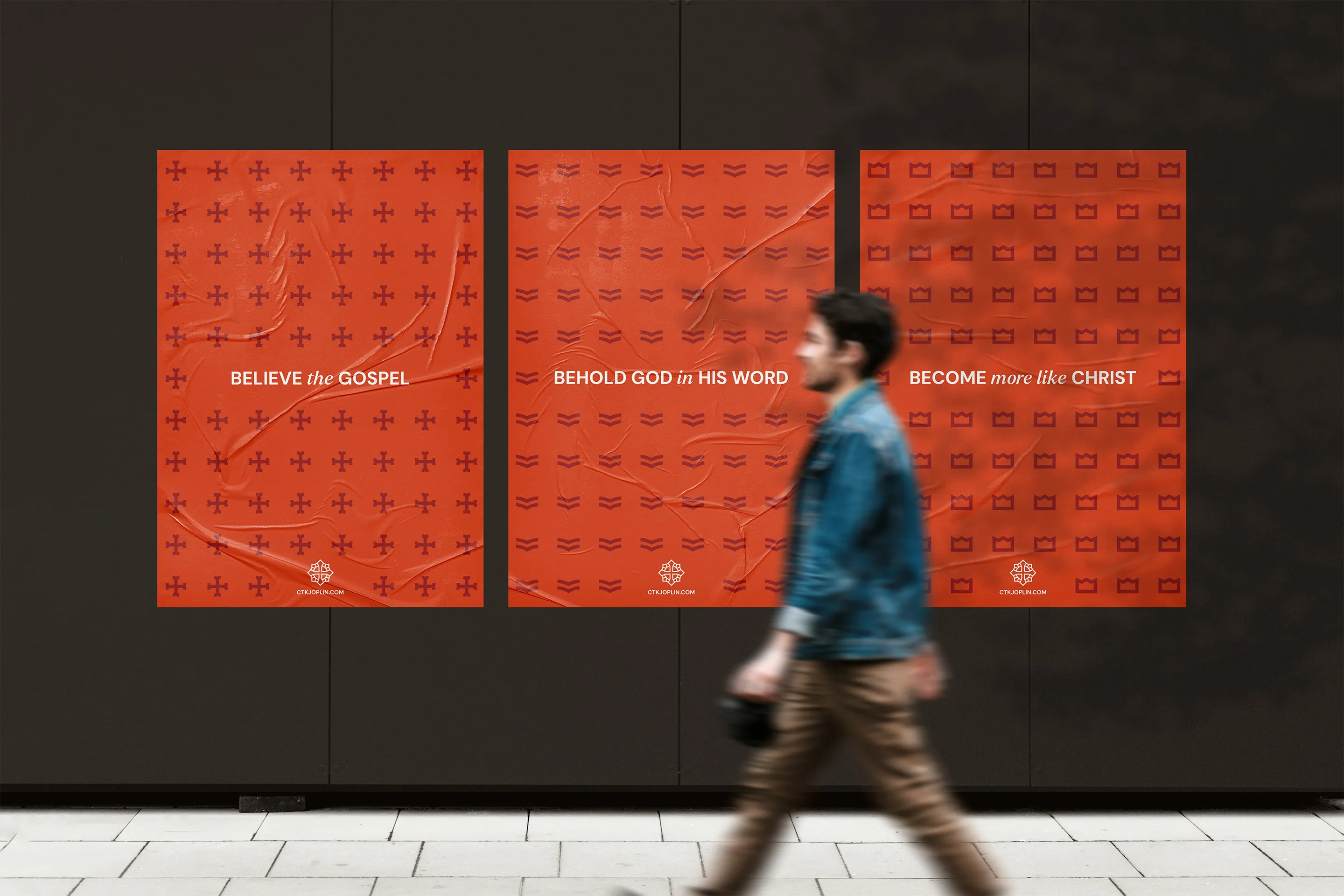
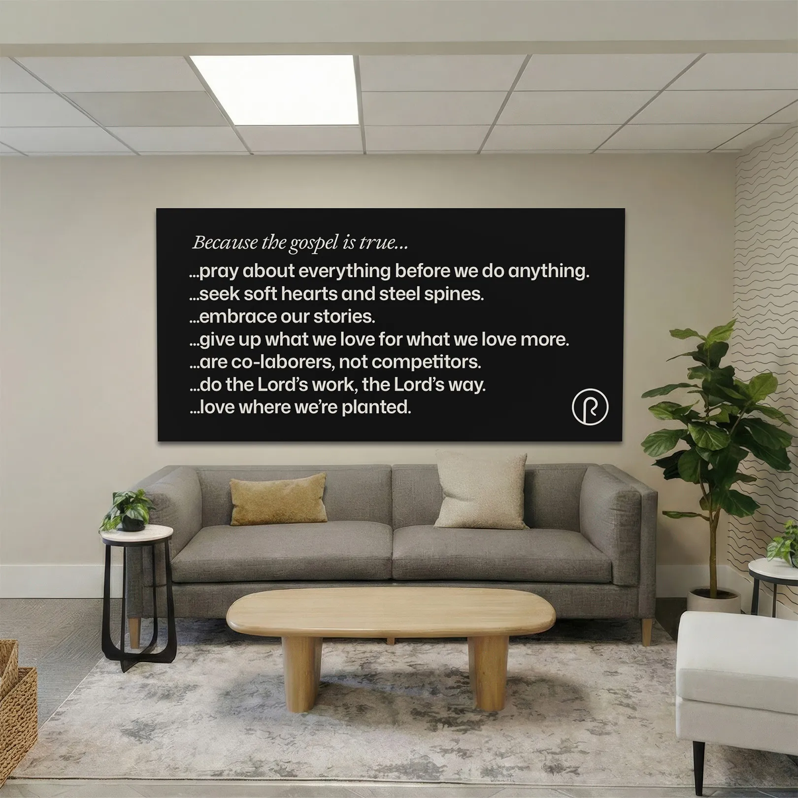
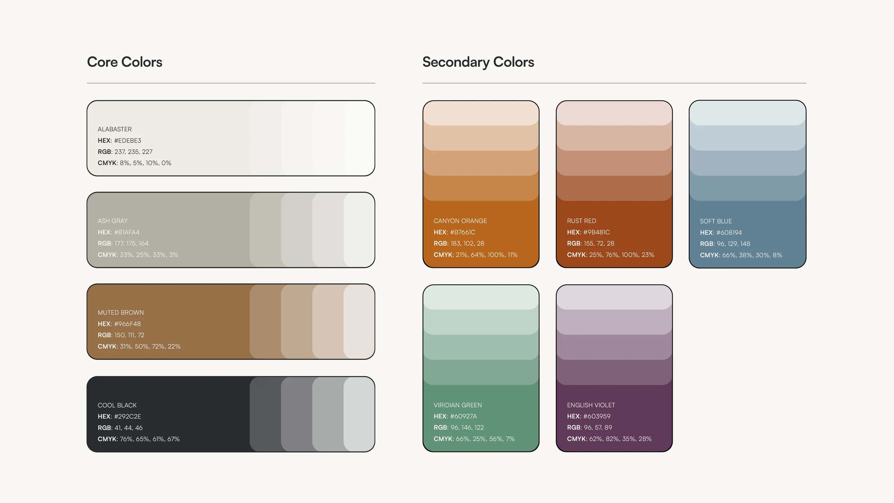
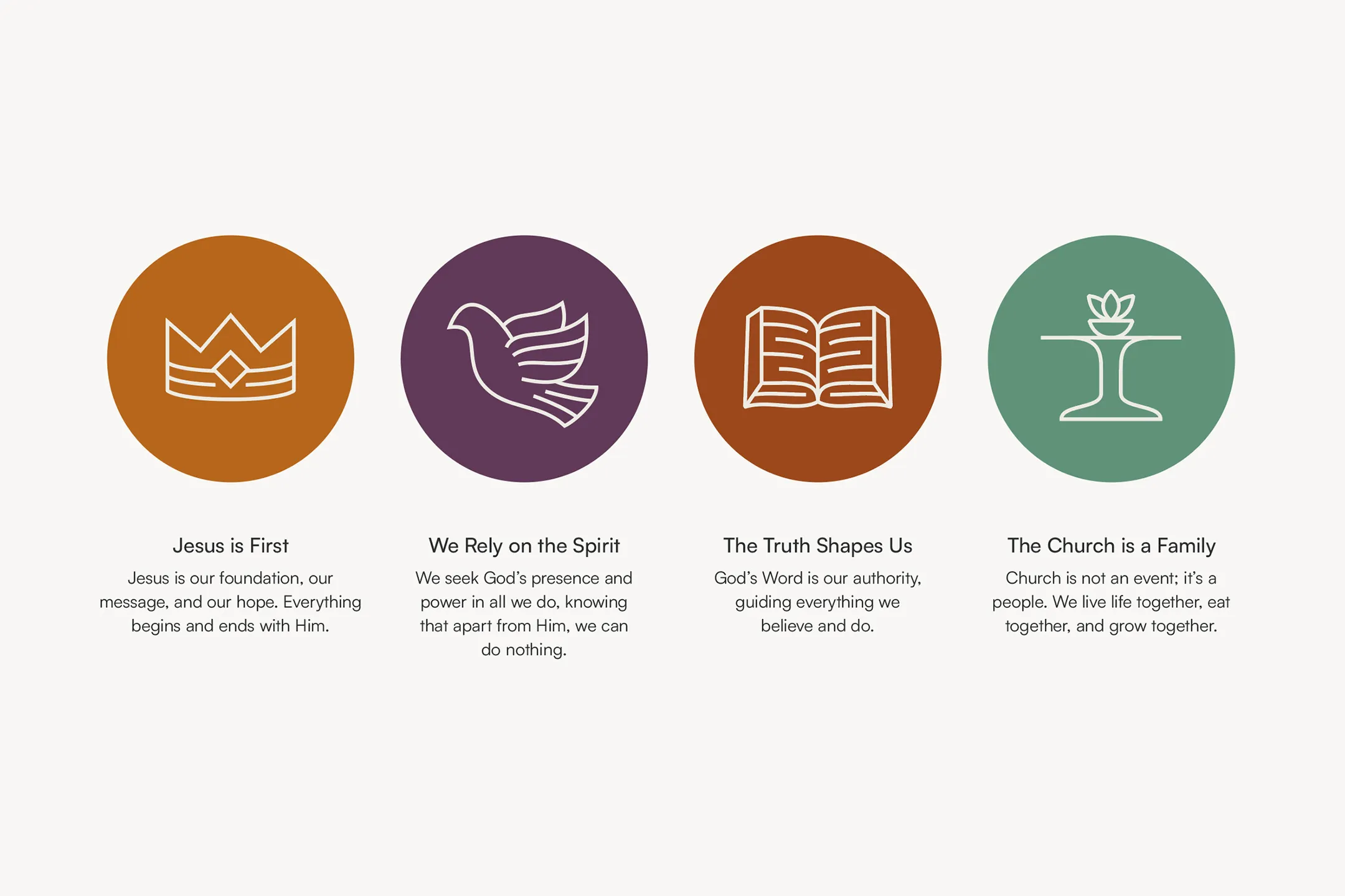
But this Christ-centered process proved to be the opposite! Logo and colors were addressed, but the team got even more value from defining exactly why Refuge Church exists for this community.
Andrew and Brett realized that church branding was was about shaping culture and gaining clarity, not vanity.
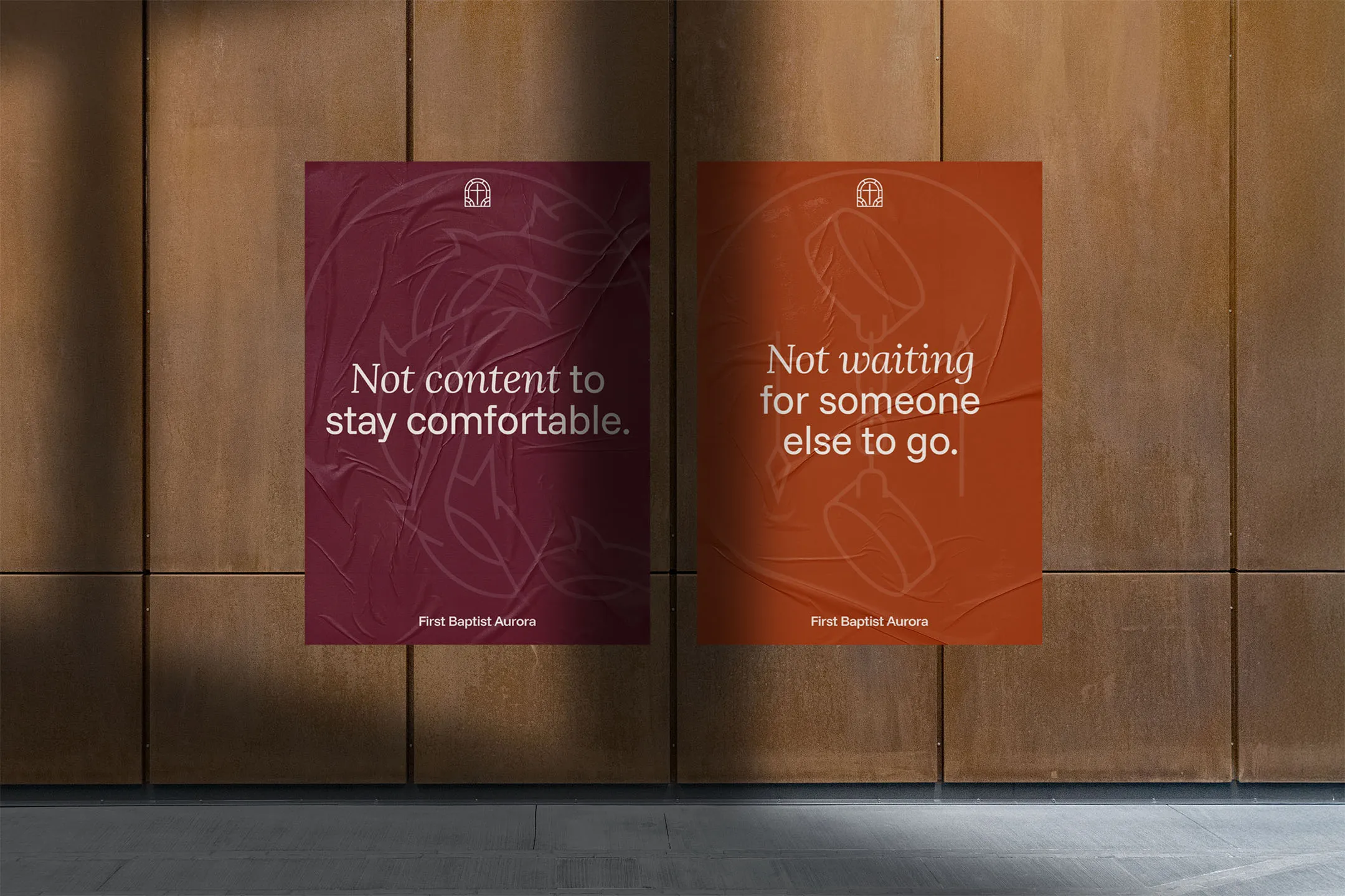
The difference between "before" and "after" wasn't just aesthetic—it was functional.
Andrew and Brett went back to that same apartment manager (the one who was skeptical before). Armed with professional business cards and a clear identity, the dynamic shifted. She didn't just accept them; she gave them permission to post materials in the main office.
During the Christmas season, they distributed 50 full meals and gift cards. This time, every interaction included a professional, branded invitation card, creating a clear pathway for follow-up and connection.
Before working with Braden, we honestly felt like we were 'larping' at being a church. We had the vision, but when we tried to talk to community leaders or apartment managers, we looked illegitimate. We didn't have a clear identity, and the lack of serious branding was a barrier for people to engage with us.
Braden didn't just give us a logo; he gave us clarity. He helped us distill our entire mission into a visual and verbal identity that actually communicates our heart. Now, we have the confidence to walk into schools and businesses and partner with them.
We are finally "adulting" as a church, and the relief of having this handled by a pro is priceless. If the cost was double, we’d still pay it. It’s not just branding; it’s a pathway to get people to Jesus.

Take the first step and answer a few questions about your church.
It only takes 90 seconds.