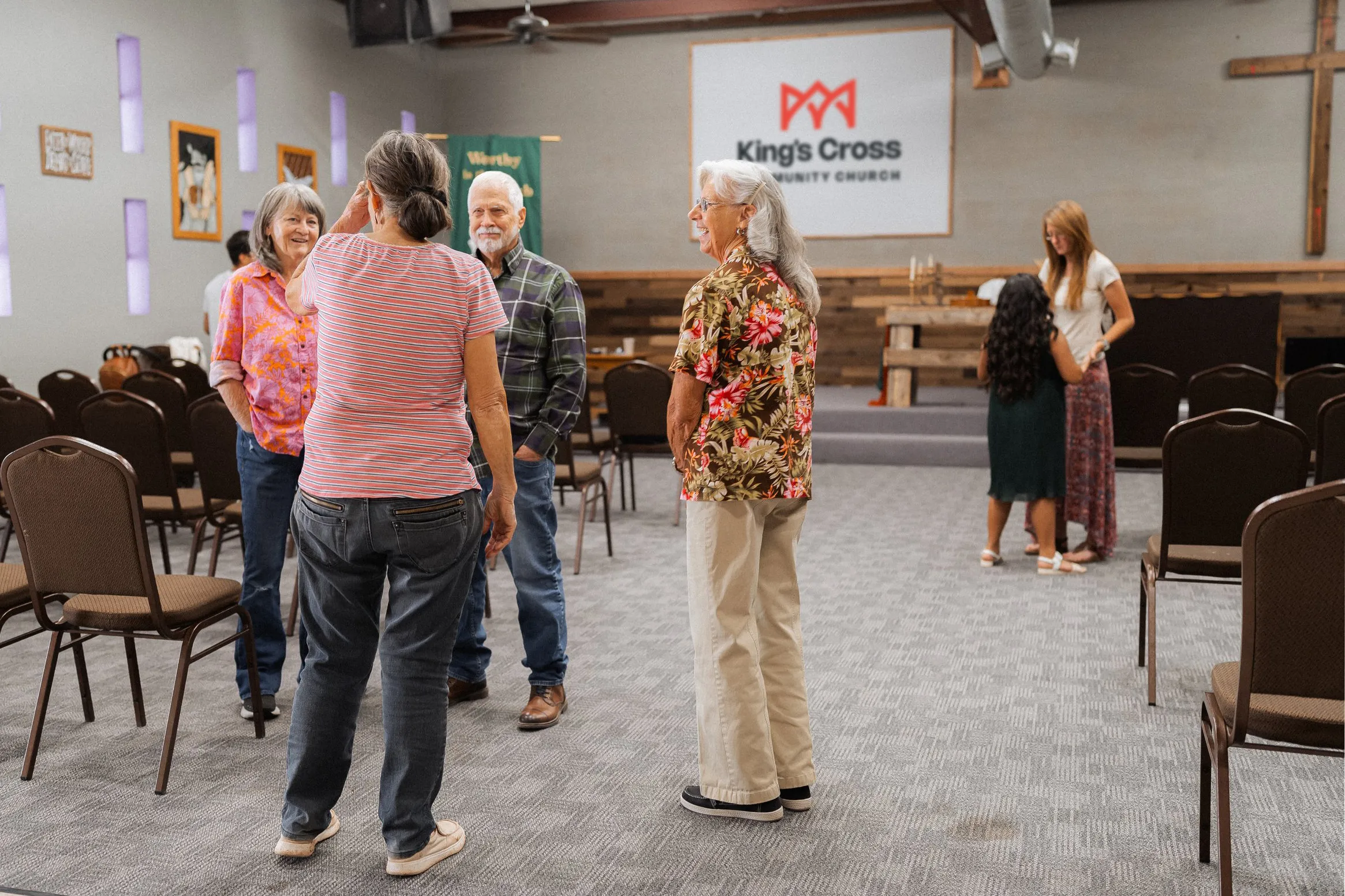
Christ the King Presbyterian Church
Christ the King Pres. was a younger church that desperately needed a new look. After rebranding with me, they're easily creating graphics that reflect their mission and vision with a branding toolkit — right inside Canva!
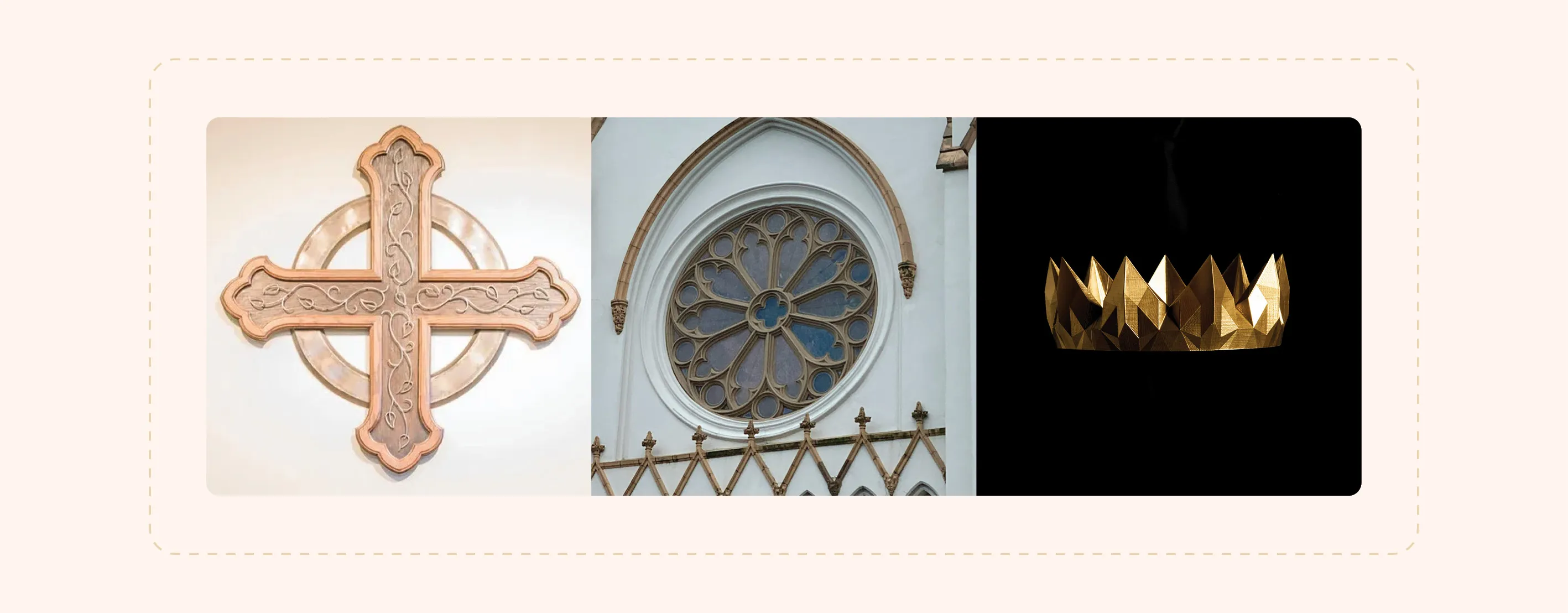
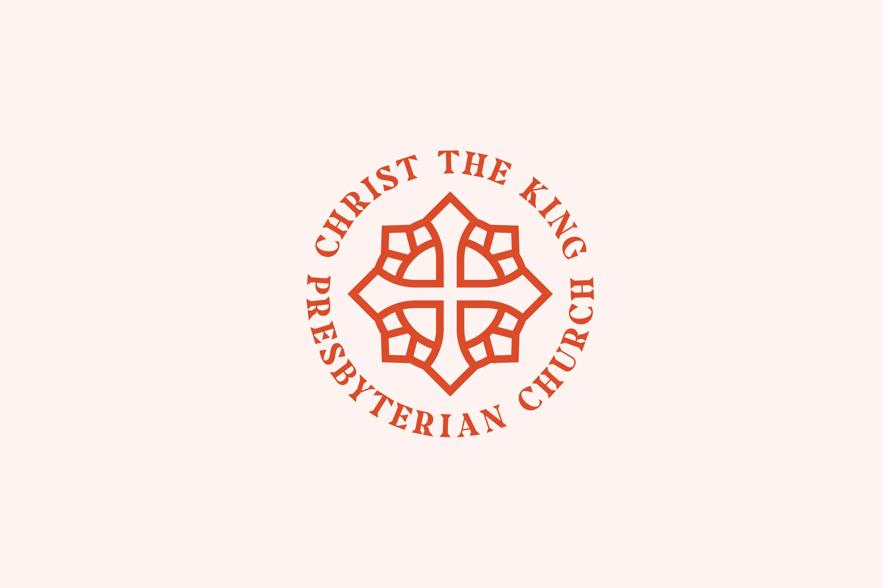
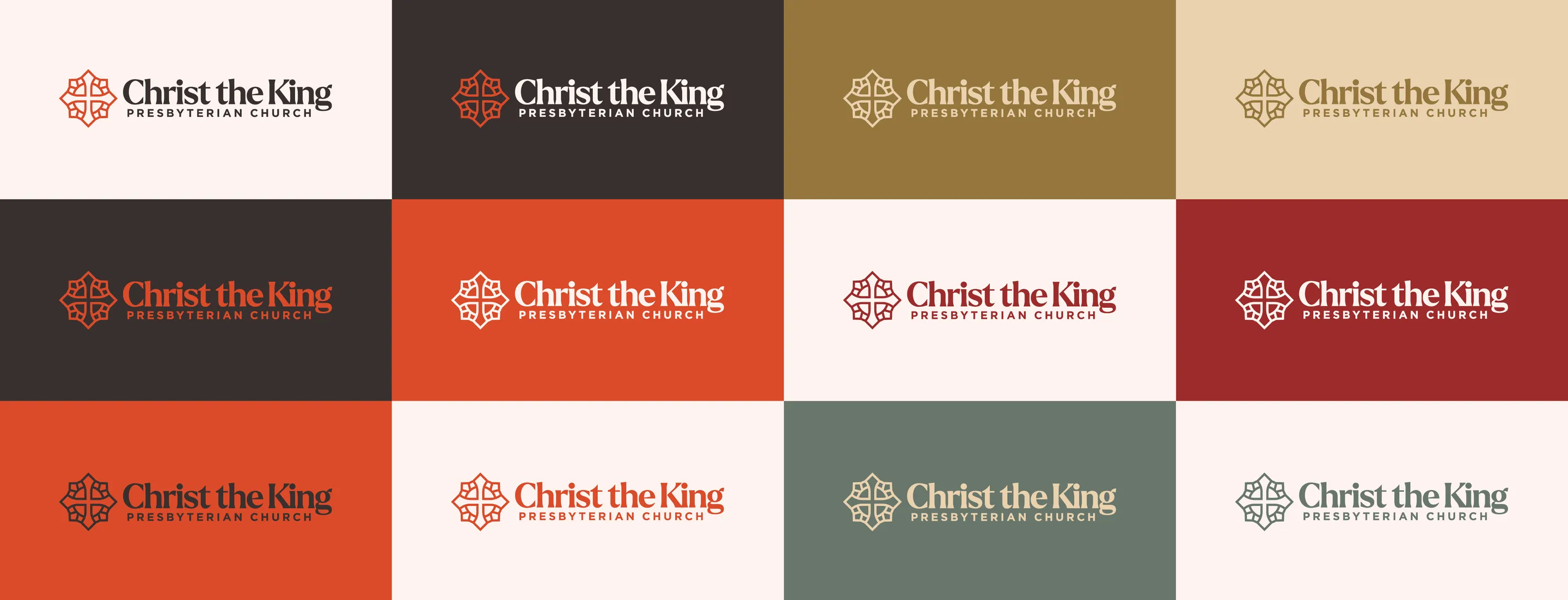
The CTK logo went through several iterations before focusing in on the iconic shape of the historic Presbyterian cross, which traditionally symbolizes both the atoning death of Christ Jesus and his life-giving resurrection.
The angular gemoetry of the outer shapes resemble gemstones in a royal crown. This was key to the CTK brand not only because of the name “Christ the King” but also due to the kingdom-oriented vision of the church elders.

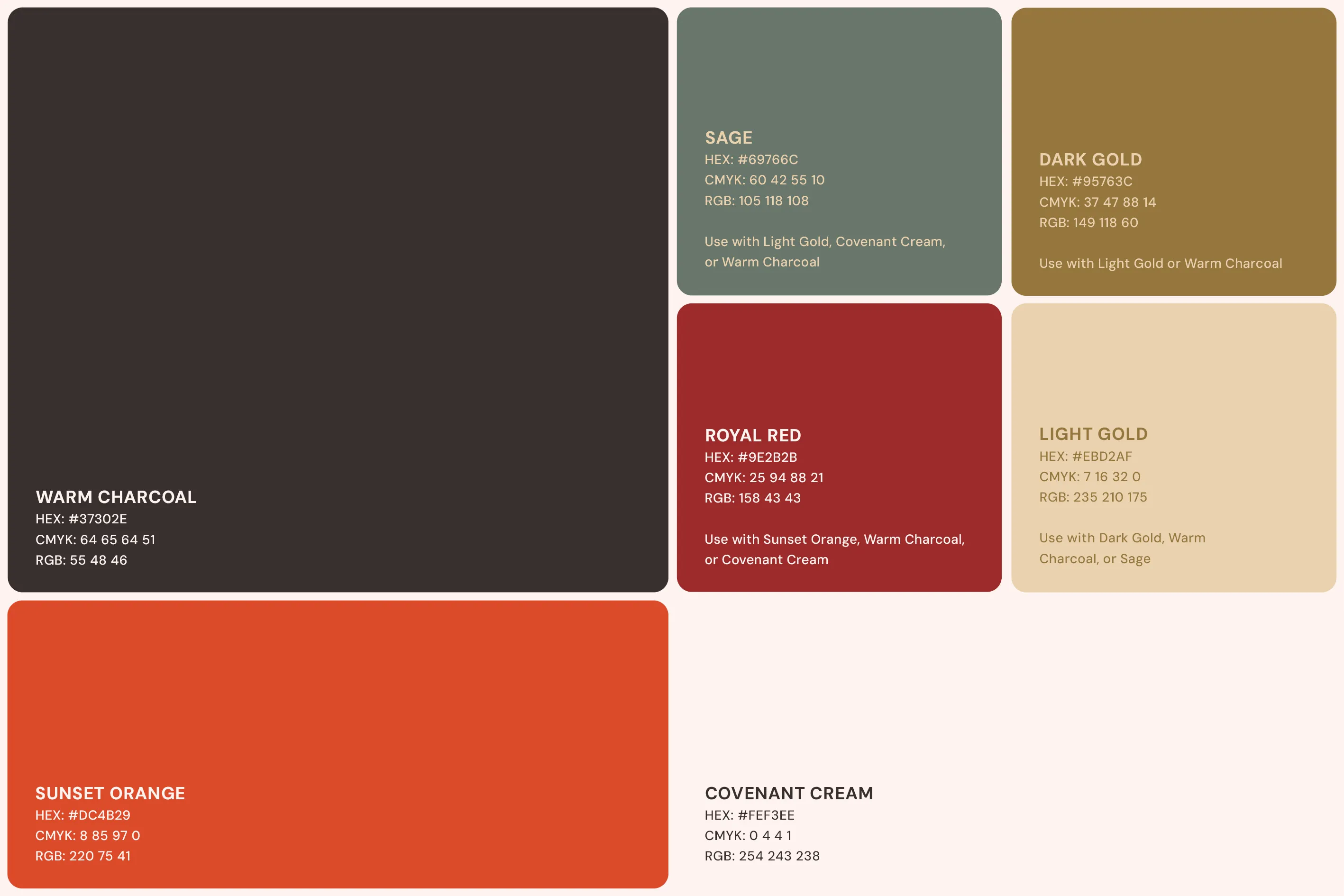
The CTK color palette was carefully chosen to express warmth, reverence, order, and balance.
This versatile palette allowed the CTK brand to take on a more serious tone when the need arises. These colors also translated well to fabric and textiles, making them great for t-shirts, paint, and other real-world applications.
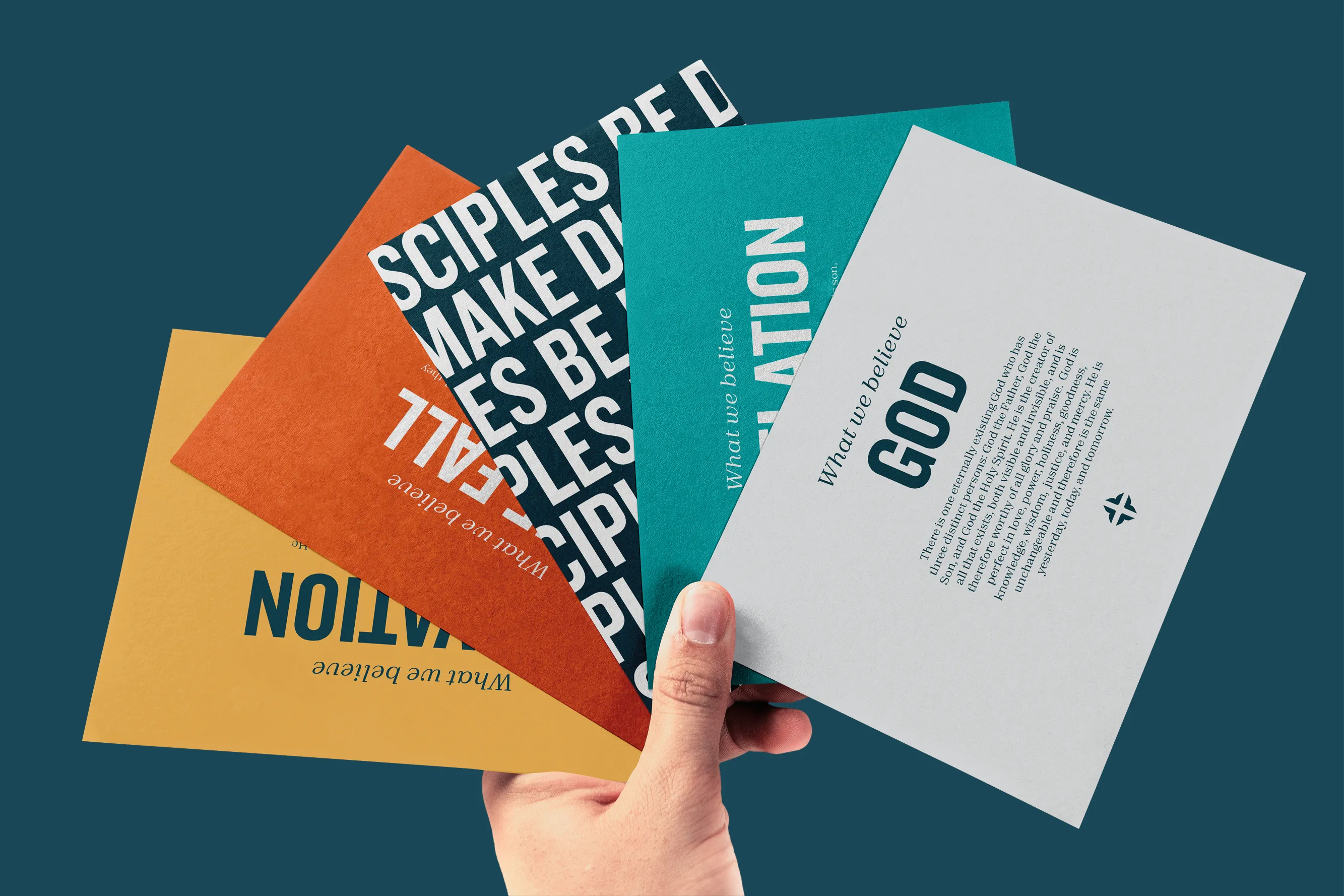
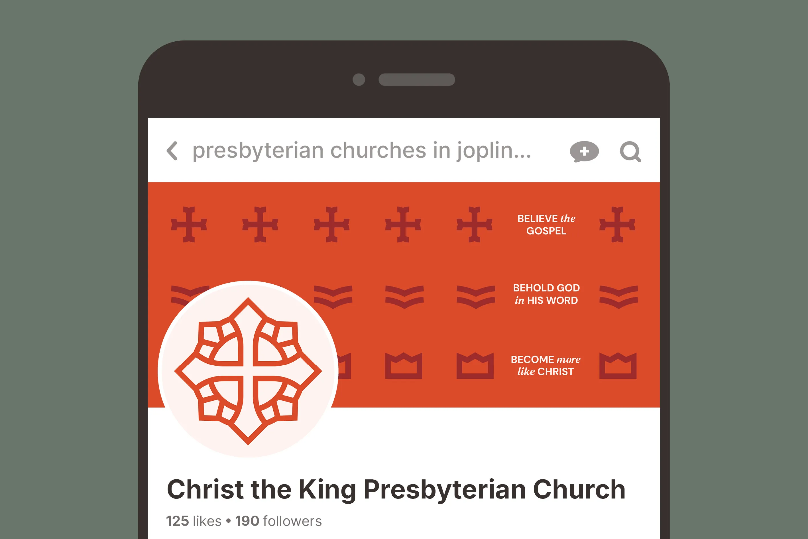
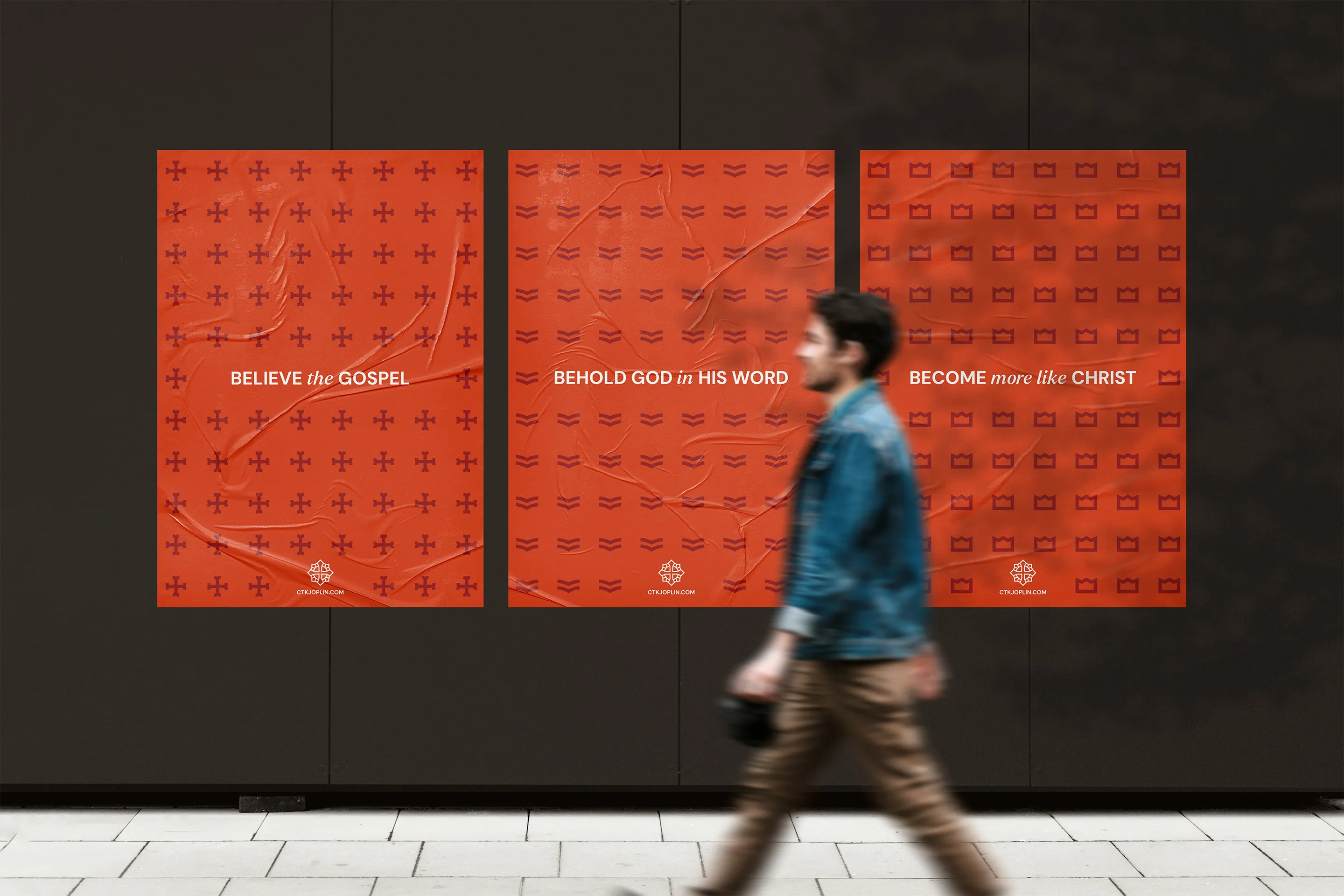
We worked with CTK's leadership to design subtle yet powerful patterns that communicate their threefold vision in a reverent and modern way.
The Cross Pattern represents the first part of the CTK vision, “Believe the Gospel” and ties in nicely with the primary logo. The Bible Pattern represents the second part of the CTK vision, “Behold God in His Word”. Finally, the Crown Pattern represents the third part of the CTK vision, “Become more like Christ” which also harkens to the kingly focus of the church's name.
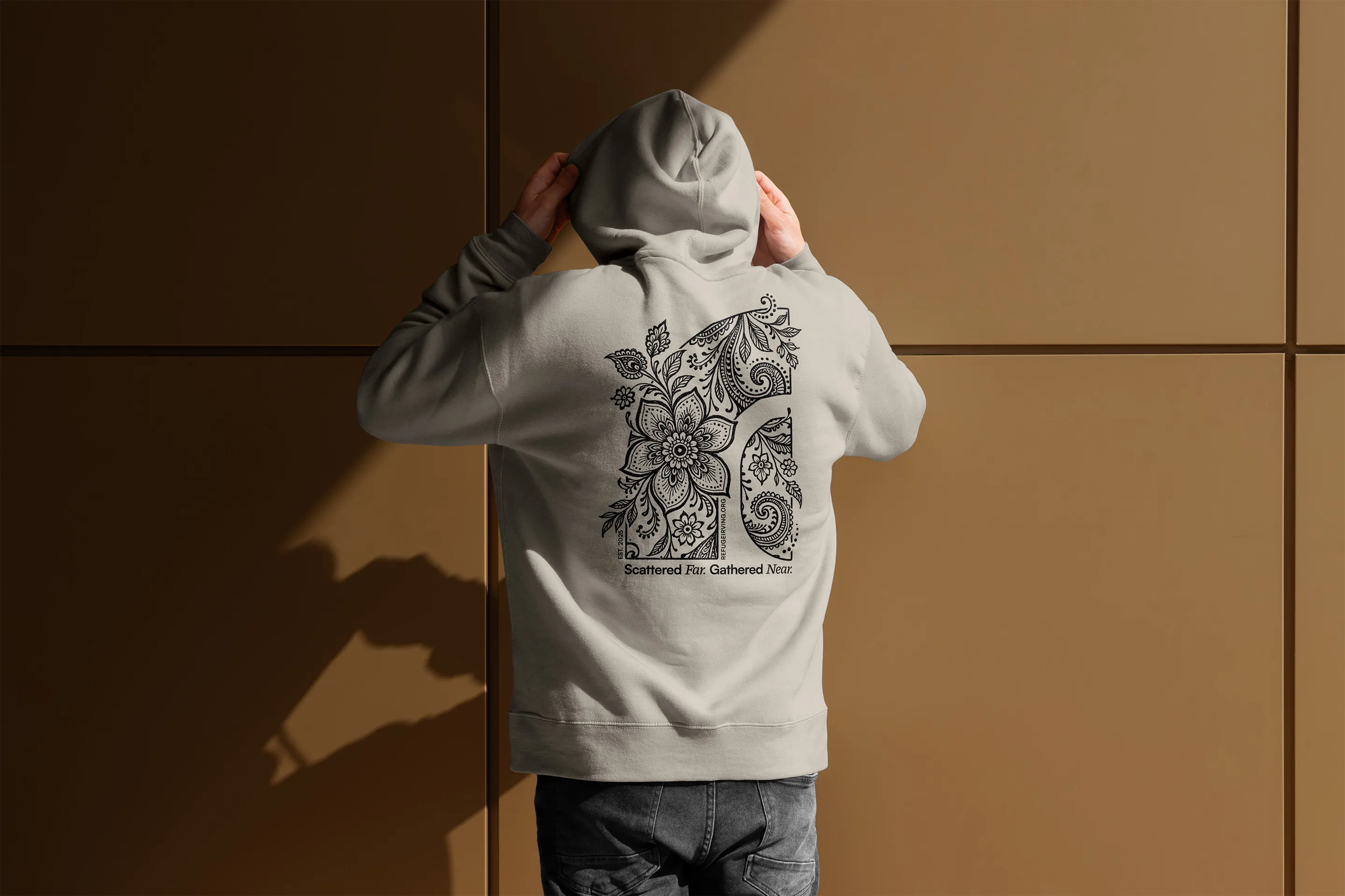
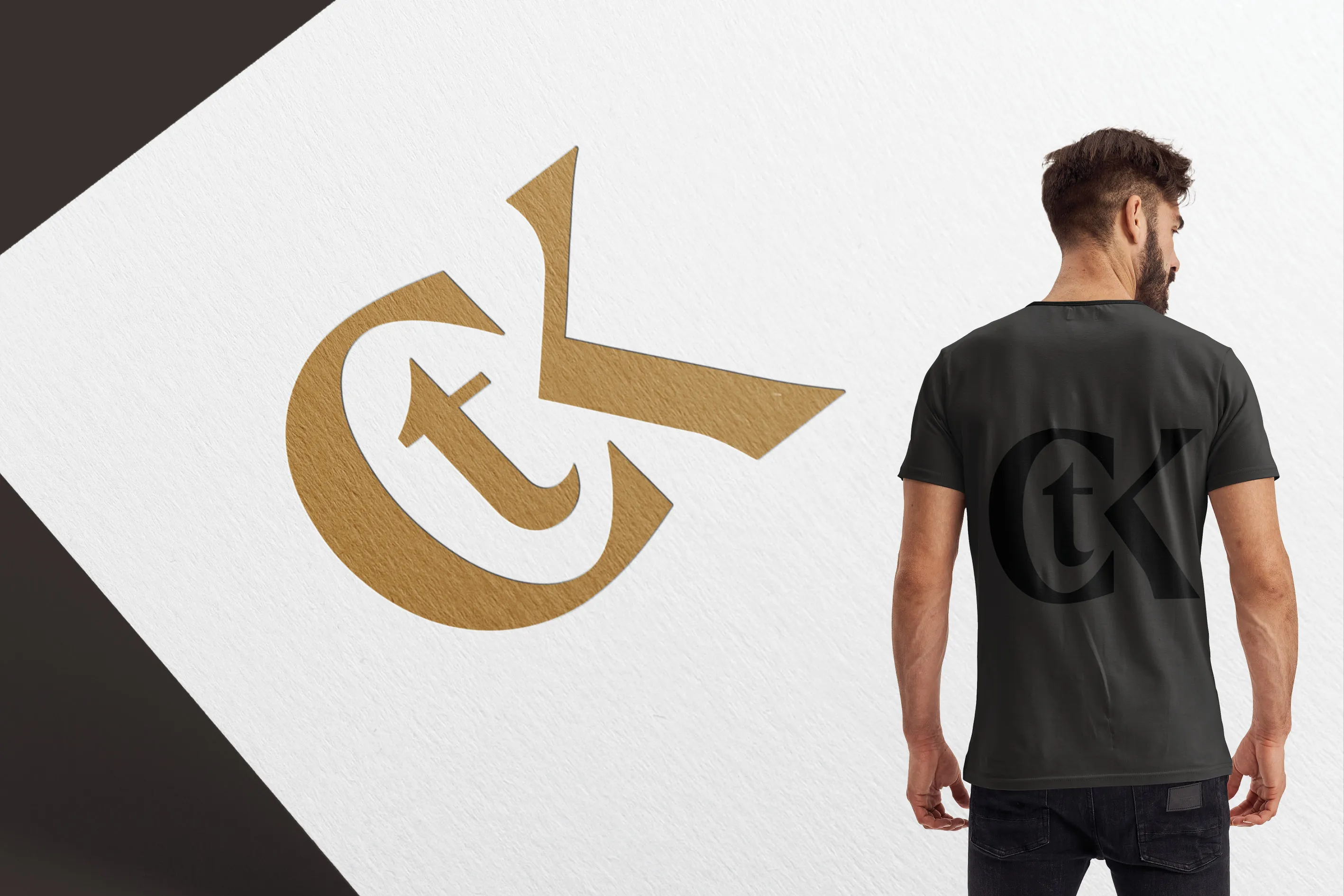
The CTK monogram was created as an alternate mark in the church’s visual identity, offering a refined and elegant expression of the brand.
This unique part of the CTK brand toolkit was intended to be used sparingly and intentionally, preserving its formal nature. Rather than replacing the primary logo in general communications the monogram is a special mark that conveys the church’s identity in an elevated form.

We were in desparate need to refresh our church's visuals, but not sure where to start. Every step of the process was clearly communicated and Braden was responsive to all our questions and feedback.
The end result was a new logo, colors, and branding guidelines that incorporated the key elements of our mission and vision, along with our church's history, bringing a cohesive visual identity to who we are. I cannot recommend Restore Graphics enough!

Take the first step and answer a few questions about your church.
It only takes 90 seconds.