Cross Creek Church
Cross Creek Church is a multigenerational PCA in northwest St. Johns County, Florida. The church has deep connections in its community. Families have worshiped together for generations, and local groups use its building throughout the week.
Cross Creek had a wonderful problem: the neighborhoods around the church were growing quickly. New families were moving in, and many had never heard of the church. Cross Creek wanted an identity that would help people recognize it and give them a clearer picture of the church they’d find there.
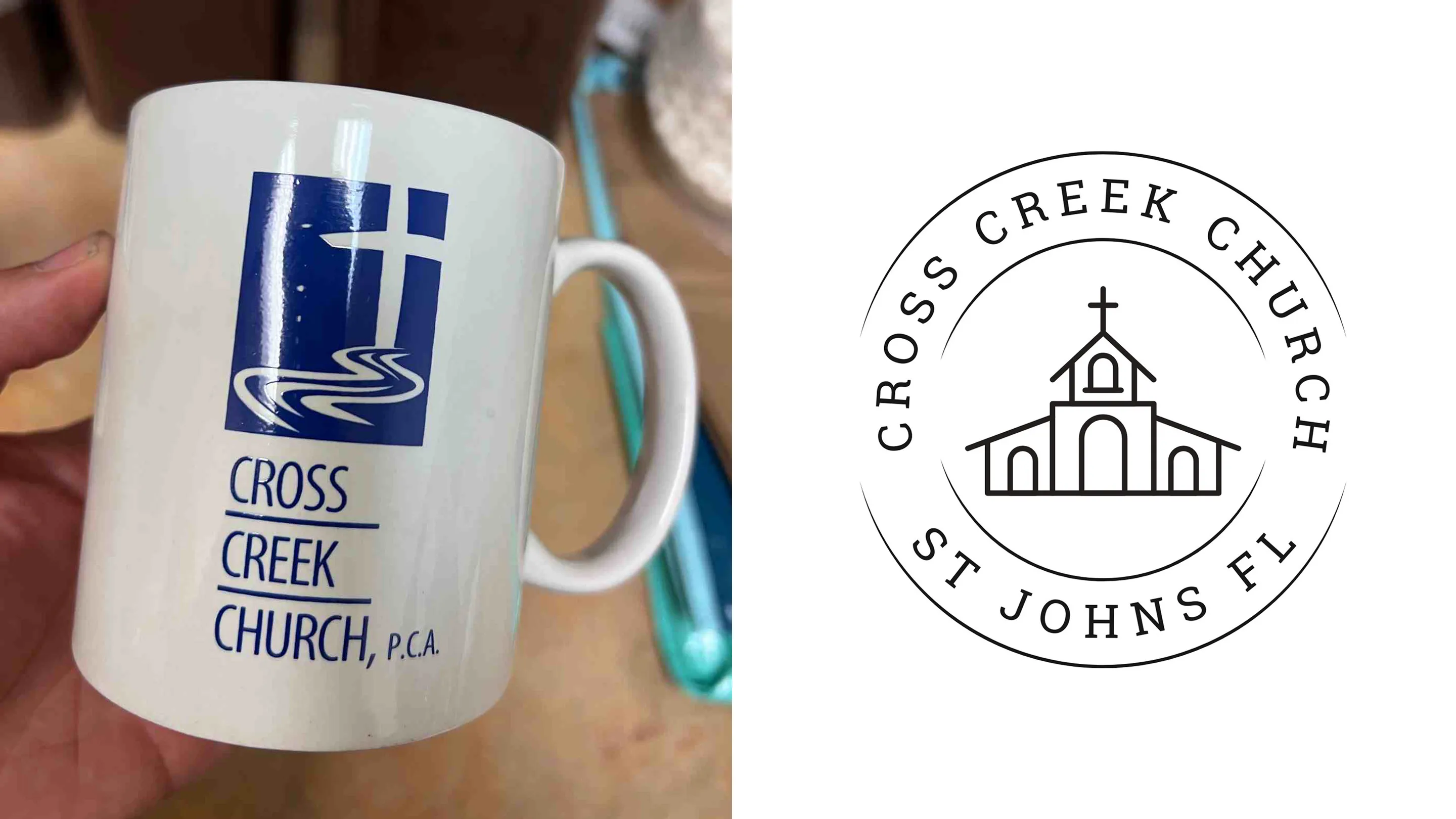
Cross Creek’s logo had changed several times over the years. One version had been made for T-shirts, and older logos were still floating around in different places. The church needed something simple and recognizable that would work on postcards, shirts, social media, and signage.
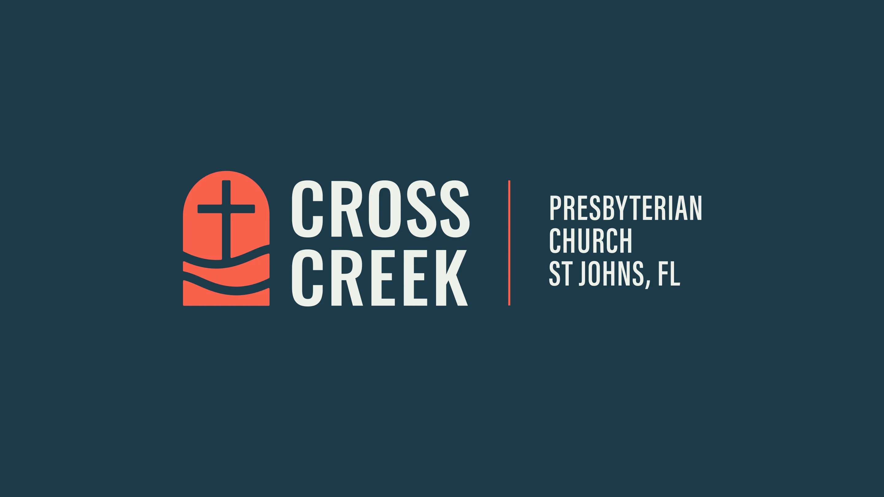
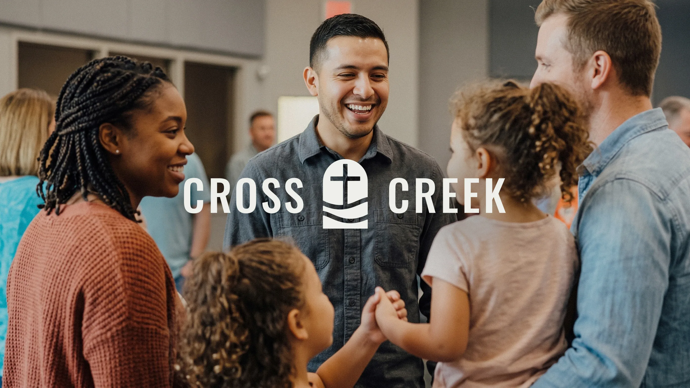
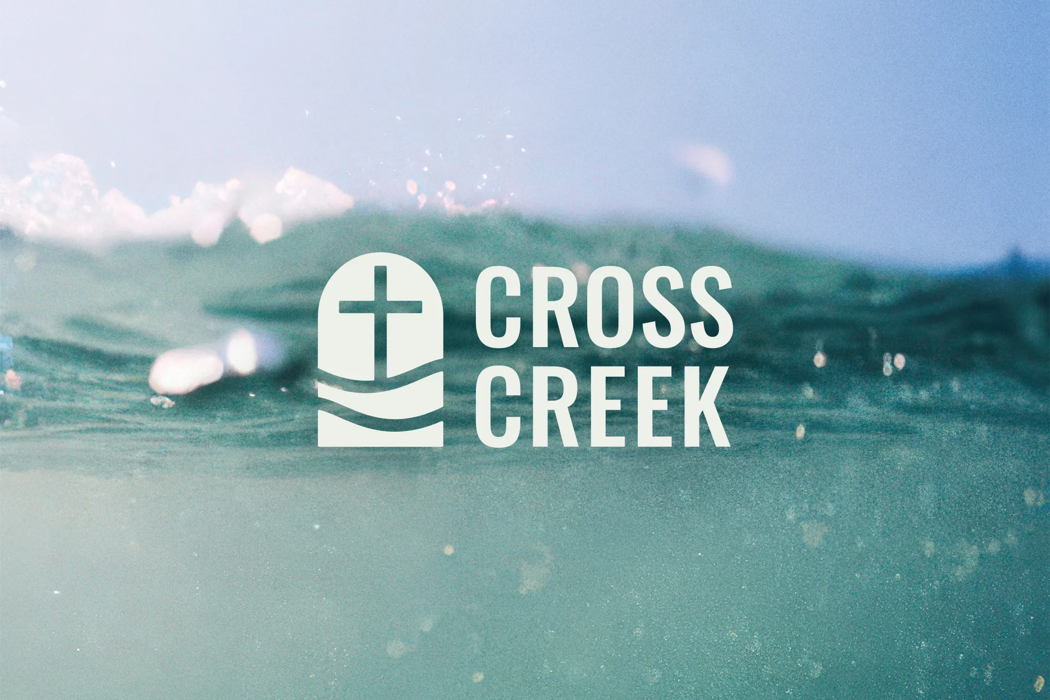
We explored water imagery because it connected to both the church’s name and the nearby St. Johns River. The direction we chose brings together a cross, flowing water, and the shape of a church window or door.
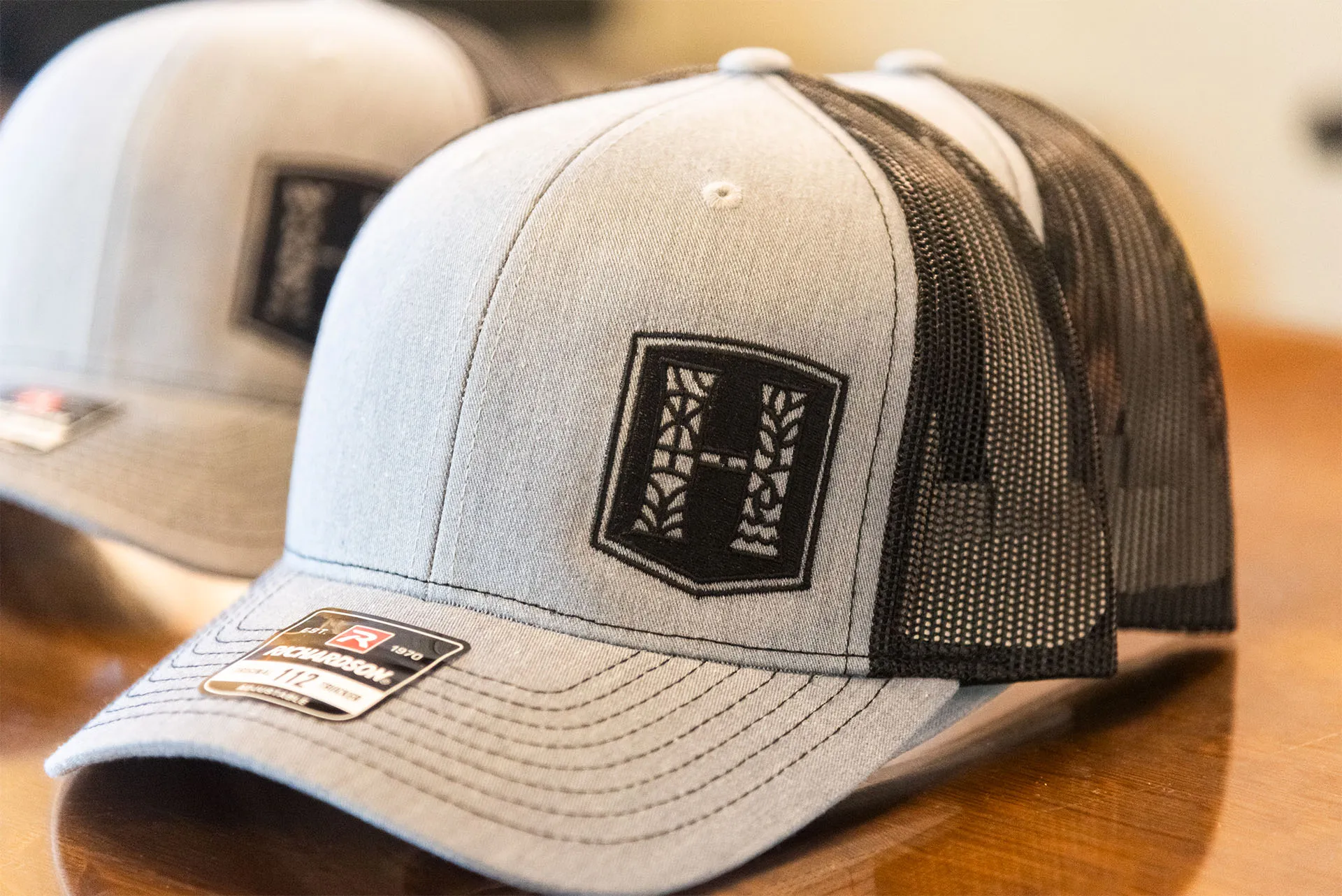
The team liked a more detailed stained-glass concept too, but it became harder to read at smaller sizes. The simpler mark held up better across the applications we reviewed, from social media to hats and building signage.
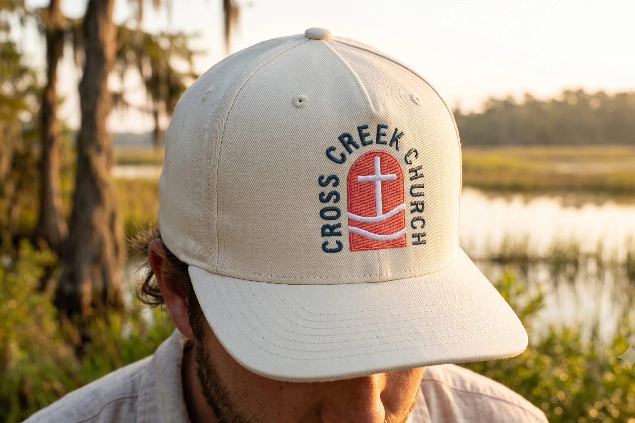
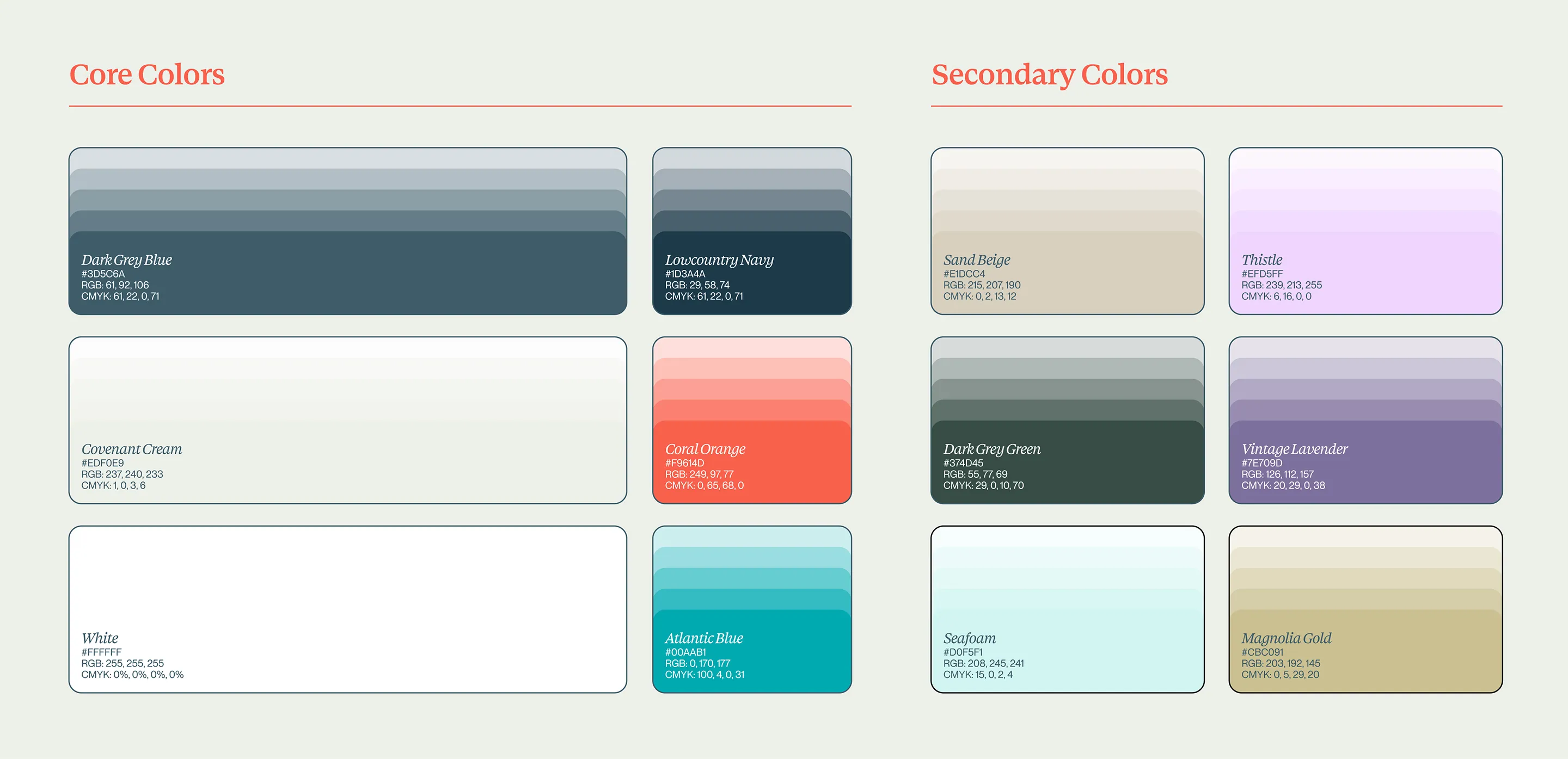
Cross Creek wanted to stand apart from other churches nearby, many of which already used blue. The church’s branding team leaned toward warmer colors, but there was a practical consideration: the church’s lobby had recently been painted blue.
We built the palette around warm coastla and lowcountry tones, with blue as a supporting color. The result gave Cross Creek a different look while still working with the space the church already had.
After the first logo review, the church’s branding team presented the concepts to their staff and collected feedback privately. The response to the mark was positive, and we explored new wordmark options before landing on a clean, all-caps typeface that gave the logo a more established feel and worked across different arrangements.
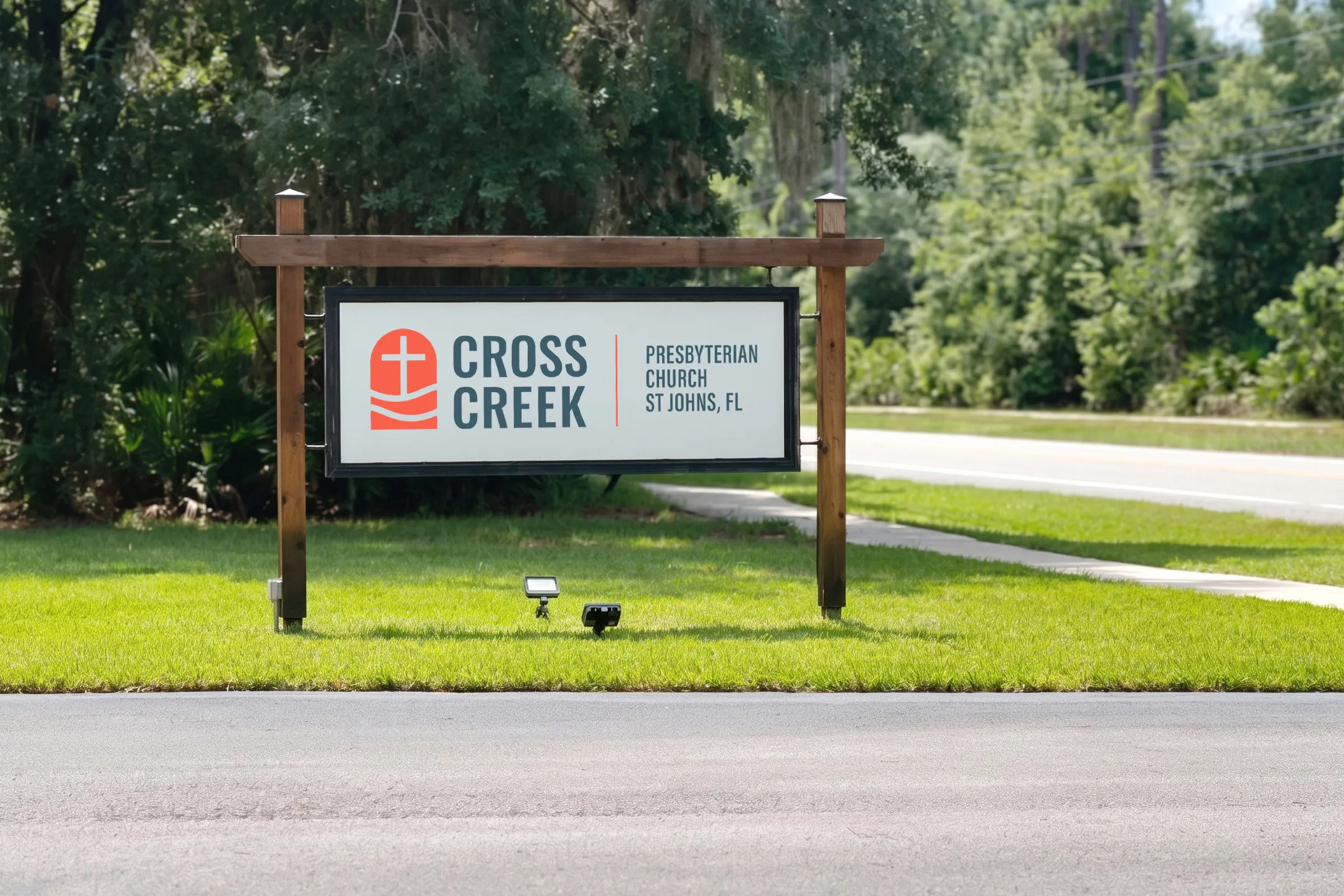
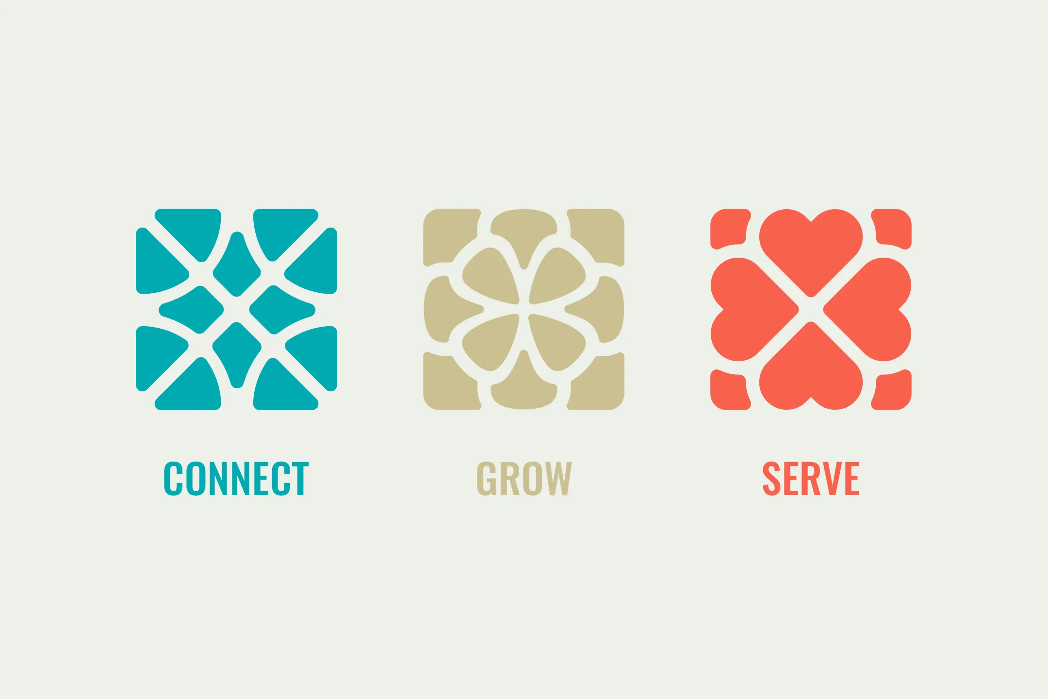
The finished identity included logo variations, brand guidelines, a Canva brand kit, supplemental graphics, and a logo animation. We also updated Cross Creek’s website to bring its content into the new visual system. The redesigned site went live in October.

Braden is great to work with and will help your church get a unique brand design in a very visual world. Our church had an okay logo, and Braden helped us with a logo/design that is helpful, clear, and very easy to use. I will strongly recommend Braden to any church or any ministry for his service to help create and design a visual identity for your church or ministry. Thanks, Braden, for your hard work and skills.

Take the first step and answer a few questions about your church.
It only takes 90 seconds.