Liberty Hill Church

...
There was a hidden flaw undermining the way Liberty Hill presented themselves as a church. That problem was brand fragmentation. Ministries had drifted into their own looks, the building was being rebuilt with no visual system to guide signage, and non-designer staff were making one-off color and font choices. They needed something that could honor 140 years without looking dated or disposable.
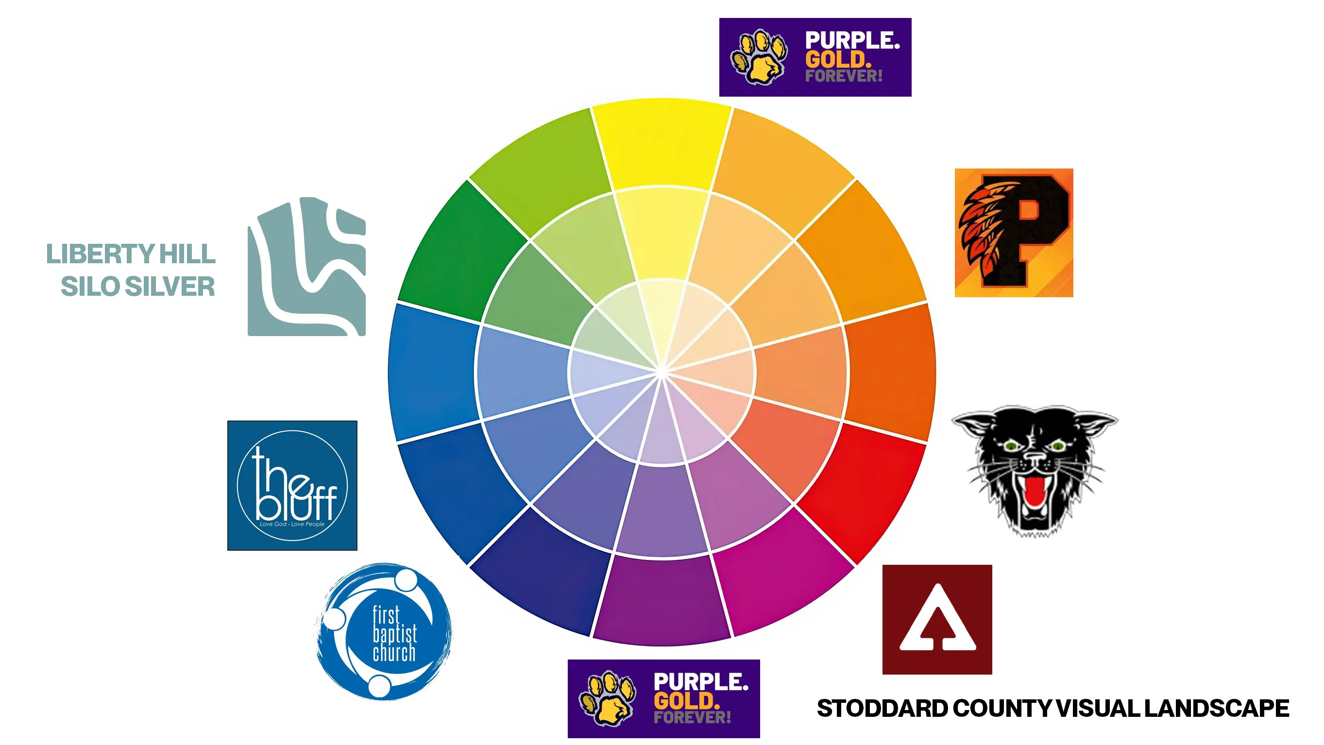
Liberty Hill sat between several towns with rival sports teams that had claimed wide parts of the color wheel. Dexter was red and black, Bloomfield was purple and gold, Puxico was orange and black, and Liberty Hill Church was the one place where families from all of them sat under the same roof.
Other churches had already claimed blue (First Baptist Dexter), orange (Risen), and red and black (Assembly in Bloomfield). The palette had to stay neutral across rivalries while still standing apart from the other churches in town.
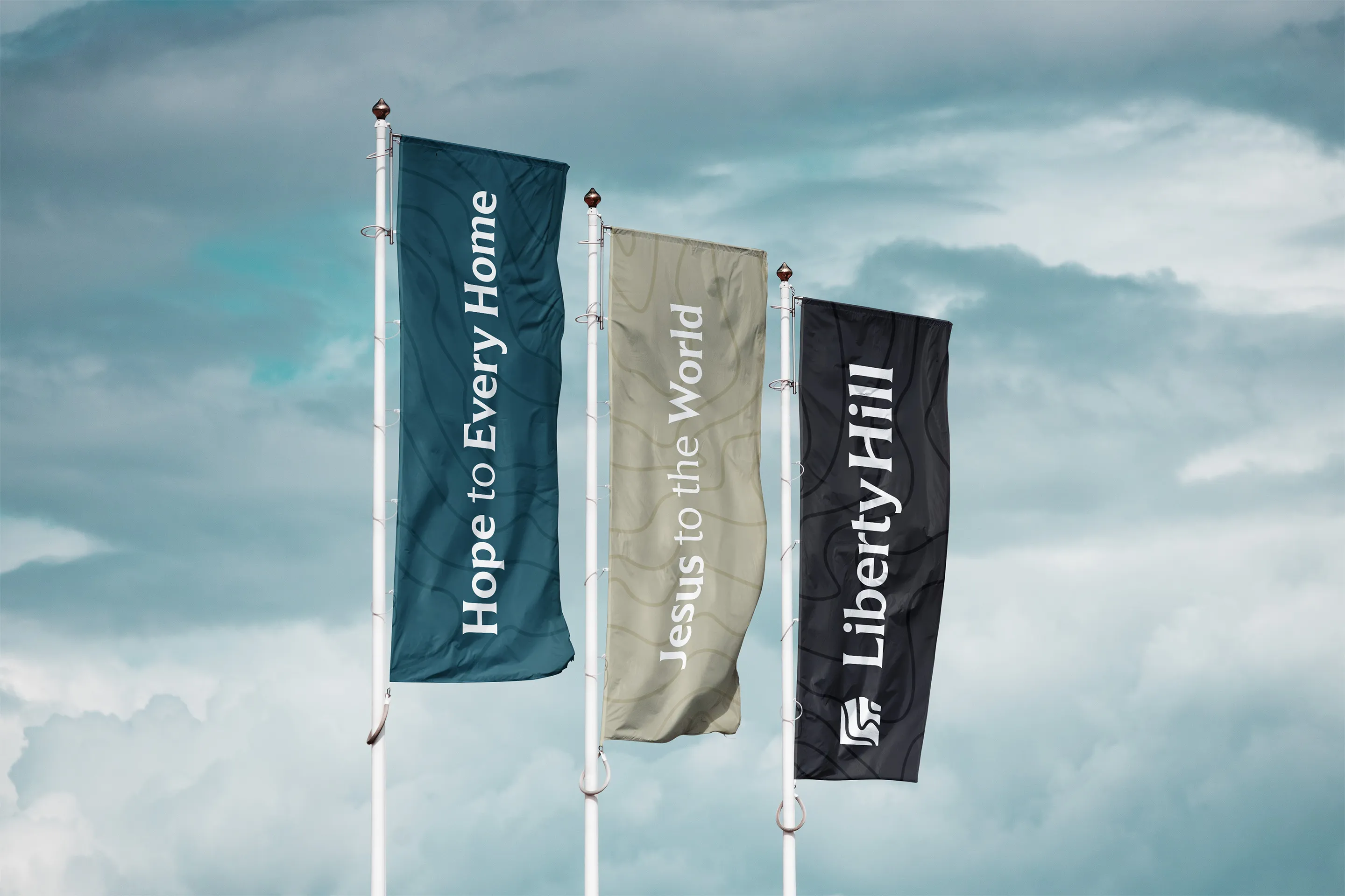
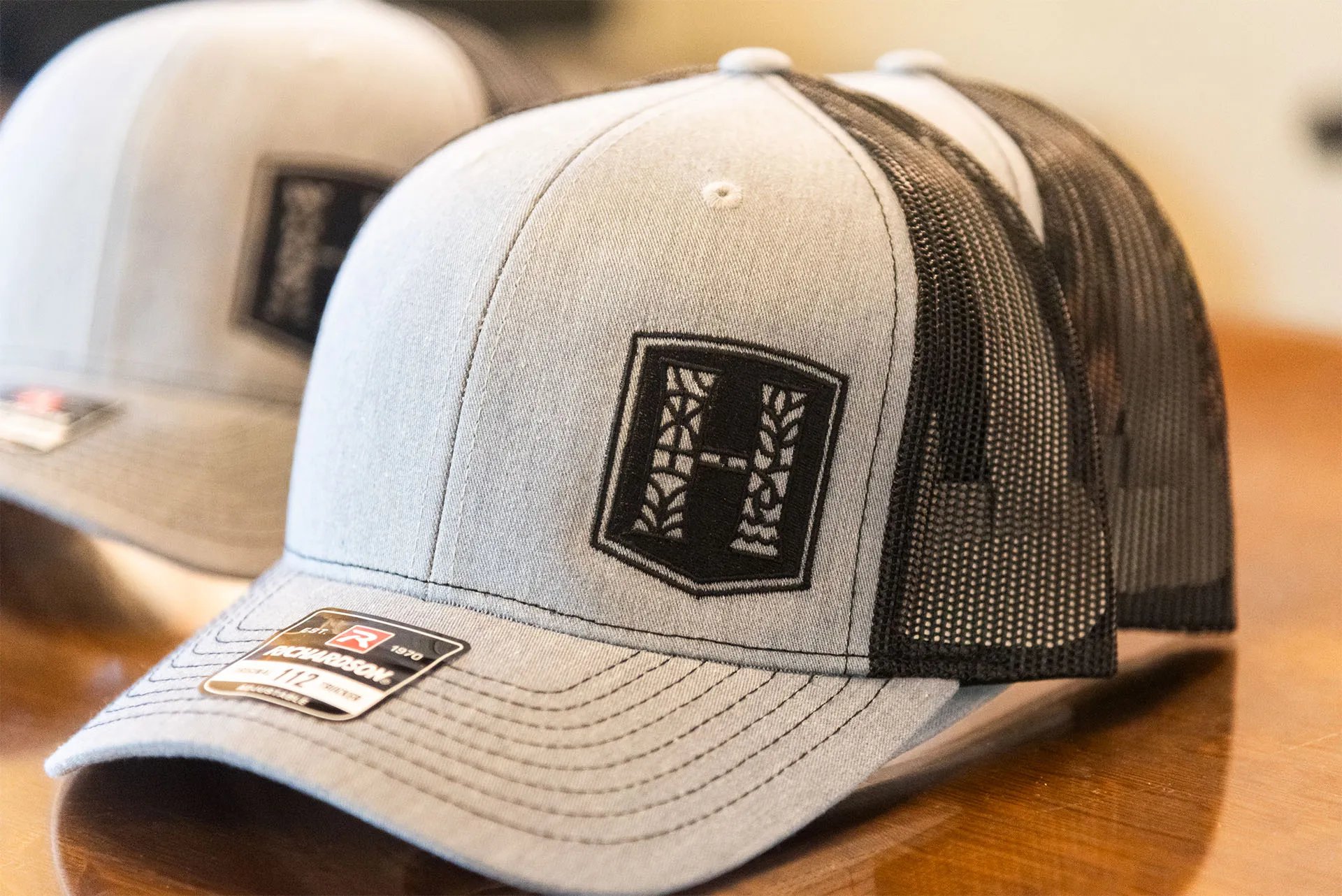
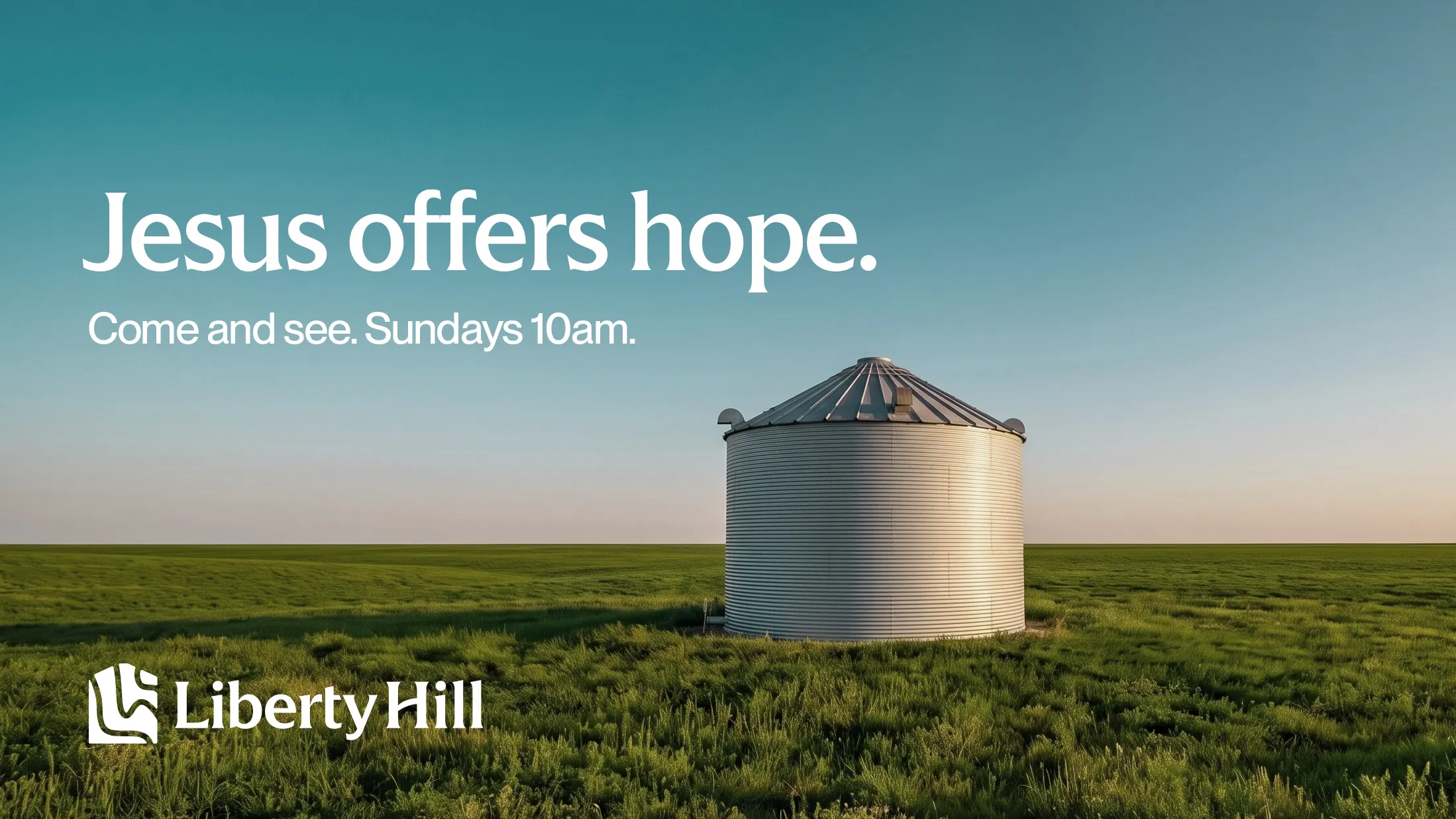
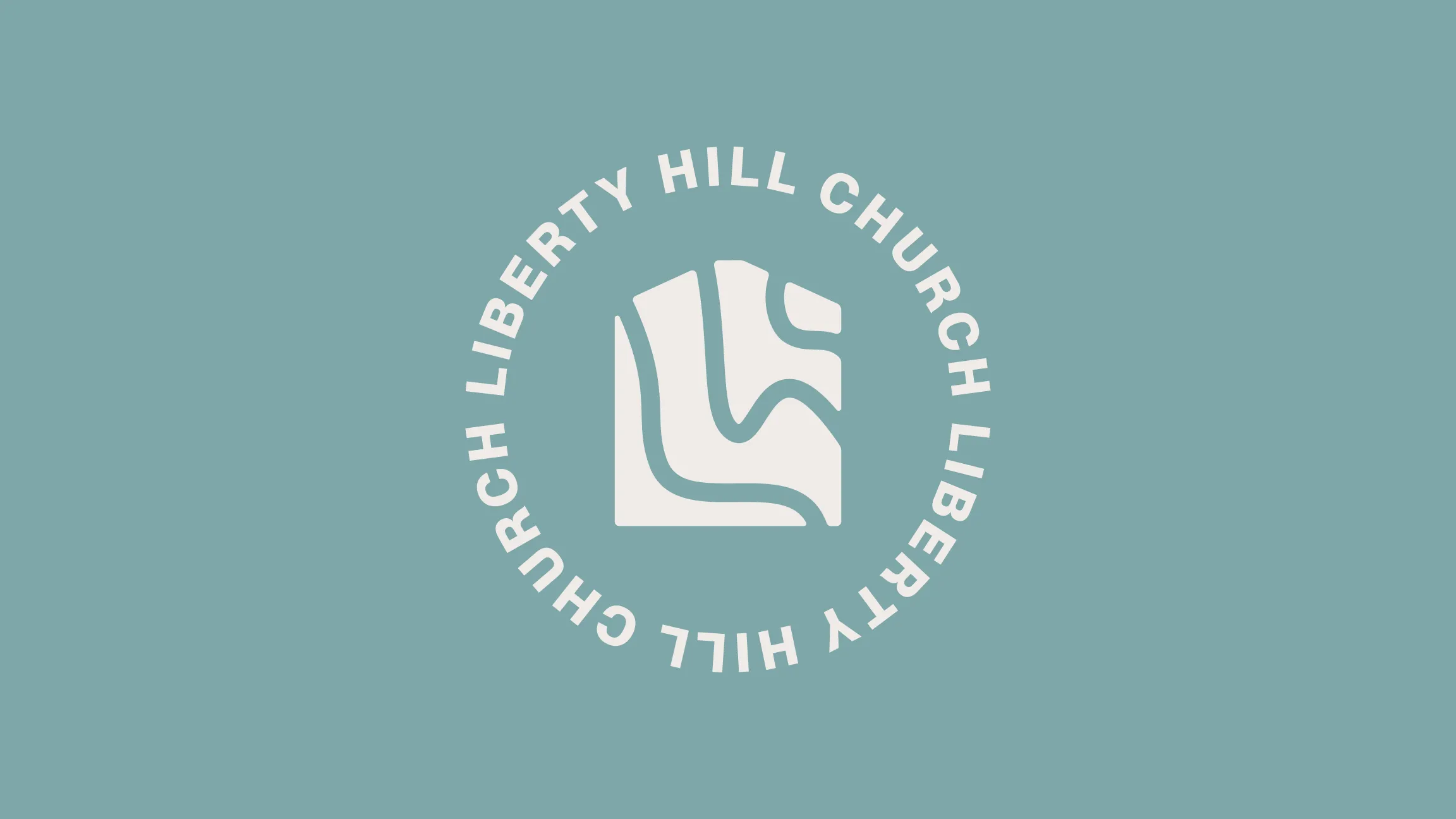
We designed every logo concept based on the form of a grain silo, since silos work as landmarks and waypoints in their rural area. They're on every corner and you literally can't drive a mile without passing one.
The first round of concepts got very close, and we were split between two strong options. After a few days of sitting with them, we made a few more adjustments and then provided the church staff with a focus group survey to help us make a decision.
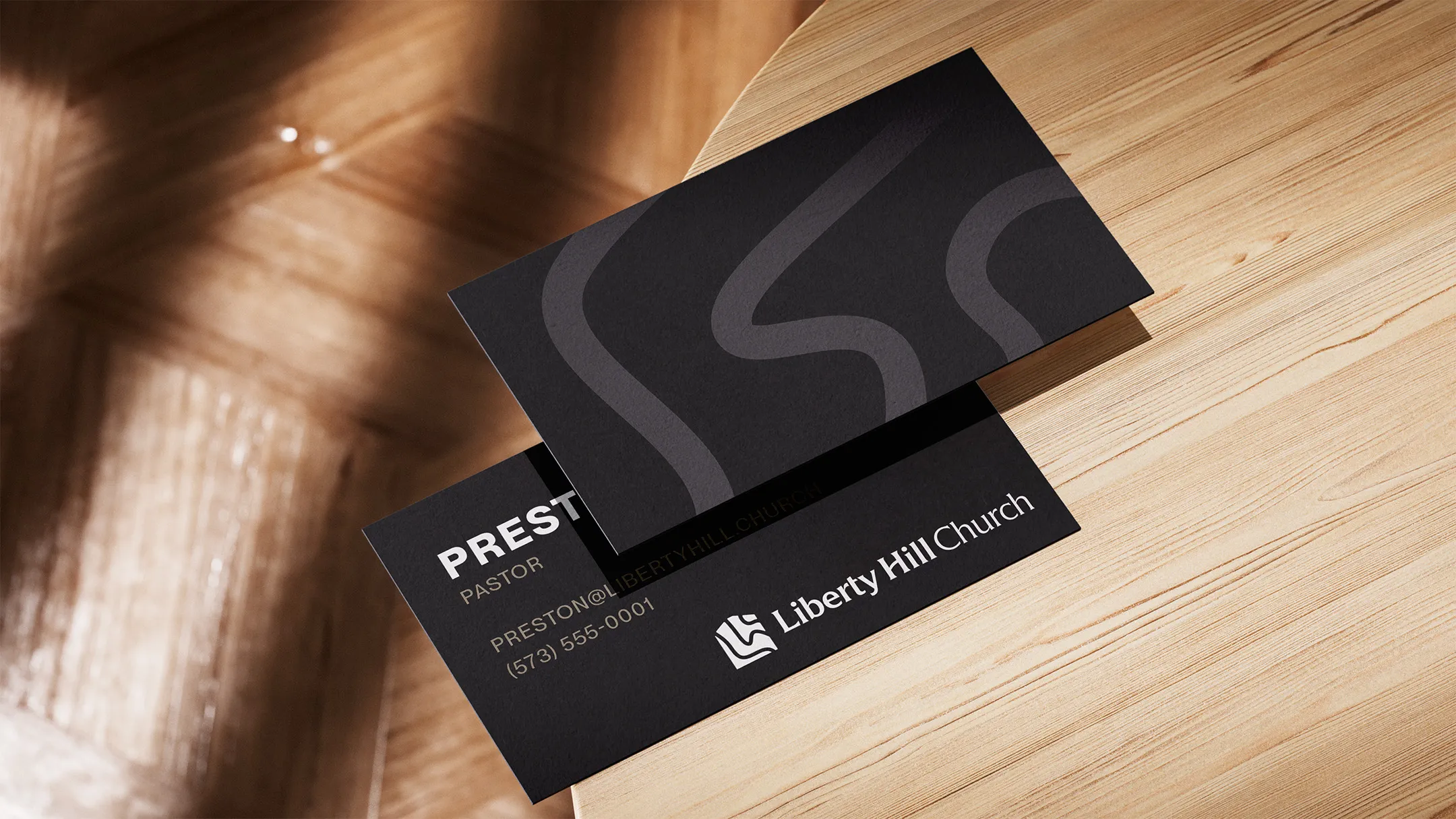


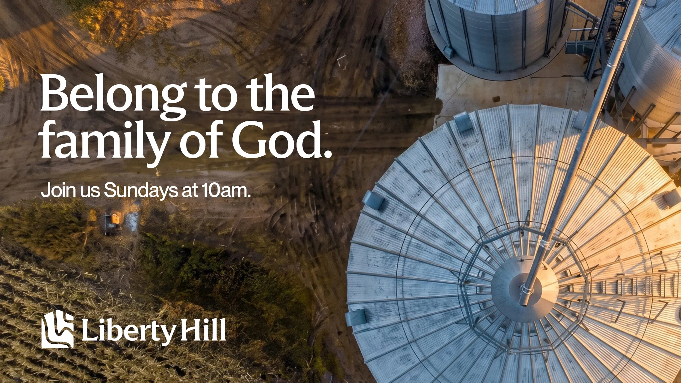
Part of the original issue Liberty Hill's team had was showing that the church was one unified organization, not a coalition of disparate ministries. The key to solving this problem was giving each ministry a distinct look that was still connected to and integrated with the parent brand.
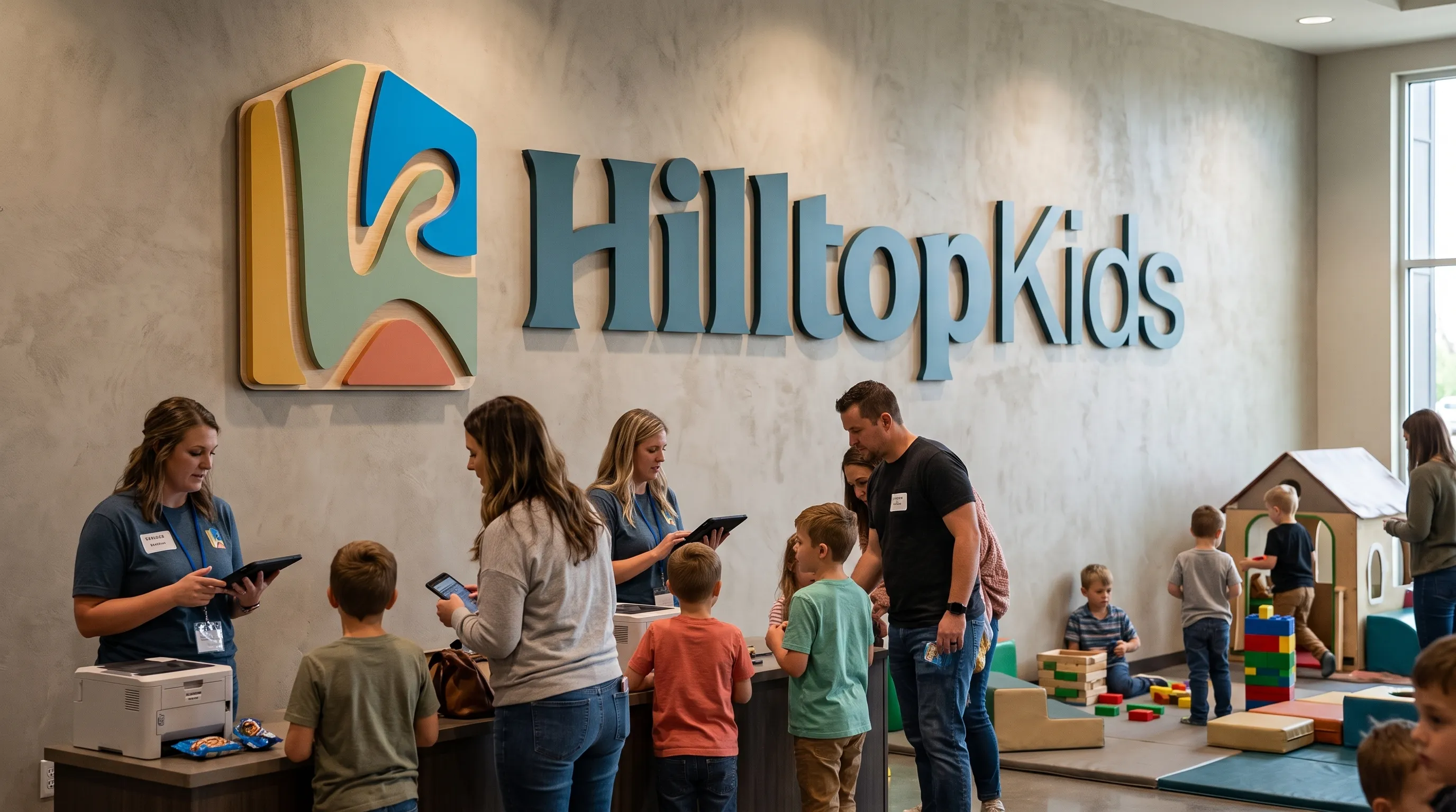
The kids ministry took special effort to develop something that felt fun, approachable, and kid-friendly while not losing the core identity of Liberty Hill Church. We chose brighter shades of the main color palette, similar fonts with a playful edge, and even a unique "hk" brand mark for Hilltop Kids.

The leaders opted to tease the new branding leading up a multi-night church event, where they would celebrate God's faithfulness over recent years and cast a clear vision for the future.
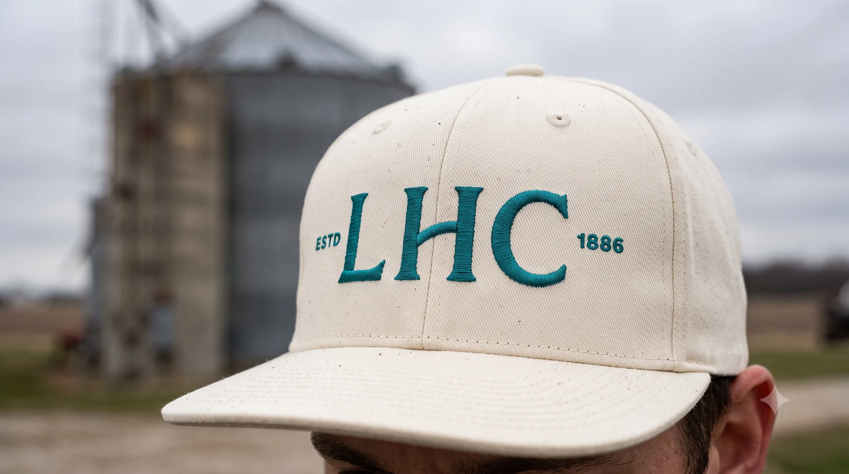
A key part of that vision was the identity of the church, symbolized in their new logo and graphics, which tied everything together and reflected the people and purpose of their ministry.
Take the first step and answer a few questions about your church.
It only takes 90 seconds.