Heritage Church


Heritage Church was trying to replant with two separate congregations, but their leadership didn't have a way to bring their people together. Now they have one unifying brand AND a church that understands its shared identity.
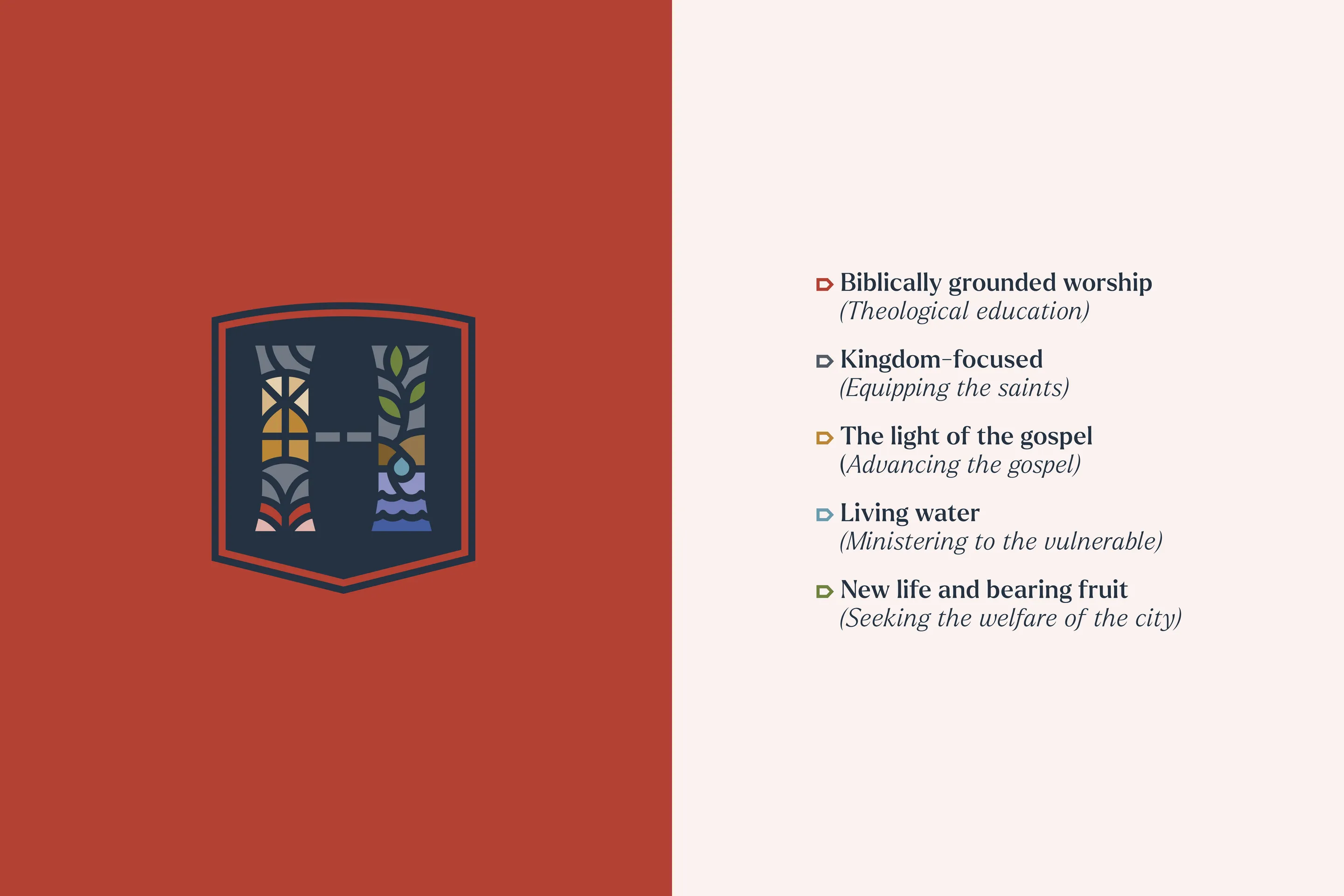
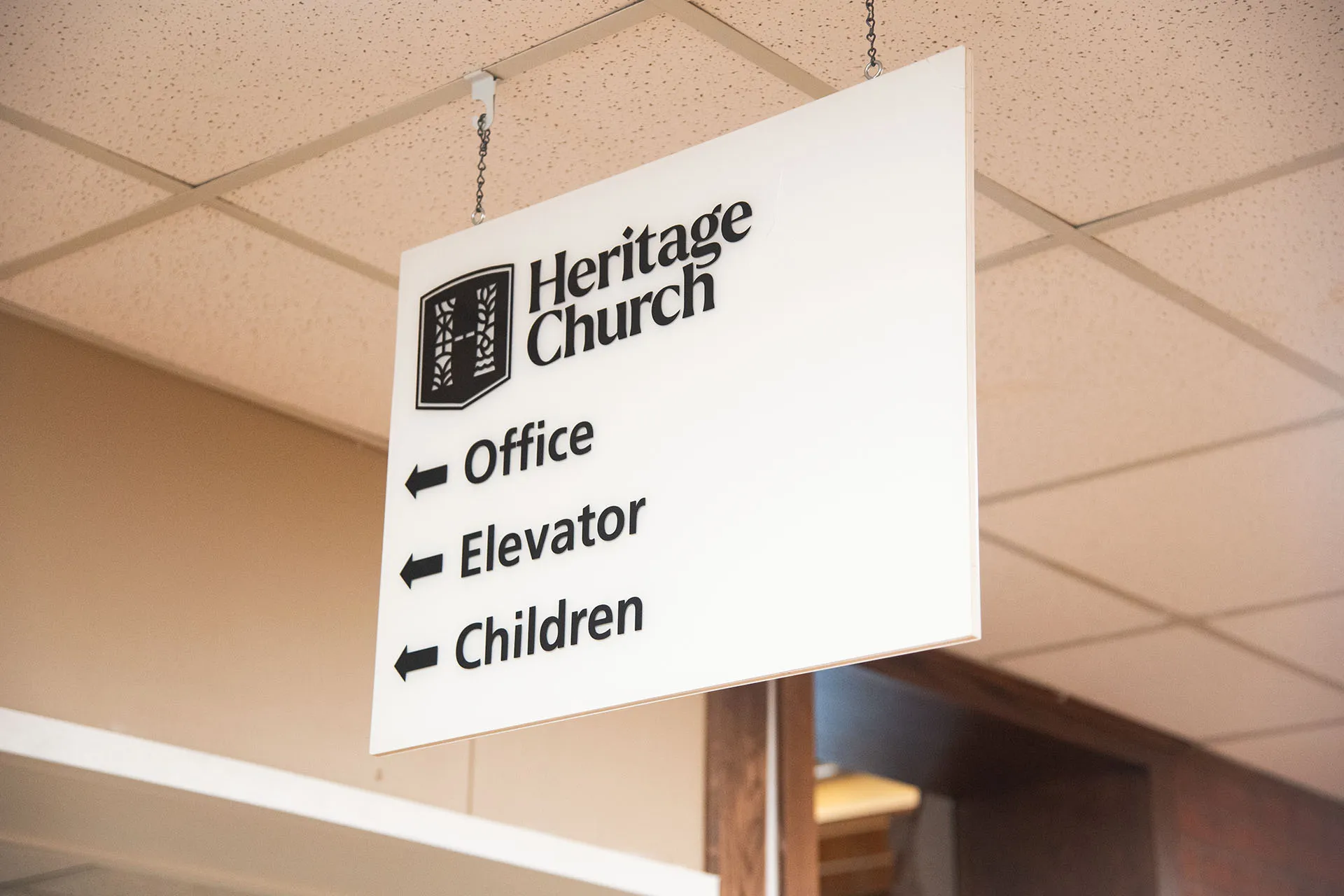
Leadership in the church established five key value statements that described the vision and identity of Heritage. These statements set the tone for the entire brand system, from the logo itself to graphic pattern elements.
![]()
For Heritage, it was vital to simultaneously look historical and modern, bringing together two unlikely themes as a representation of their congregational diversity. The logo and colors were my "ground-zero" for discovering how to achieve that vibe.

Braden walked us through an outstanding rebrand process with intentionality at every step. He handled the licensing of fonts and aspects of the project we would have never considered going into the project. Restore Graphics delivered a unique Christian perspective to design a church logo that visually represents what God is doing in our congregation.

![]()


Each element of the identity came together to form a whole that aligned seamlessly with the mission of the church. In the end, Heritage had a unique, longstanding brand to clearly identify their ministry and reinforce their vision for the body of Christ in Shawnee.


The work that Braden put into researching our history and understanding our core values was tremendous. His ability to incorporate the many aspects of our church into a single identity made the rebrand process very unifying for our church.

Take the first step and answer a few questions about your church.
It only takes 90 seconds.