St. James Florence
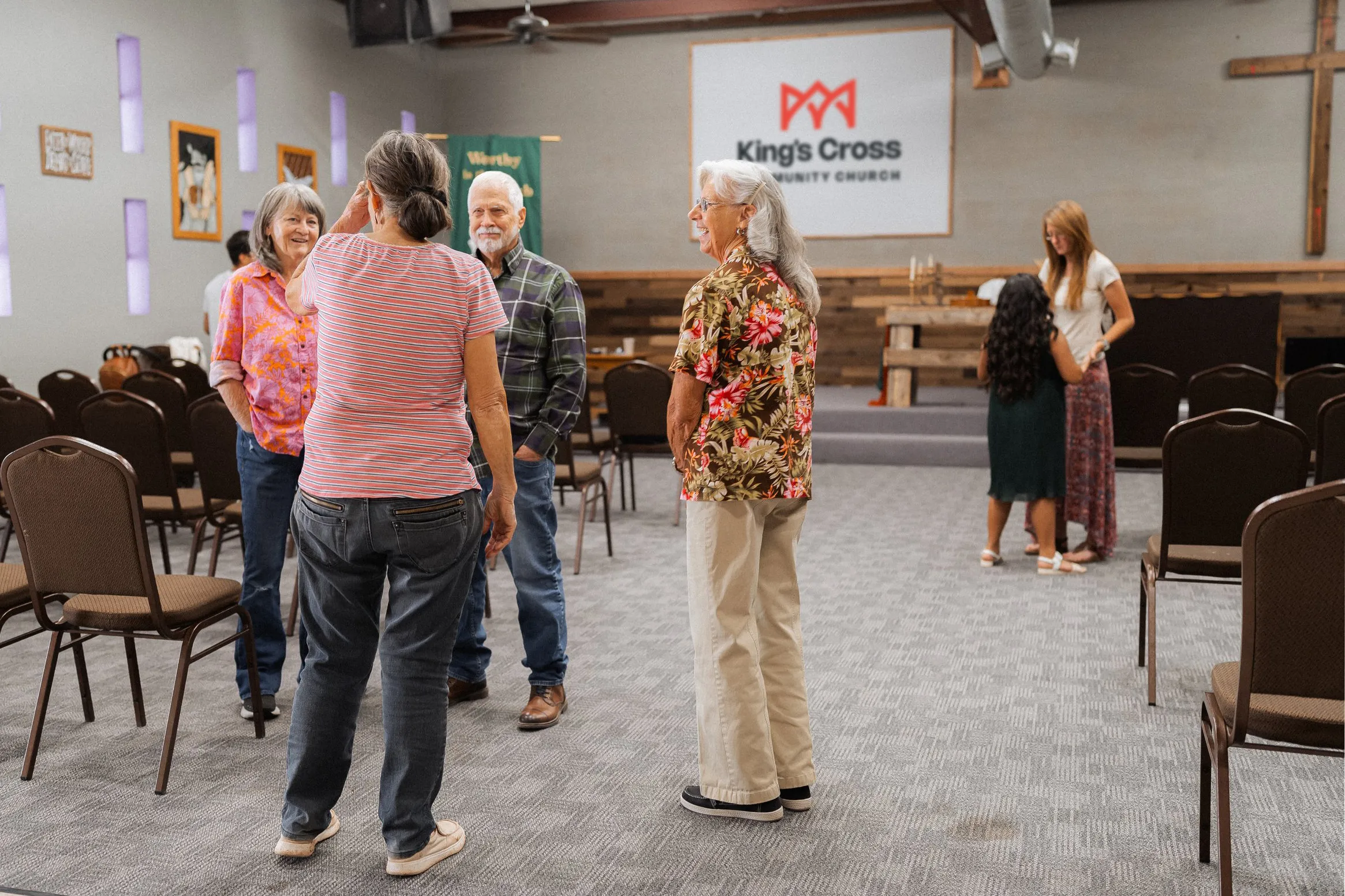
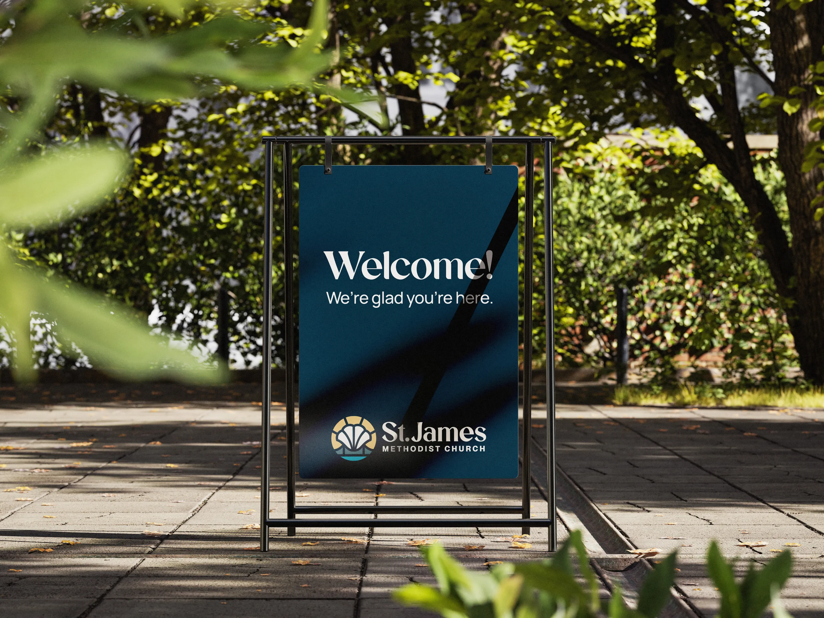
St. James Methodist Church sits on Cox Creek Parkway — one of the busiest roads in Florence, Alabama. For a congregation with over 200 years of history, a warm and growing community, and a pastor who had already brought in 16 new families in his first five months, that kind of visibility should have been an asset.
The problem wasn't the people. The problem was the brand. St. James had been in the same spot so long that the community had stopped seeing it.
Their existing visual identity borrowed colors from the Global Methodist denomination rather than reflecting anything distinctly St. James. And despite a genuine warmth and a "Goldilocks" size that people loved once they walked in the door — almost nobody in Florence knew what St. James stood for.
The leadership knew the church had something worth communicating. They just needed help saying it.
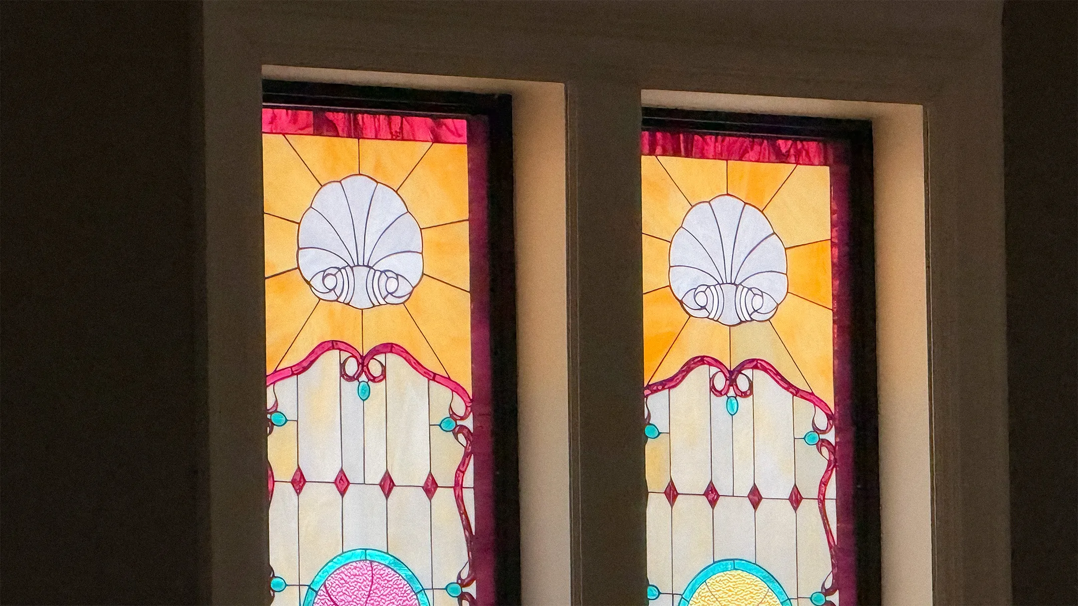
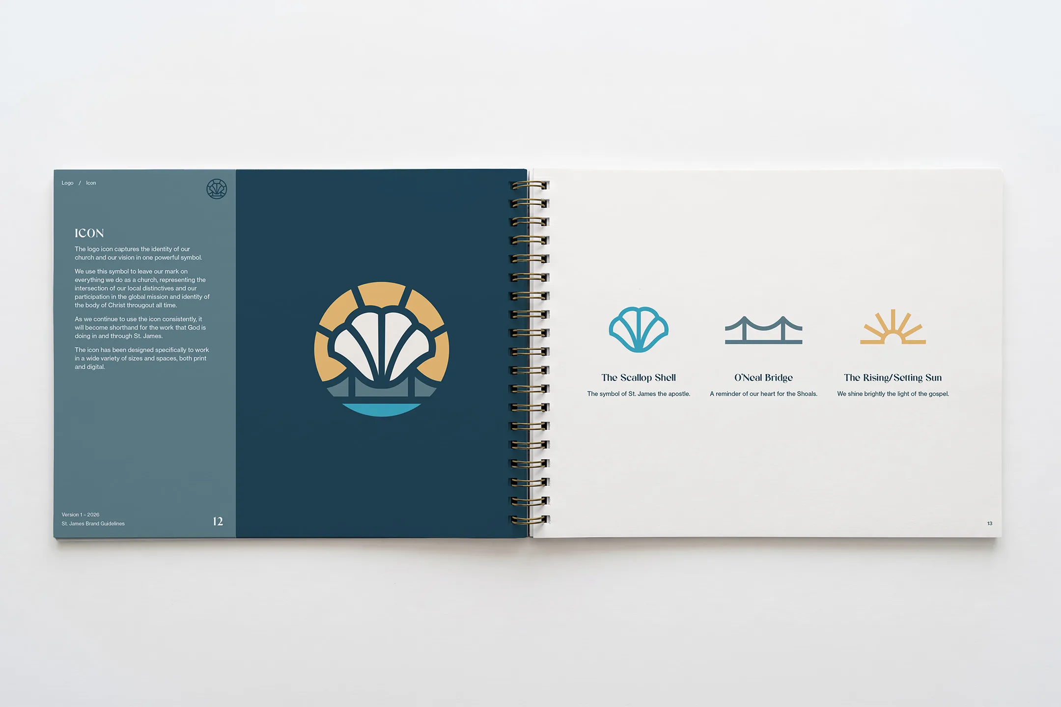
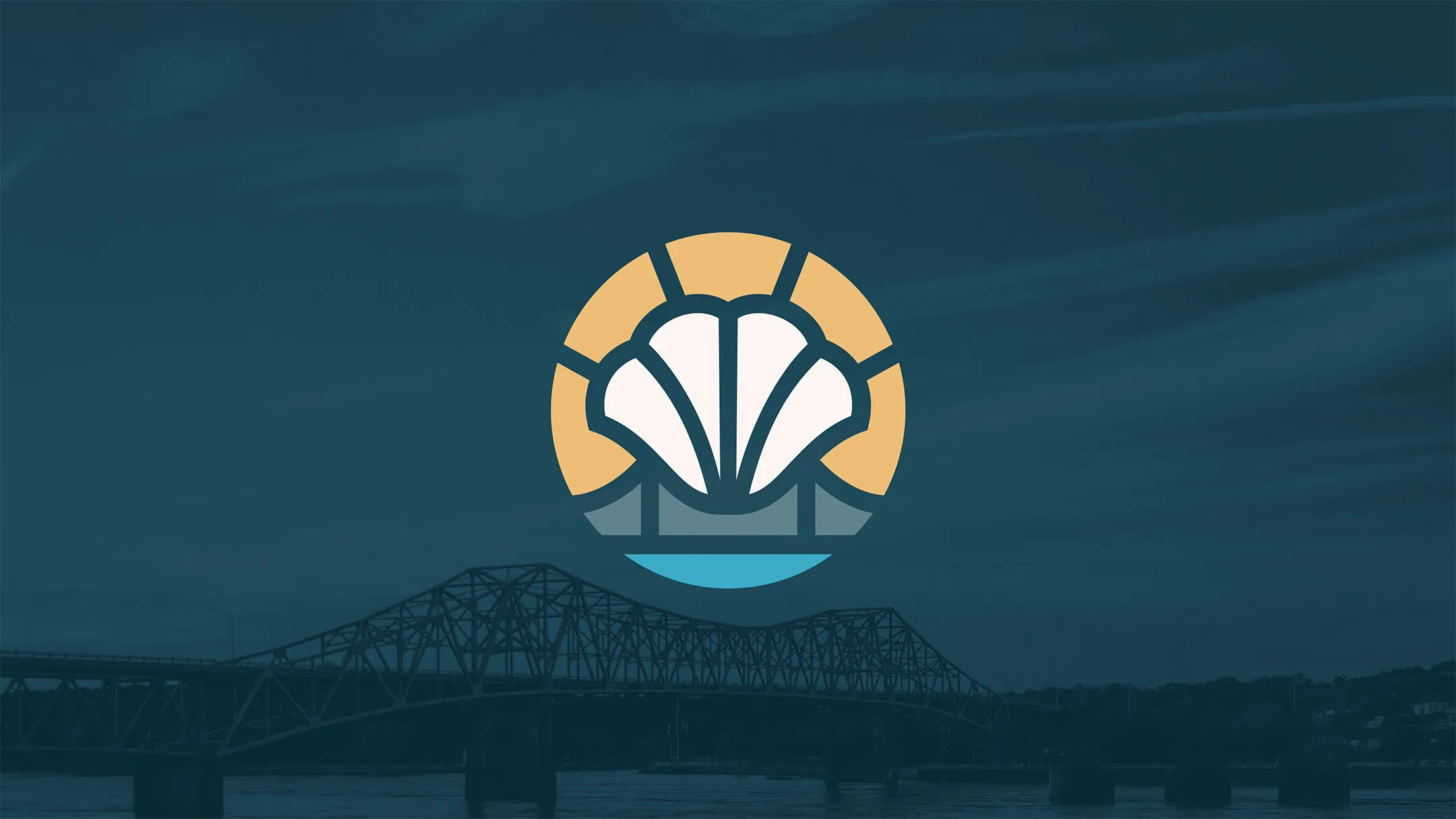
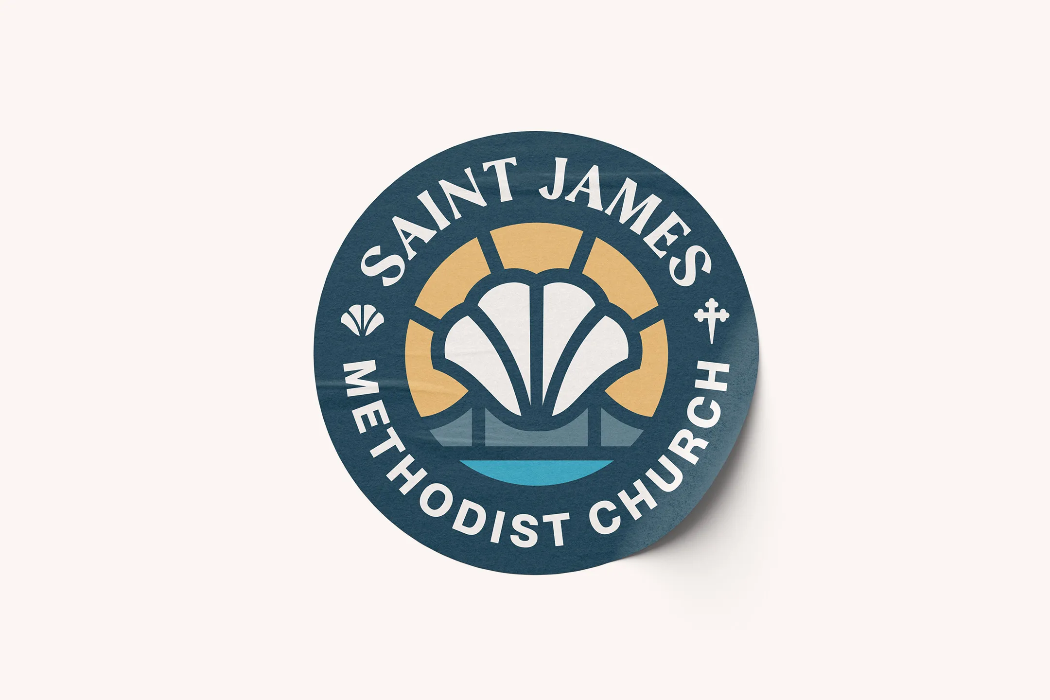
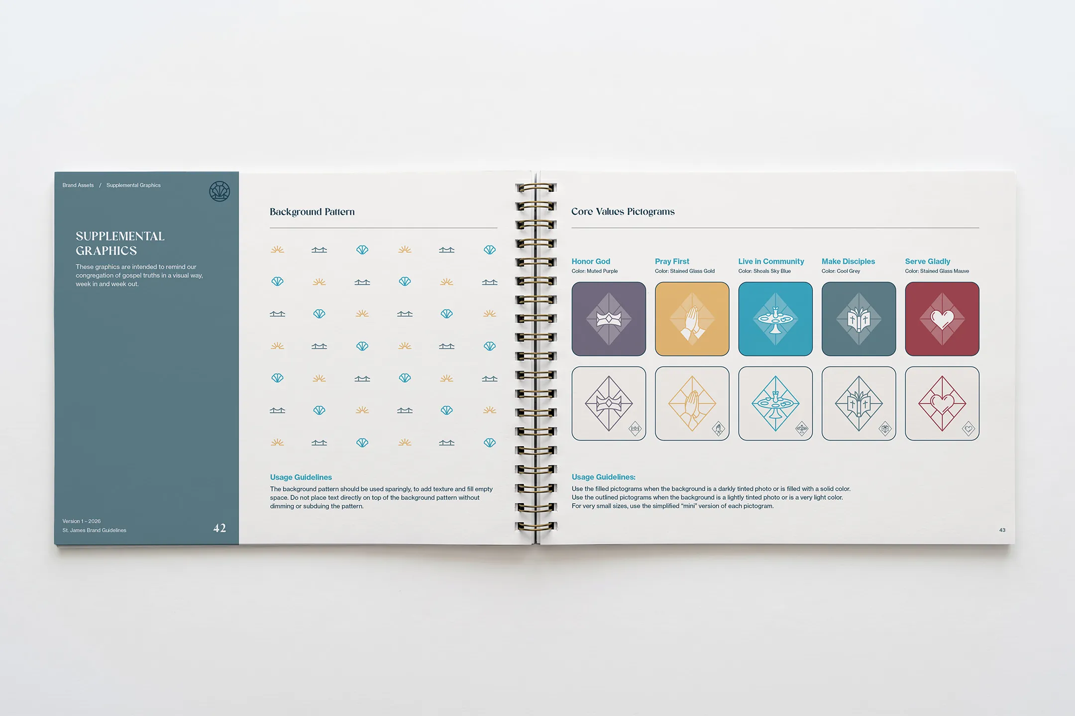
The seashell is the historic symbol of St. James, and it was already woven throughout the sanctuary's stained glass and woodwork.
This made it a natural anchor for the logo. Bridge and water imagery reflected the local geography of the Tennessee River. The color palette was pulled from the church's own prayer garden and stained glass windows, resulting in shapes and colors that felt authentically St. James rather than borrowed from a denomination or trend.
![]()
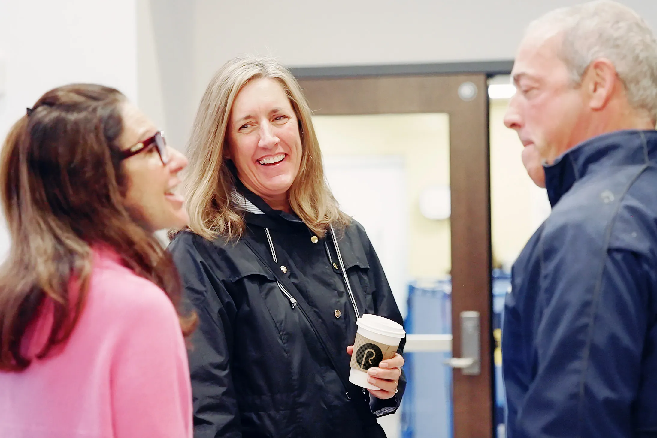
With a three-person committee assembled alongside the pastor, the project kicked off with a structured discovery phase. A congregational survey gathered 31 responses and surfaced consistent themes: warmth, Bible-centered preaching, a family atmosphere, and a strong desire to reach young families and college students. The data gave the team a clear picture of who St. James already was — and who they wanted to become.
![]()
Rather than designing a logo and calling it done, we started with the verbal identity that would be the foundation for the visuals.
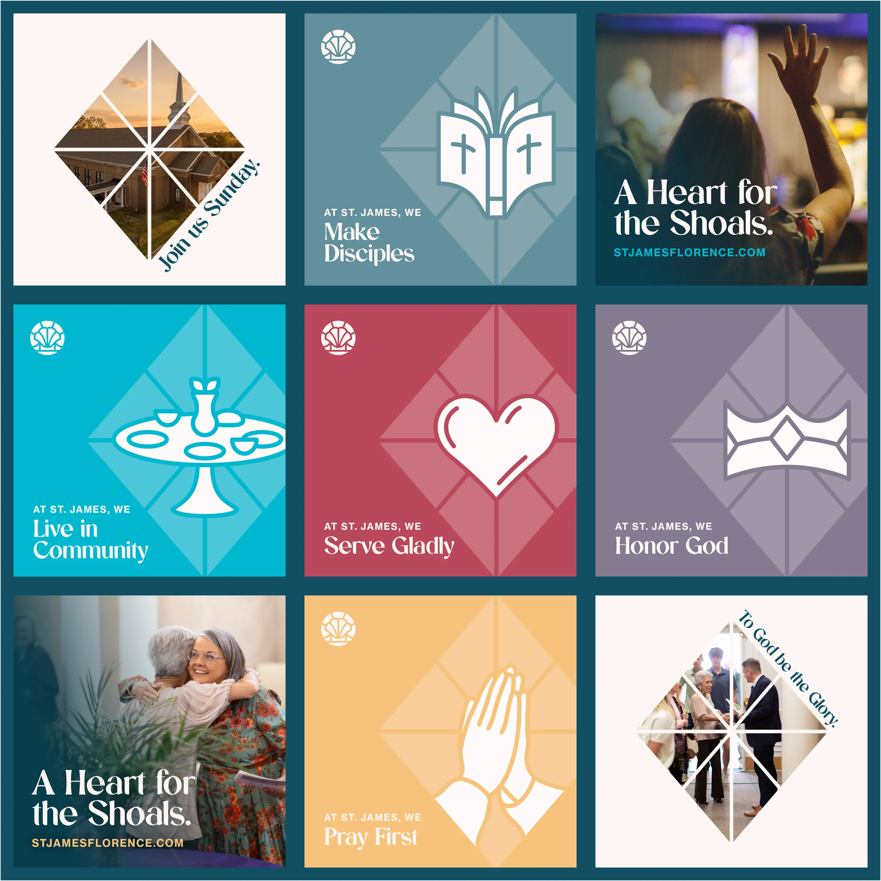
That meant workshopping tagline options before landing on a clear answer: keep the existing tagline, "A Heart for the Shoals." It was already familiar to the congregation, it opened a natural conversation with outsiders, and it captured the church's genuine orientation toward the local community. The process we went through gave the pastor a story to tell his congregation about why it was chosen.
The pastor planned a logo reveal presentation for the congregation, walking through the story behind each design element: the shell, the bridge, the sunrise symbolism. A sermon series was built around the church's new core values, dedicating multiple Sundays to "who we are as a church" — turning the rebrand into a moment of congregational ownership.
![]()
![]()
A church that had been invisible on one of Florence's busiest roads now has a visual identity that tells its story before anyone walks through the door. The brand reflects 200 years of history without feeling dated.
The congregation has a tagline they can own. The leadership has a brand guidelines book that makes every future design decision easier. And the pastor has the tools to keep building momentum — with a Canva brand kit, licensed fonts, animation files, and a full suite of assets ready for whatever comes next.
I can't express how transformative the rebranding process with Restore Graphics has been for St. James Church! Before we started, we struggled with low community awareness despite our prime location on Cox Creek Parkway. Our brand didn't reflect the unique spirit of St. James, and we lacked a memorable visual identity.
Braden went above and beyond expectations. He provided much more than just a logo; he gave us a voice and a full brand identity. The discovery phase helped us articulate what St. James truly stands for, and the brand guidelines book brought clarity and direction. The weekly meetings kept us on track and informed.
The rebrand sparked exciting ideas, including a special reveal with meaningful symbolism and new brand assets that opened up possibilities we hadn't planned for. Confirming our tagline, "A Heart for the Shoals," made it easier for our congregation to embrace our message.
For anyone considering rebranding, I highly recommend Restore Graphics. This investment has been invaluable, and I would do it again in a heartbeat!
Take the first step and answer a few questions about your church.
It only takes 90 seconds.