7 Design Principles for a Church Logo
The good way that churches are different
A well-designed church logo serves as the sacred symbol that captures the identity of your congregation. Beyond mere aesthetics, a church logo becomes a visual testament to its unique history, vision, and mission. If you are a pastor, elder, or ministry director reading this, you understand the profound significance of crafting a church brand that represents and resonates with the heart of your congregation.
Let's be real, while your church logo is important to convey your unique vision, it means nothing without a solid foundation of meaning that it can point to and represent.
Your church logo needs to be a tangible representation of your church's commitment to its beliefs and values.
A logo simultaneously says "This is who we are." and "This is who we want to be."
Logo animation for Heritage Church
A logo is a central piece in vision-casting for any church, so here are seven principles to guide you in creating a mark that will best serve your church.
Every church has a distinctive history, vision, and mission. Aligning the logo with these unique elements is absolutely vital. Invite your elders and leaders to reflect on the beliefs that are core to who your church is and who you are becoming. These core values will lay the foundation for a logo that authentically represents a powerful vision and identity.
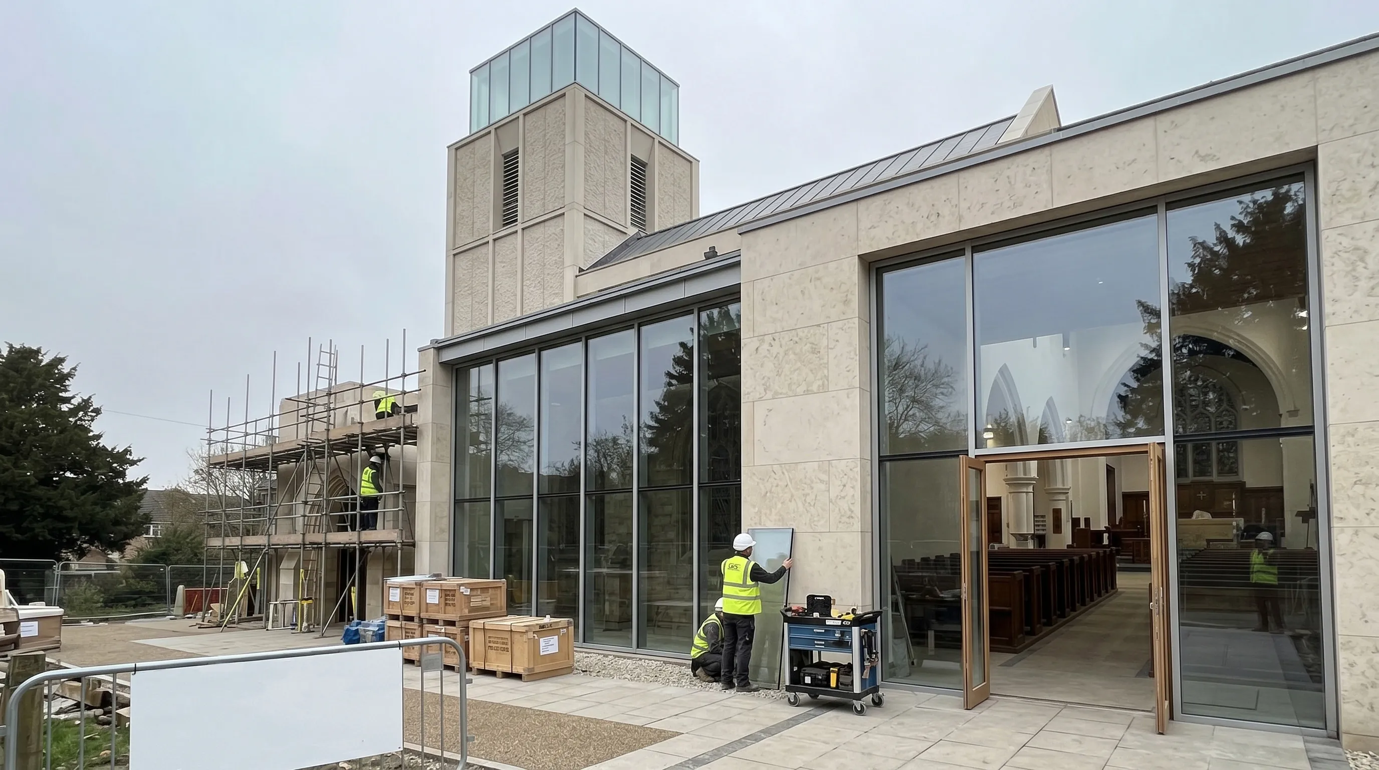
Does your church have its history recorded? You may want to study those records for important themes and threads. Is your church building recognizeable by a specific feature or location? Take note of that.
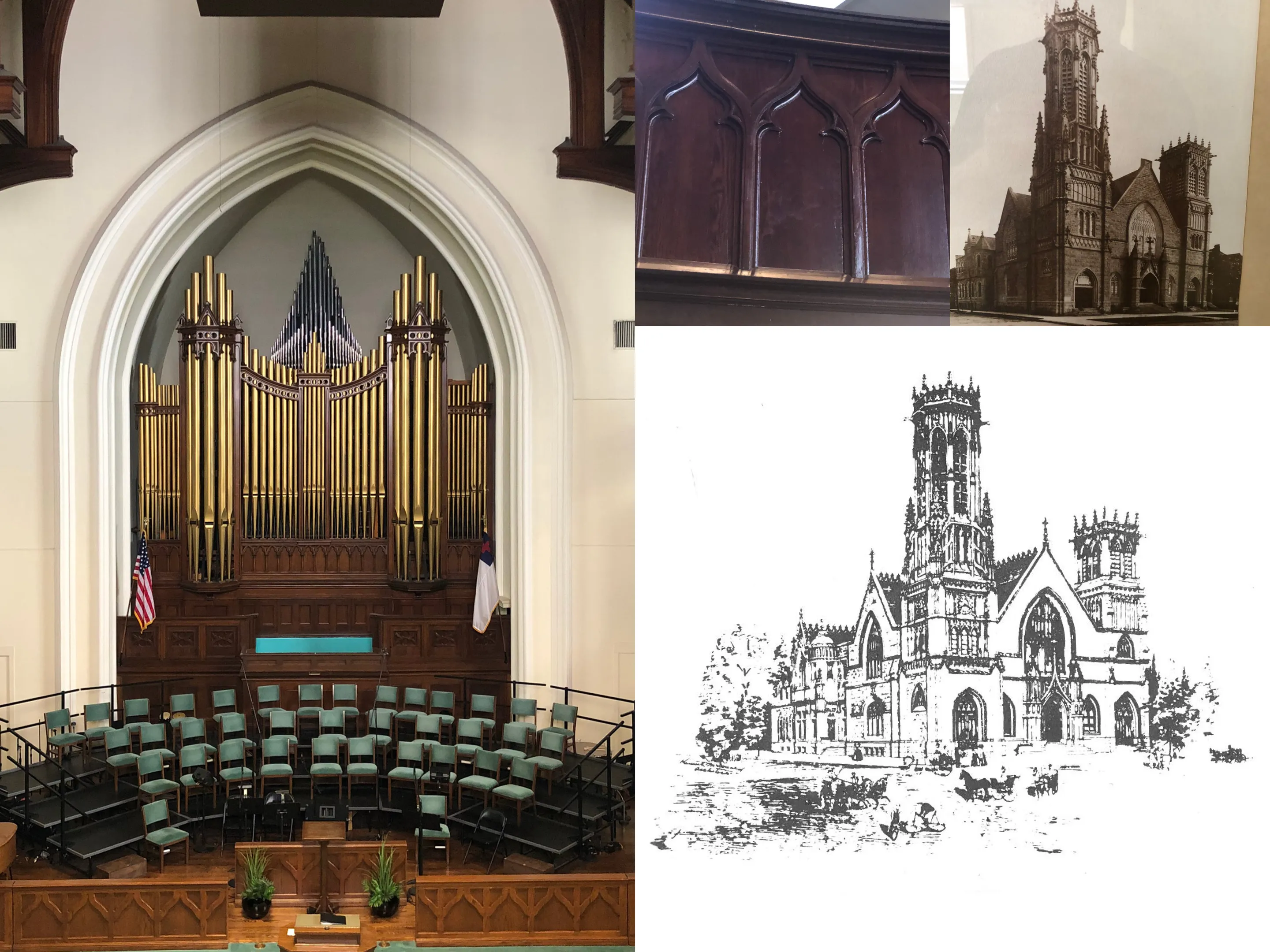 Building photos from Walnut Street Baptist Church
On their own, these individual pieces may not seem signficant, but before you know it, you'll have a list of attributes and iconic features that make your church one-of-a-kind.
Simplicity is the key to unlocking memorability. A logo that is clean and straightforward can leave a lasting impression, making it easily recognizable in the minds and hearts of the congregation and beyond.
This isn't to say that a church brand should look one-dimensional or corporate - Quite the opposite! As Christians, we believe in a God who has created with elegance and complexity, simplicity and dimension. To reflect this in your church logo, we can draw from the intelligent design of the creation we see around us.
![]() Logo for First Baptist Muskogee
Logo for First Baptist Muskogee
Just as everything has a purpose and a function in the created world, so too does each part of a church logo need to have a purpose and specific intent. For further reading, visit this post on borrowing from our Creator's handiwork in order to design beautiful church branding.
Christian symbols carry profound meaning: just think of the Cross, the Fish (Ichthys), or the Dove. Sometimes, incorporating one or two of these into a logo can evoke a deeper sense of your church being Biblically-based. However, these symbols can also be misconstrued or overused, so exercise caution.
![]() Logo for Christ the King Presbyterian Church
Logo for Christ the King Presbyterian Church
Seek to interweave meaningful elements into the design, like these examples where logos effectively convey a clear Christian message. Notice that while several of the logos integrate a biblical symbol, there is usually a tasteful flare that nods to the church's vision or name and makes the mark unique.
Colors speak a language of their own, conveying themes and emotions. In Christian logo design specifically, many factors are at play! This can make the process of choosing church brand colors different from selecting a palette for secular designs.
For example, red in a Christian context is more likely to remind one of the blood of Jesus, while black may be associated with sin (but not always). Brilliant, high-energy colors may not be right for some churches, depending on their context.
![]() Color palette for Walnut Street Baptist Church
Color palette for Walnut Street Baptist Church
Most churches would benefit from a slightly more subdued, timeless color palette.
Similarly, it's important to select a font that will retain its appeal to the congregation and local community for a long time. Trendy and quirky fonts may look interesting and exciting, but would be a branding miss for many churches. Classic, clean typography is often a better choice.
A well-crafted logo should seamlessly adapt to various mediums where your church is present, from church bulletins to websites. Simplicity (see Principle #2) makes this particular step a breeze. When a logo is complex and uses many colors, it can fail to adapt well to the places it will be seen the most.
When choosing your church logo, one very important versatility consideration is scalability. If the logo can be identified at a very small size, while keeping its distinctive features, that's a win! If you want to get advanced, create a simplified alternate version of the logo that scales more easily for when you have limited space.
![]() Logo design for Grace Presbyterian Church
Logo design for Grace Presbyterian Church
Another consideration is how well the "footprint" of the main mark fits into a square or circle. If a logo is very wide or too narrow and tall, it may shrink down to an illegible size on a social media profile circle. The goal of the church logo design should be adaptability, in order to not compromise the integrity of your brand.
For a fun detour, see these examples of logo designs, many of which have kept versatility in mind.
Many church bodies have a healthy mix of age ranges and cultural backgrounds, while some cater to a more defined culture and stage of life. Understanding the demographic makeup of your church is crucial in designing a logo that resonates with its members.
To appeal to the greatest portion of your congregation, it can be helpful to focus on the timeless parts of the church that will still be true in 5, 10, or 20 years.
A less diverse church may have more freedom to choose a logo that feels particular to their members, rather than appealing to a broader demographic.
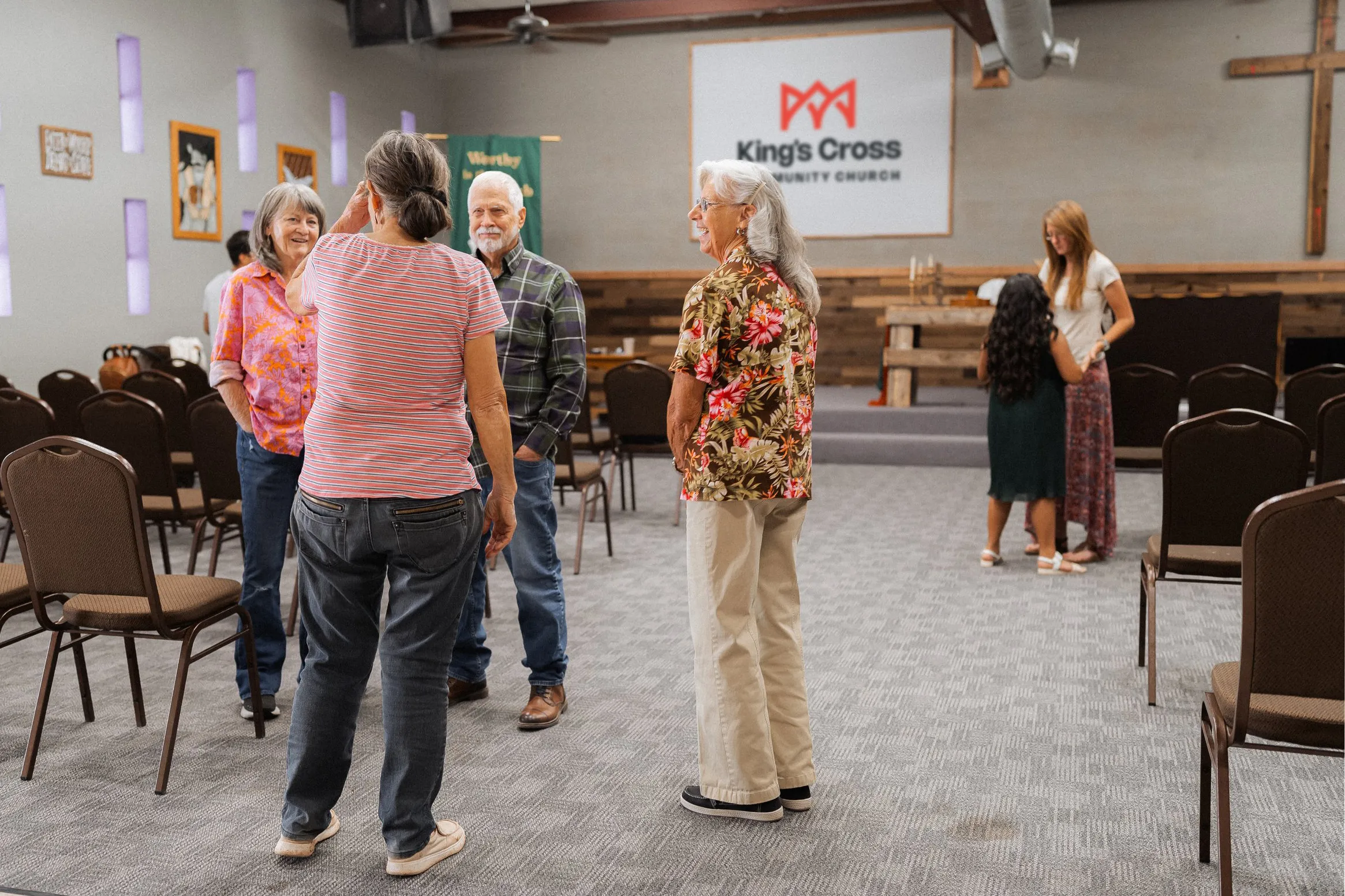 Logo design for King's Cross Community Church
Let's face it: Implementing these principles is easier said than done.
Designing a meaningful and timeless visual brand takes years of experience. Not only that, but the logo is just one small part of a brand identity.
That's where I come in.
Logo animation for Walnut Street Baptist Church
As a brand identity designer for nearly a decade who specializes in church brands, I want to come alongside you in the start of this new chapter. Not only will we work together to design your logo, we'll actually walk step by step through building a strategic foundation for your brand that will make it last for decades.
Let's capture your vision and start your next chapter with a brand that actually fits.
Answer a few quick questions about your church, and I'll reach out with some personalized information for you.
It only takes 90 seconds!